Five quarts of turkey stew has been squirrelled away in freezer and the last dish from Christmas dinner has been washed and put away. Soon it will be time to take down the decorations and change over the house for the new season.
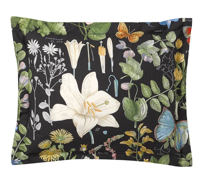
January is too early for pastels, I always feel, but here in the Great White Canadian North, we are also longing for some colour. I often opt for a black & white combination for the kitchen in January, and let flowering bulbs and coloured glassware provide the colour. But some of my favourite china features a deep blue background (the collage above is testament to that!), so last January, I was easily seduced by some dark background florals and paisley linens that were on offer at Pottery Barn. I got some lovely lumbar pillows for our family room, a pattern called Isla Paisley. It looked great in combination with some deep green and navy velvet cushions.

They also had a reversible black/white background floral duvet cover and pillow shams combination. I wish they’d done a reduced scale version of the black background fabric in napkins and runner, because it would go very well with black & white china. Hmmm….
 It looks like the blue trend is continuing for this year, as well as boldly coloured florals. Pottery Barn, Williams Sonoma and Pier 1 have all released their spring previews, and an ocean of blue greets the eye! No argument with that.

Pottery Barn Sophia
-

- Sophia Dinner Plate
-

- Sophia Boat Dessert Plate
-
- Sophia Village Salad Plate
The Sophia pattern by Pottery Barn looks to me like a combination of Spode’s Blue Italian and Juliska’s Country Estate in Delft Blue, with a little of Mottahedeh’s Virginia Blue throw in on the edging detail. It’s a refreshingly modern take on the classic toile pattern, with an interesting border throughout the collection. As is the modern way, the dinner plate has lots of white space on the centre of the plate and two different dessert plates feature more full coverage. The cereal bowl and mugs are generously sized at 25 and 14 ounces, respectively.
-

- Spode Blue Italian
-

- Juliska Country Estate Delft Blue
-
- Mottahedeh Virginia Blue
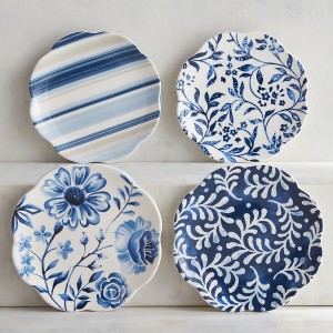
Williams Sonoma has continued with the navy blue and white theme from last year. This year’s Japanese Garden Collection includes four different salad plates, two in each of navy and white backgrounds. There are two sets of bowls in different sizes, two rectangular platters and a large serving bowl.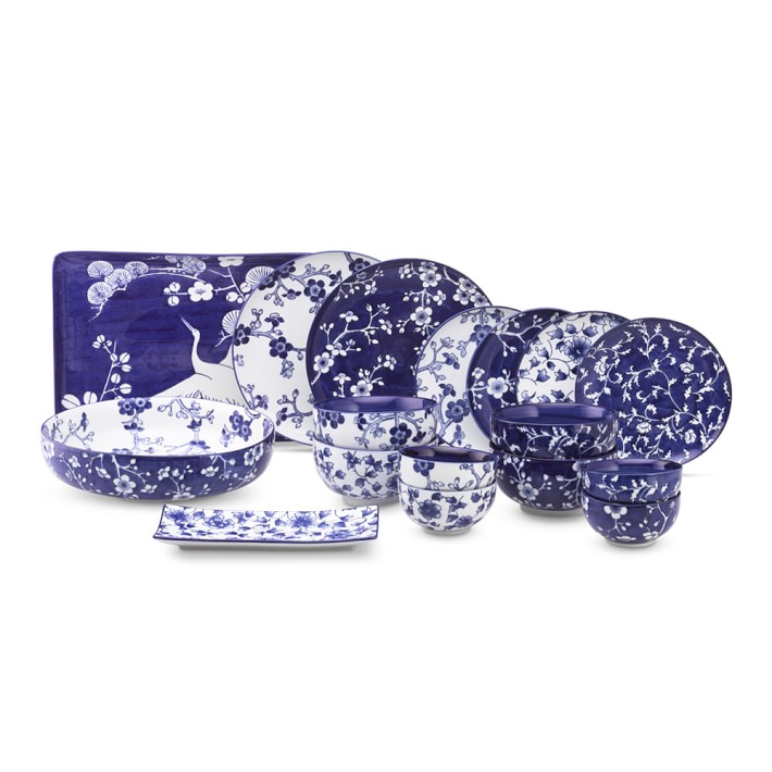 The Pier 1 collections have something to please everyone, from stylized florals to lively stripes in several shades of blue. I quite like the mix and match aspect, and am always a fan of their pasta bowls, which often feature the pattern inside as well as outside the bowl, as they do in the case of the Azure Floral, below.
-
- Pier 1 Azure Floral Appetizer Plates
-

- Pier 1 Azure Floral
-

- Pier 1 Sarah Striped
I then spent some very fun time wandering around 222 Fifth’s assortment of patterns. The gallery below just scratches the surface – 222 Fifth are nothing if not prolific. The Blue Dynasty pattern, in particular, features many different dinner and dessert plates. Some of these are available at Replacements.com and some on e-Bay. I’ve shown just two of the options below.
-

- Hawthorne Blue 222 Fifth
-

- Santosha-Blue 222 Fifth
-
- Santosha-Blue 22 Fifth
-
- Indigo Rose Dark 222 Fifth
-

- Blue Dynasty 222 Fifth
-

- Adelaide Blue 222 Fifth
-

- Indigo Rose Light 222 Fifth
-

- Blue Dynasty 222 Fifth

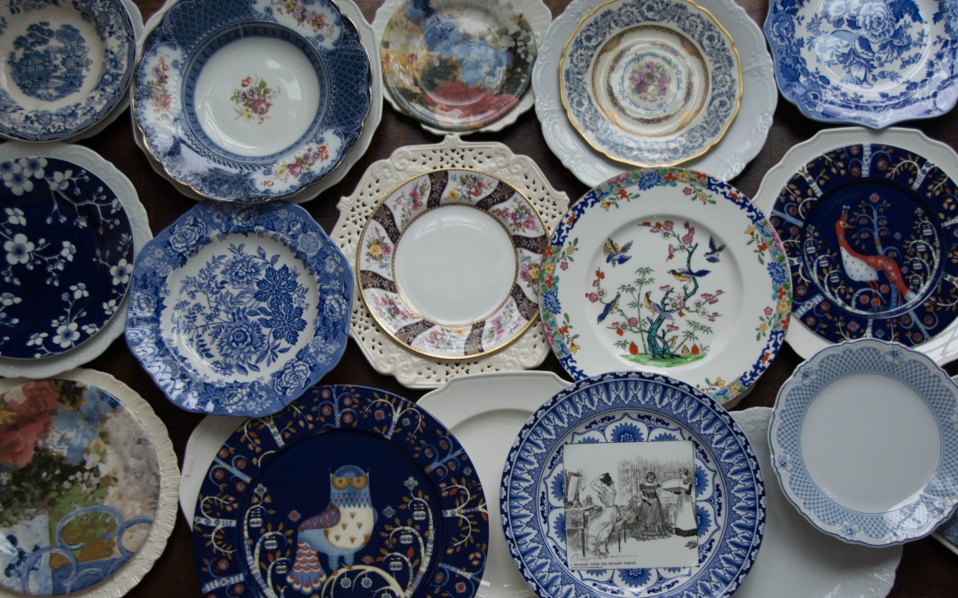
For anyone interested in the patterns in the collage above, starting in the top left hand corner and working across the rows:
Top Row: Tonquin by Royal Staffordshire; Sevres by Ridgeway; Chaise Bleu by Gien; Marguerite by Black Knight; British Flowers-Poppy by Spode (The Blue Room Collection);
Middle Row: French Blue Bouquet by Williams Sonoma; Jasmine by Spode (The Blue Room Collection); Kingswood by Spode (The Cabinet Collection); Emperor’s Garden – Cobalt by Mintons; Taika by Iittala
Bottom Row: Chaise Bleu by Gien; Taika by Iitalla; Gibson Girl Series Ware by Royal Doulton; Estelle by Hutchenreuther
What does everyone think of the colour choices for spring? What are your favourite combinations?
I’m sharing this post with Between Naps on The Porch.
