My daughter Kirsten and her husband Mike both have birthdays in March, so we often celebrate them together with a family dinner. As Kirsten’s favourite colour is purple, I wanted the table to reflect that. Yes, Mike is also interested in tableware (actually, even more so than Kirsten), but she got first dibs this time round. He had received some Depression Glasses, repurposed as Scotch and Port glasses for said birthday and I’ll be blogging about those at a later date. (I think it’s only polite to let him use the pieces for a bit, before I whisk them to one side to start snapping photographs.)
Ta Da!
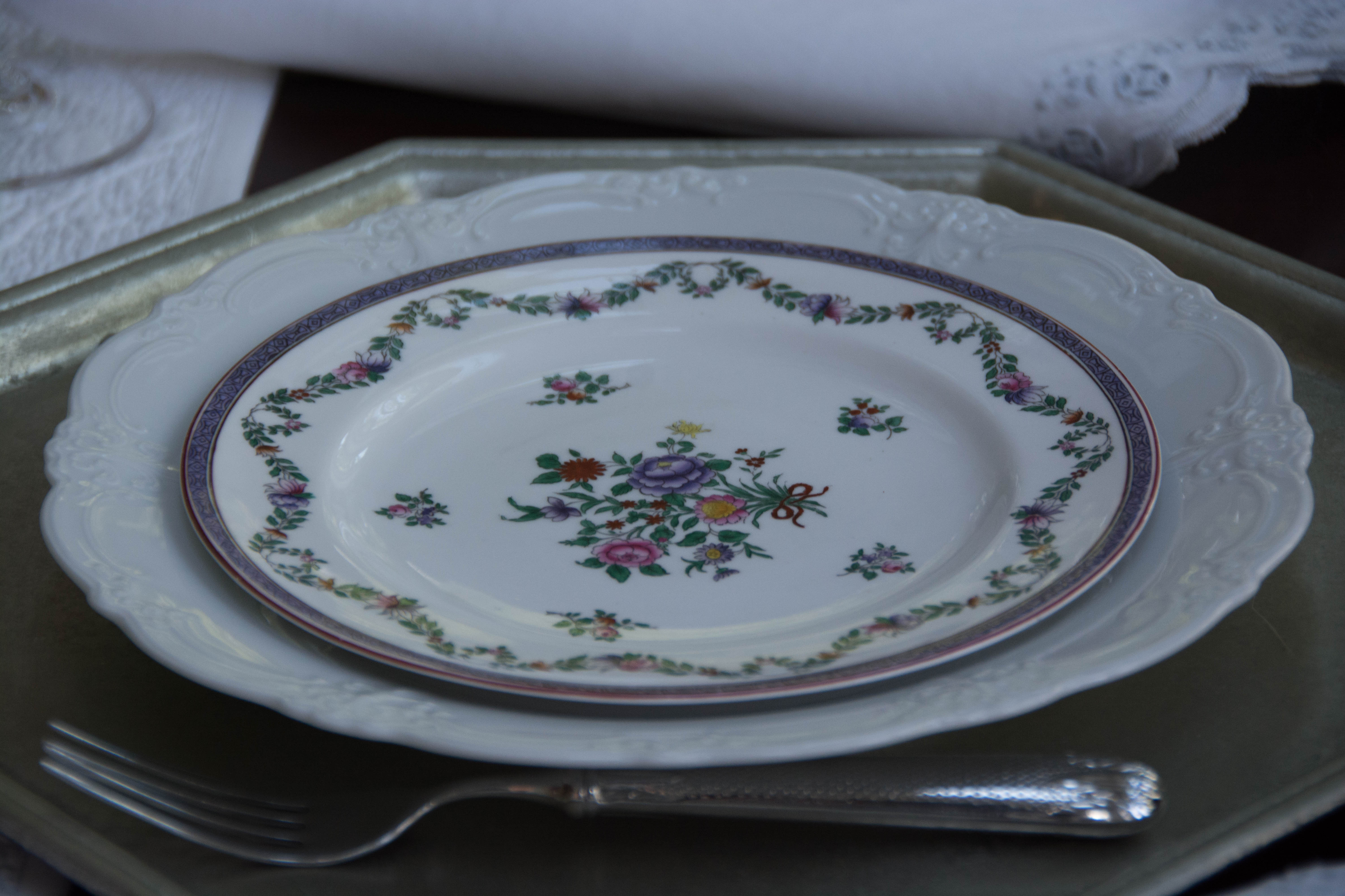
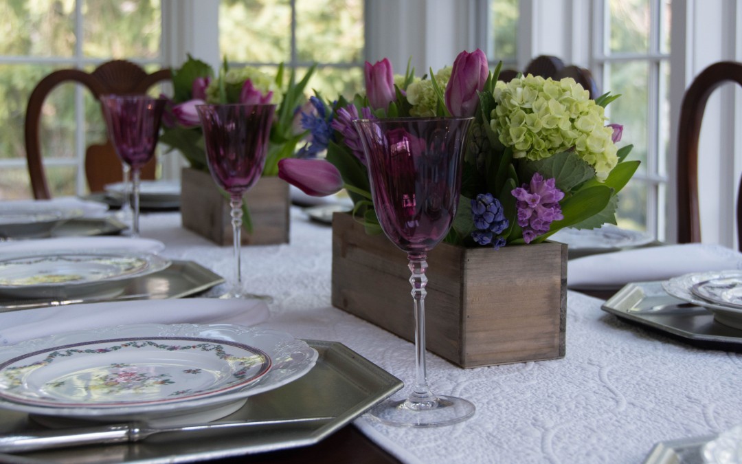
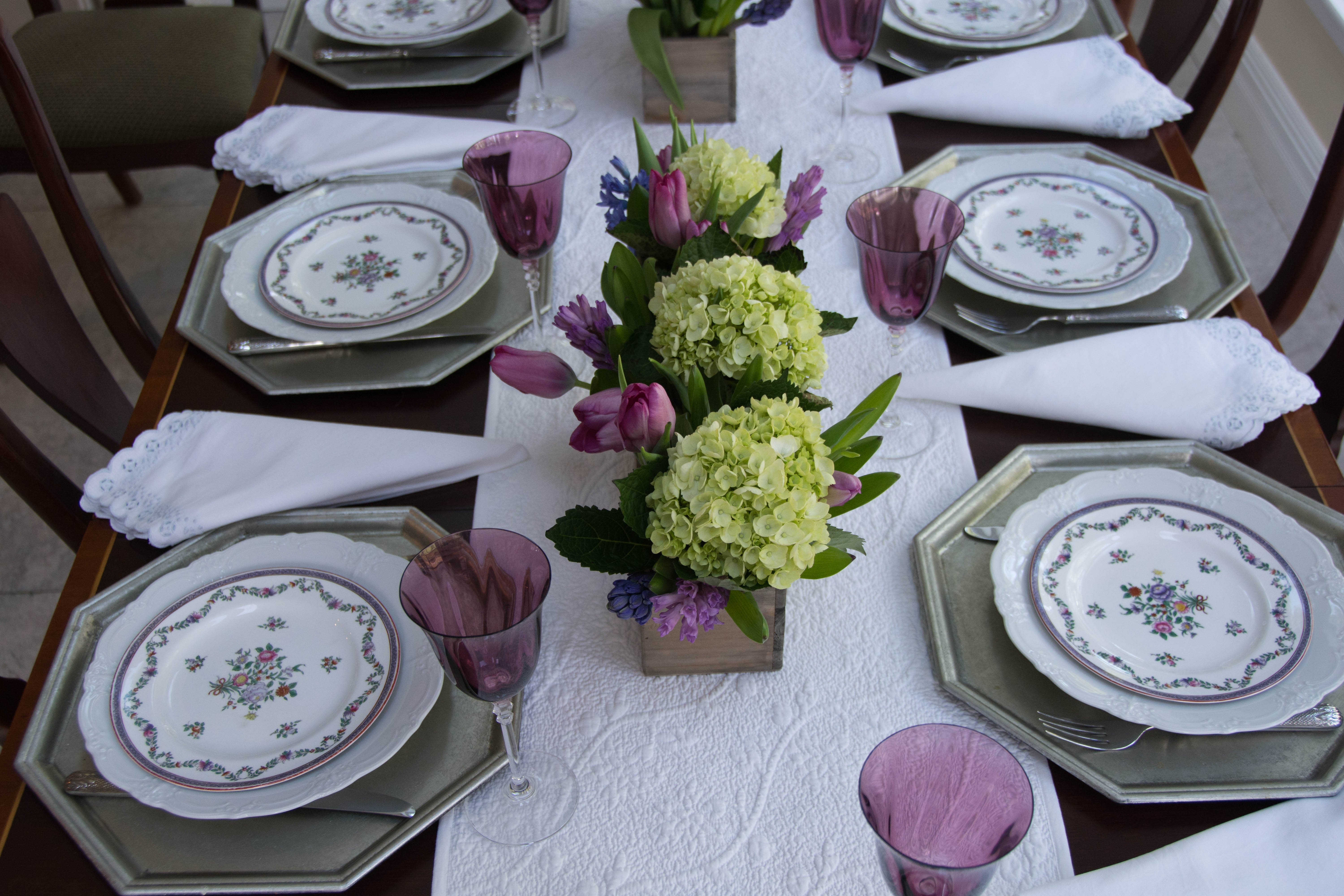
Purple is not a common colour in tableware. The plates, romantically named Spode R3912, were a Replacements find from an extended cruise around their website one day. While not dated, I’m fairly certain the pattern is quite modern – likely after 1970 when Spode began to reuse that that name on their pieces, rather than Copeland Spode as they had previously.

I purchased the glasses some time ago at a thrift shop. The purple contains quite a bit of red, and it goes nicely with the tulips and hyacinths, which are among Kirsten’s favourite flowers.
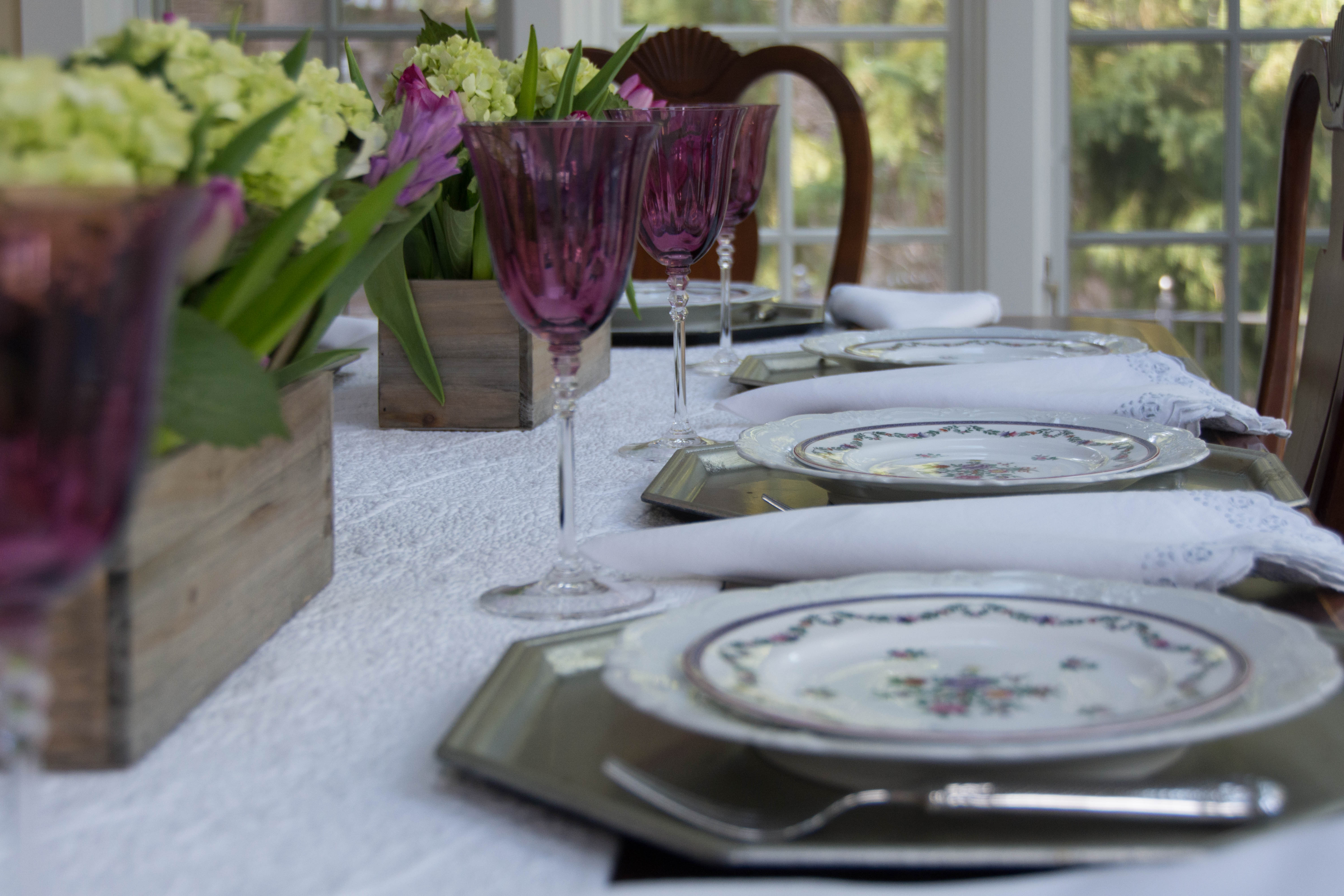
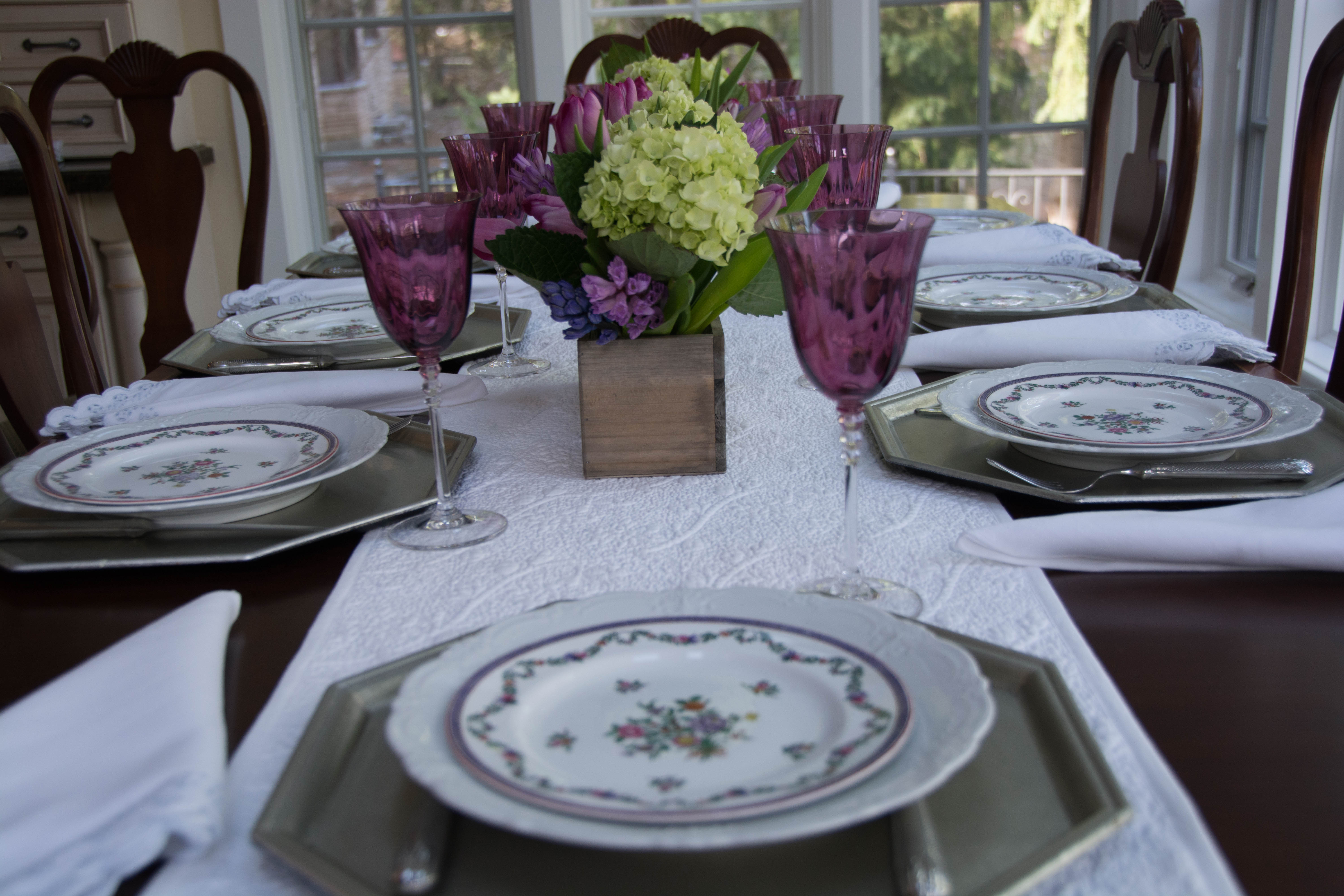
I used simple white linens. The runner is the Vine Floral Boutis in white from Williams Sonoma.
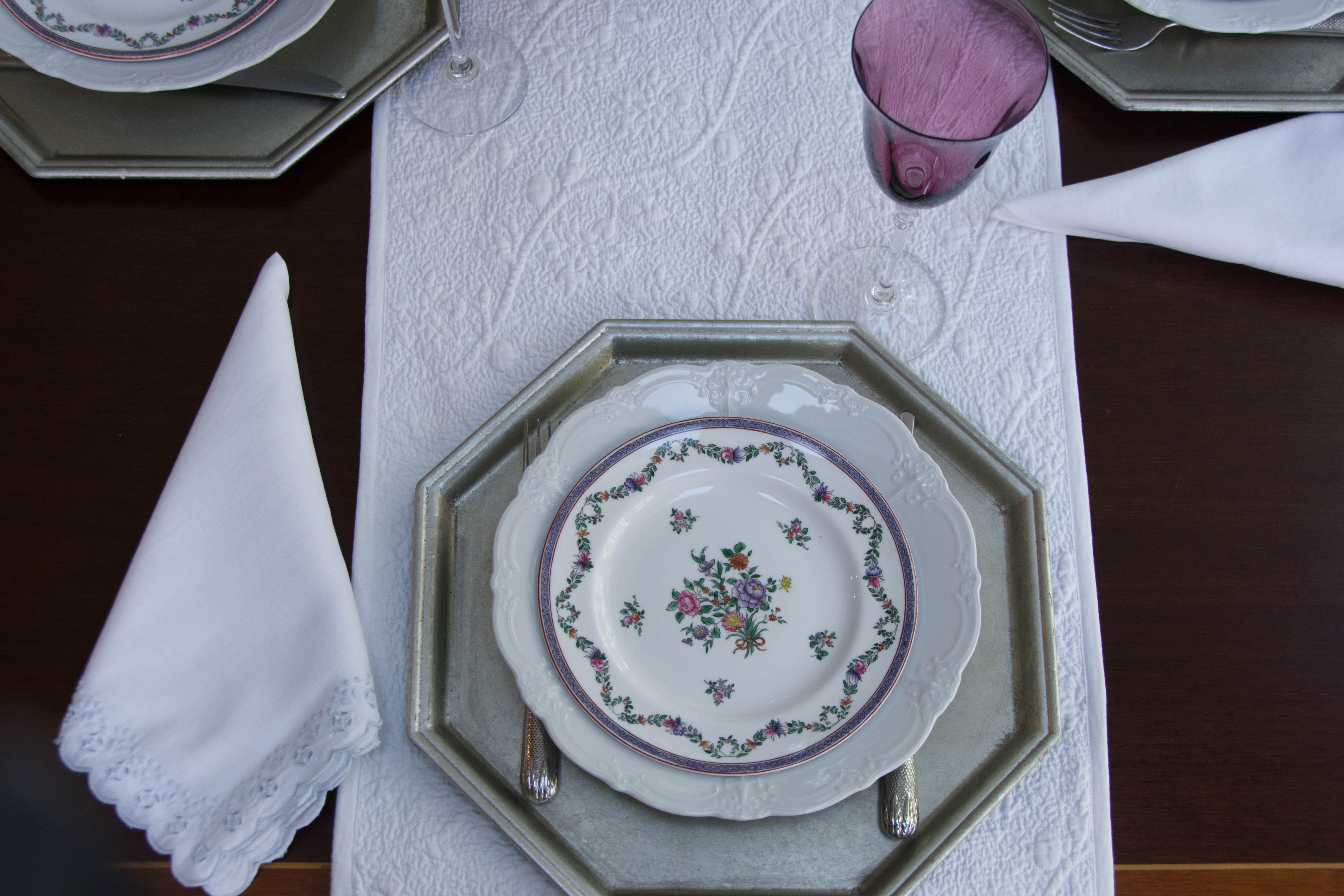
The napkins are from many years ago. They have an eyelet edging in a very pale blue, which added another layer of interest to the otherwise quite plain table. The chargers are from Pottery Barn a couple of years ago, and the dinner plate is Baronesse White by Tirschenreuth, purchased at the same thrift shop and at the same time as the purple glasses.
I’m sharing this post with Between Naps on the Porch.

I love the pair of boxes down the table runner. A different look than a single box would be. Very pretty. Having the silverware on the charger almost makes it a tray. Very fun. I don’t own any purple. Your purple pieces are so pretty and work so well together. The white linens make the colors pop.
Hi Lorri. I use those two boxes a lot. They’re narrow and tall enough that they support the flowers on their own without the need for oasis, and when placed together end to end, they look like one box. Bonus! Enjoy your day 🙂
The table looks lovely. I like the purple stemware and the beautiful china. I didn’t realize that Copeland Spode was the way the older dishes were labeled. The centerpiece is beautifully done- love the green hydrangeas with the purple.
Thanks so much, Liz. Spode changed its name several times over the years, and only returned to “Spode” relatively recently. There are a couple of good sites that give a concise history of the changes in name and ownership: http://spodehistory.blogspot.ca/p/spode-owners.html and http://www.thepotteries.org/potters/spode.htm. I love reading the history of Spode and Wedgwood – what tough times they faced with economic ups and downs! So glad you enjoyed the table, and thank you so much for visiting.
I love your purple tablescape. Purple really isn’t a common color used which is unfortunate because it is so pretty!
Purple is very hard to find, so I’m glad I was able to nab the glasses when I did. Thanks for visiting! 🙂
I love it ! Just beautiful color combinations.
Thanks Myrna!