
It’s that shoulder period where winter seems reluctant to release its icy grip and spring’s arrival seems tentative at best. Fluffy pastels are too ethereal, deeper colours seem out of step. And yet… Deep purple. Gorgeous, succulent, deep purple. Just the ticket.
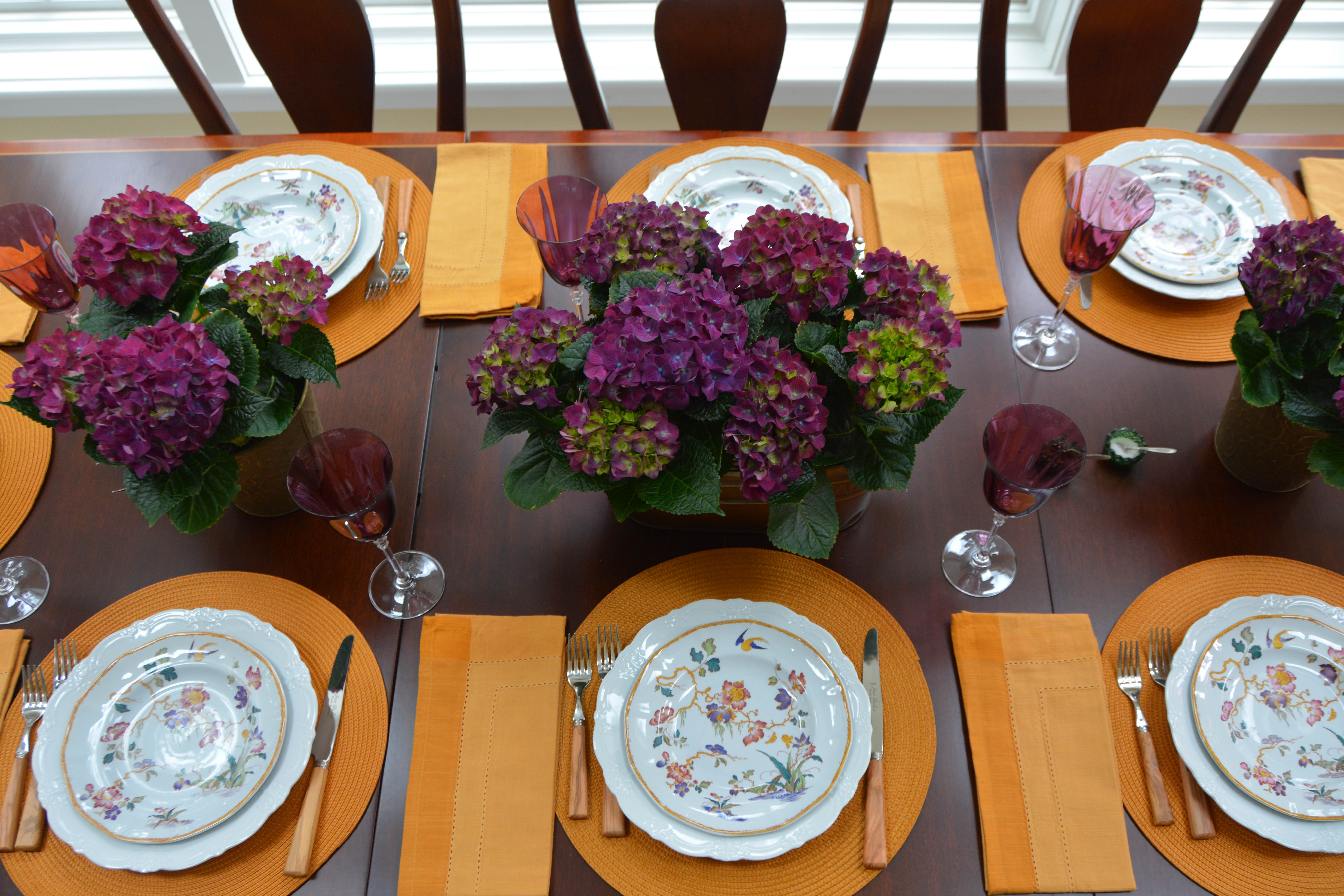
Purple can be tricky. At the blue end of the spectrum, it’s a cool colour. When red has a heavier hand, it’s warm. So figuring out which one you have to hand is the first job. These hydrangeas jumped off the shelf at me when I stepped out to get groceries, and quickly made friends with the glasses (another thrift item from the Elegant Garage Sale).
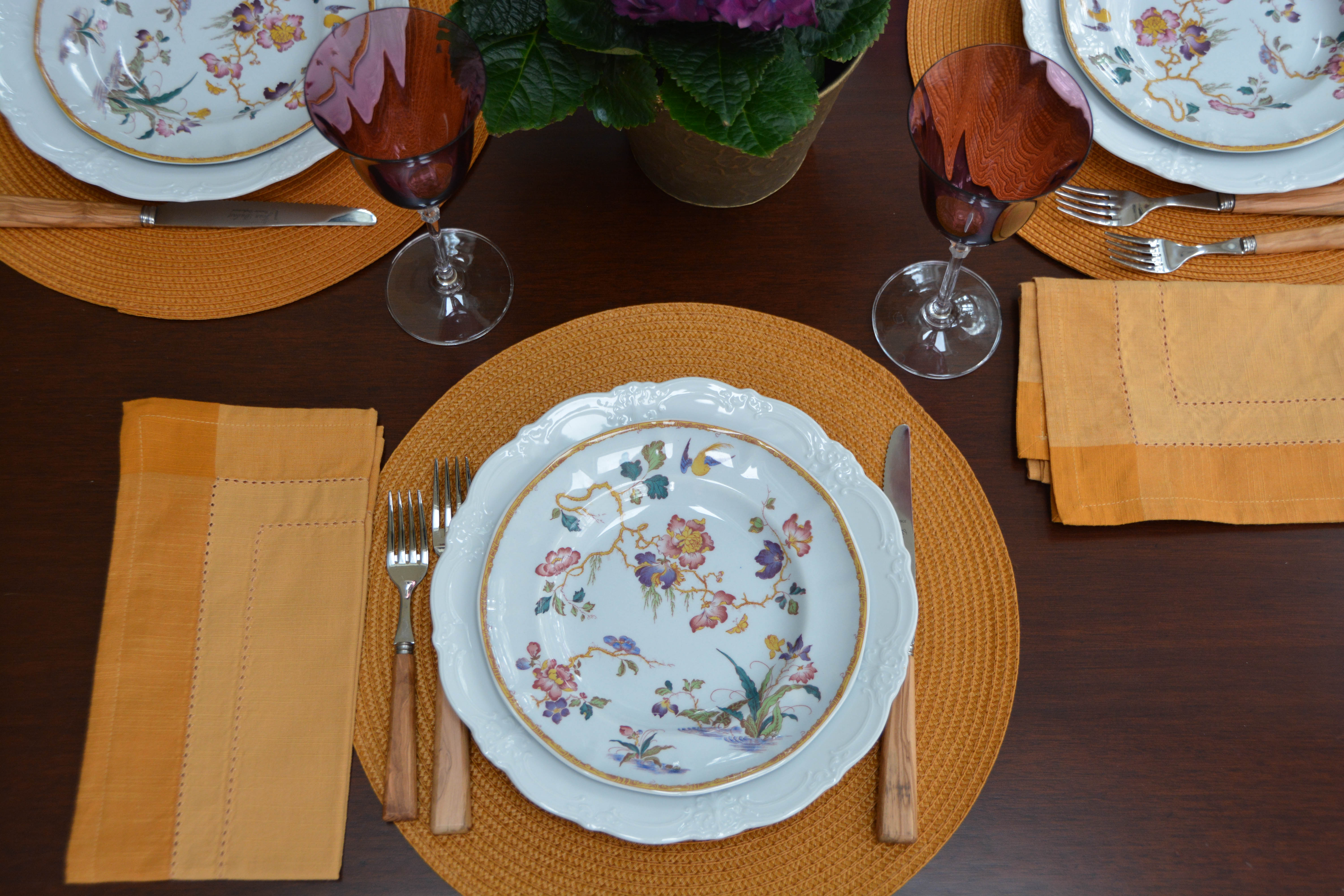
The dessert plates are Devon Rose, a pattern by Wedgwood from the 1970s (one of the very few attractive things to come out of the 70s, when you think about it. Remember flame stitch garments? Bleah!!) I really liked the unusual combination of the goldenrod coloured border and the touches of purple, deep teal and spring green in the body of the plate. The dinner plates are Baronesse White by Tirschenreuth.

The open salts are vintage glass. Pier 1 supplied inexpensive placemats and napkins to round out the picture.
I’m sharing this post with Between Naps on the Porch.

I agree that this is a challenging time of year for styling tables. This deep purple is so pretty and so perfect thank you for the inspiration.
Deep purple is one of my favorite colours. So glad you enjoyed it. Thanks for visiting.
Gorgeous color combination!
Glad you like it!