“She sends seashells on postcards from the seashore.” Isn’t that how it goes?

No? How about “She sets shell plates on tables near the seashore.” Hmmm – still not quite right…
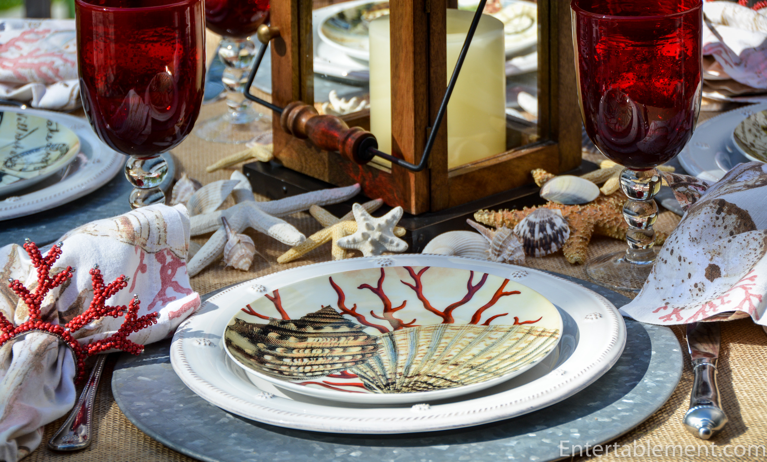
Well, she does. With plates from Pottery barn that she has had since she and Glenn acquired the Cape House almost 10 years ago. I think they can still be snagged on eBay from time to time.

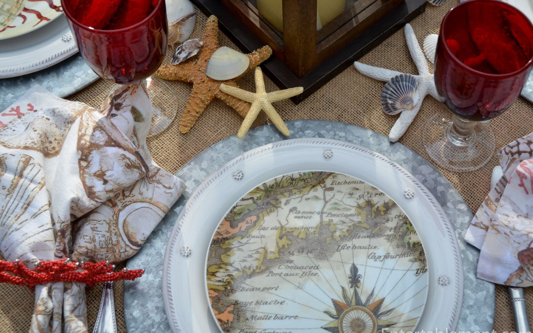
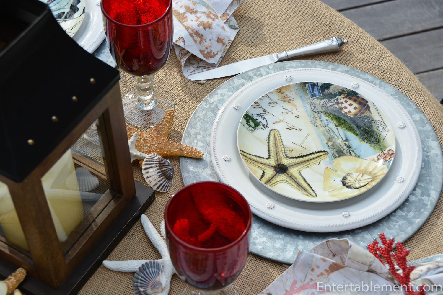
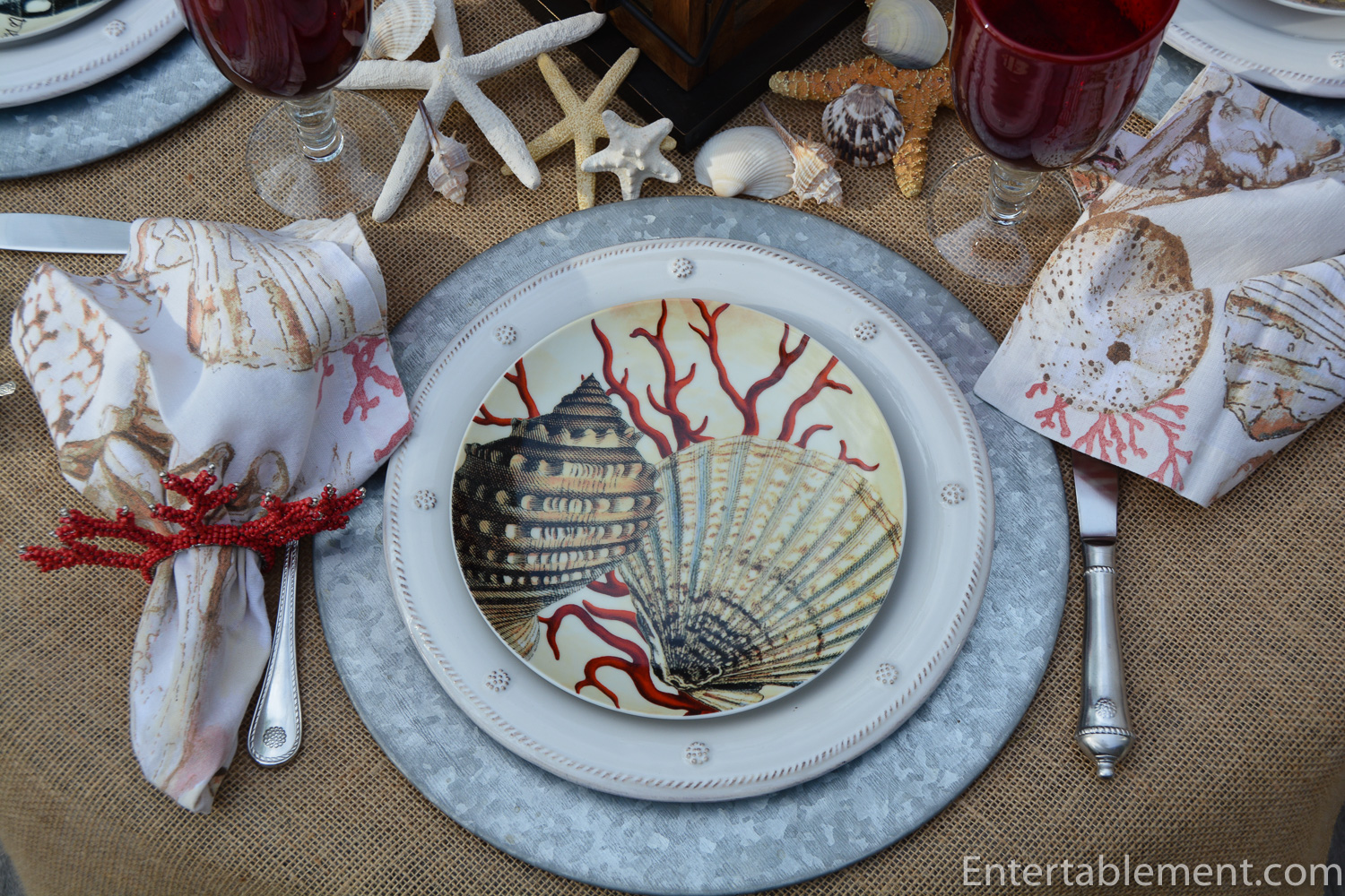
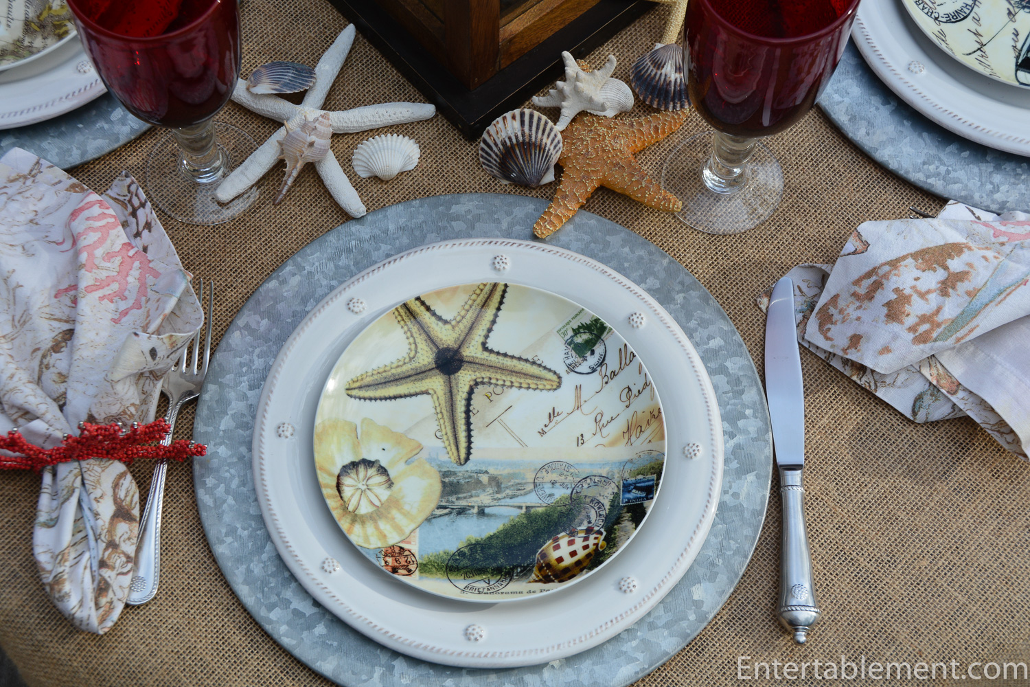
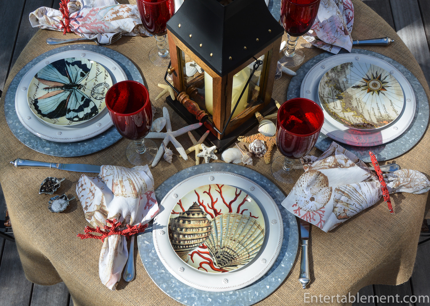
Coastal Curiosity Postcard plates by Pottery Barn feature a variety of travel and seashore related images in sepia tones. There are four different salad plates including this guy with a Gastropod shell (I kid you not – check out this site for identifying seashells) on the left, a scallop shell on the right and coral in the background.
This one has a great spotted pale blue butterfly superimposed on a postcard.

A lovely beach scene complete with bridge, sand dollar, starfish and what I think is a Cowrie shell in the bottom right-hand corner.
I think this one is my favourite. It reminds me of a treasure map. Being raised as a landlubber in agricultural Ontario, I had a lot to learn about nautical lingo when we started visiting the Cape many years ago. That’s a Compass Rose down in the bottom right-hand corner. Doesn’t it evoke tales of the Spanish Main and scurvy knaves?
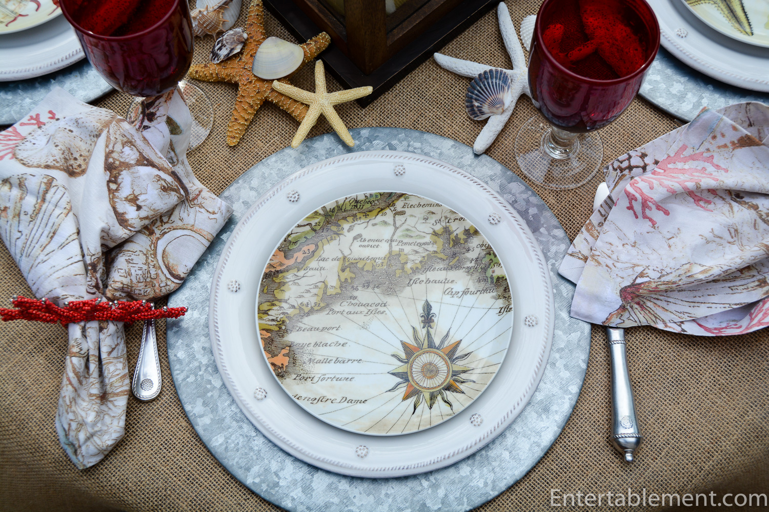
This was a really fun table to play around with. I started with the very versatile burlap base (I hesitate to call it a tablecloth), then layered on the galvanized chargers and a lantern from Pottery Barn years ago that usually graces our mantel in the family room.
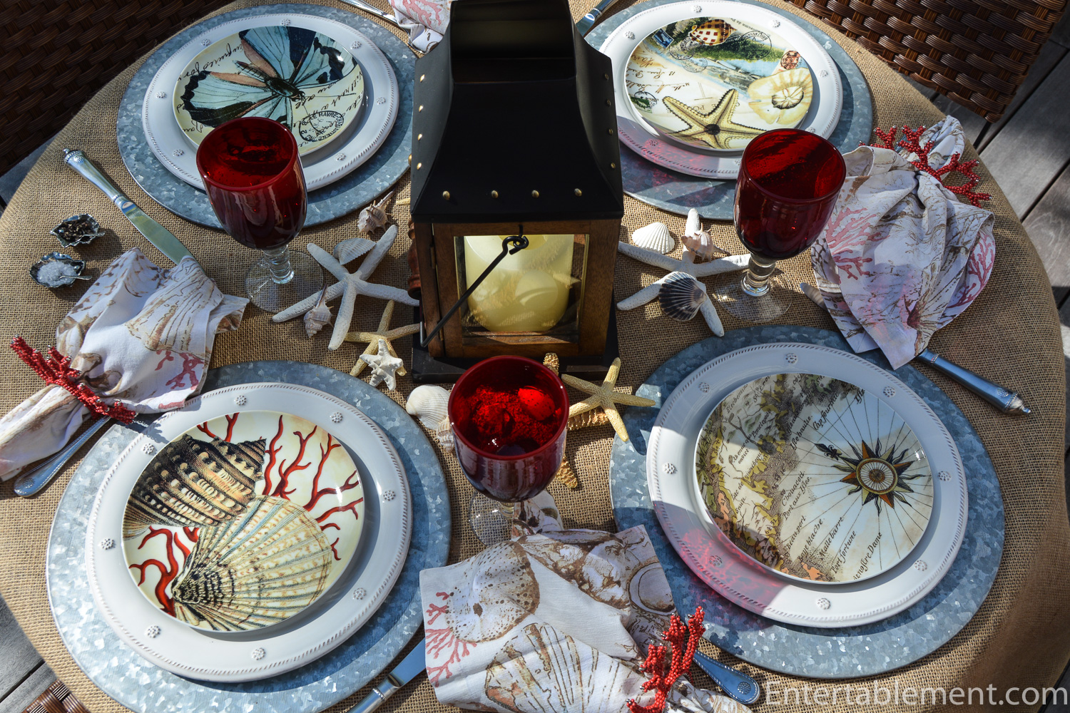
There were matching napkins with the Coastal Curiosity Plates, so I added those along with coral napkin rings from Pier 1 a couple of years ago. I used them in the Sea Life table setting.

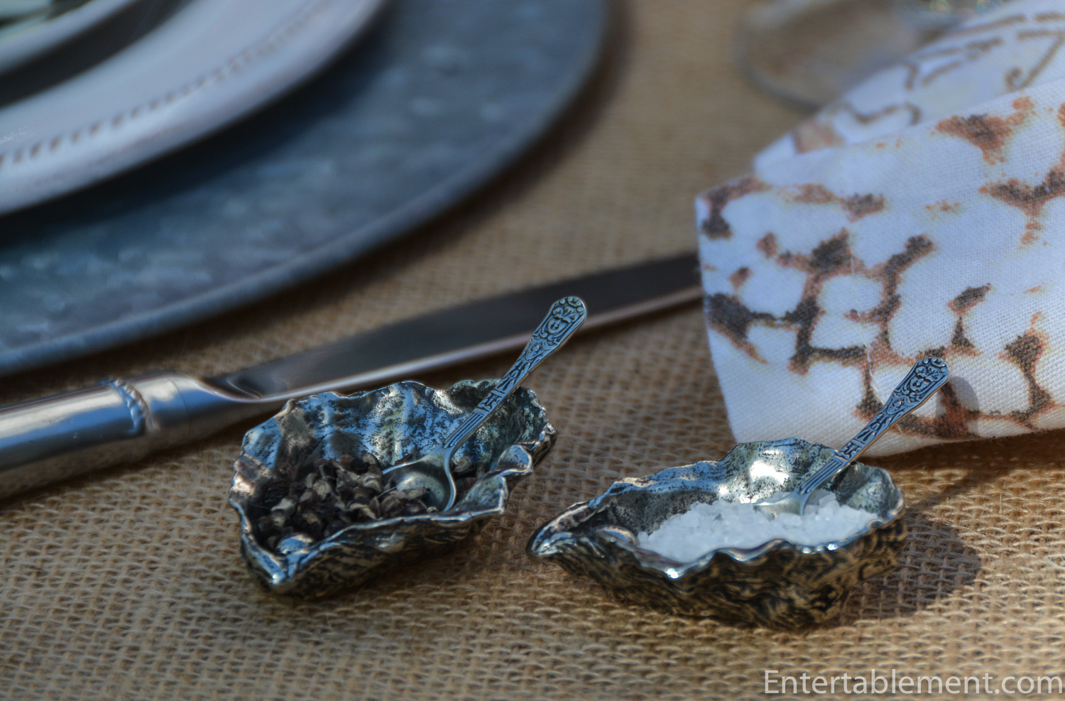
The ever-useful pewter oyster open salts came in handy.

It’s easy to overlook the detail on the tiny spoons that came with them.
Red “bubble” glasses from HomeSense are sturdy and practical. The red is a bit muted, so it coordinates with the coral, rather than fighting with it.

The dinner plates are Berry & Thread in Whitewash by Juliska. The muted tones go really well with the Coastal Curiosity Postcard salad plates.

The flatware is also by Juliska and is part of the Berry and Thread series.

All set for a warm summer casual dinner!
Coral always makes me chuckle a bit; these napkin rings look like orange antlers. Nature sure does have a sense of humour (or Pier 1 does)…

One last view!
It’s clouding over now, so I may have to rethink this whole arrangement. Isn’t that always the way?

We have embarked on a small renovation on our house in Canada, involving reworking our master ensuite and walk-in closet. The ensuite is going to be relocated to what is currently Glenn’s wood-panelled, bookshelf-lined second-floor office. I’ll do a post about it soon, but suffice to say preparation for the imminent teardown has involved packing up and donating scores of books, shredding tons of paper and rehoming some very heavy furniture, including an Ikea file cabinet (I swear that thing was made of concrete). I also had to completely clear out my walk-in closet. Oh, my!!!
“It’ll be lovely when it’s finished” as my mother used to say during the decades’ long stop-and-start conversion of a dairy barn into our family home, the brainchild of what can only be described as the evil genius of my very eccentric father. But I digress…that’s another story altogether, for another day.
I tell you this to explain my rather erratic blogging progress over the last couple of weeks. Our schlepping is done; now it’s over to the contractors. Stay tuned!
I’m sharing this post with Between Naps on the Porch.

I really like those plates! And the coral napkin rings are perfect for this tablescape. Very beachy, lots of fun. Good luck with all the remodeling. Hopefully “when it’s done” won’t take too terribly long.
Thanks, Joy! I’m so glad summer is here and we can enjoy beachy themed tables. Thank you for your good wishes on the reno, too. I’m hoping it won’t take forever, either 🙂
Thanks, Joy! I’m so glad summer is here and we can enjoy beachy themed tables. Thank you for your good wishes on the reno, too. I’m hoping it won’t take forever, too 🙂
This table looks fit for a naval captain and his officers with the nautical theme. And those red glasses are just the right size for big strong hands. Very cape cod feeling indeed. We’ll be in touch next week. C U.
Thanks Maura! Can’t wait to see you guys
Helen, you outdo yourself each time. Summer by the sea is here. I hope to live long enough for you to show us all of your hoard, I mean dishes. They are so addictive, aren’t they ? I love the salt cellers. It’s so hard to find napkin rings and salt cellers in thrift stores today. In reference to your last post that’s “bat guano crazy” about dishes. LOL
Hoard is likely more accurate, lol! They are indeed addictive. I’m finding eBay quite good for salt & peppers, and surprisingly, Amazon for napkin rings. They have quite a selection.
Thanks for the “bat guano crazy” – love it!
Oh my goodness this is a fabulous coastal table setting ! The Postcard plates are awesome! Yes, we the ones that love tablescaping do have a ‘little bit’ of an addiction to dishes.
I love the centerpiece lantern and the red glasses, everything outstanding !
Fabby
Sea shells work with so many tablesettings. They’re intricate, but casual, if you follow. I had a lot of fun with that table. Funny, I’ve had the plates forever, but they’ve been mostly on display in our bookshelves. Probably how I missed them for a table!
Have a great weekend!