
It’s time for some psychedelic wildlife fun.
Anthropologie brought us Mooreland by artist Starla Michelle Halfmann a few years ago. A little zany and a lot colourful, these imaginative renderings of wildlife creatures make an unusual table.

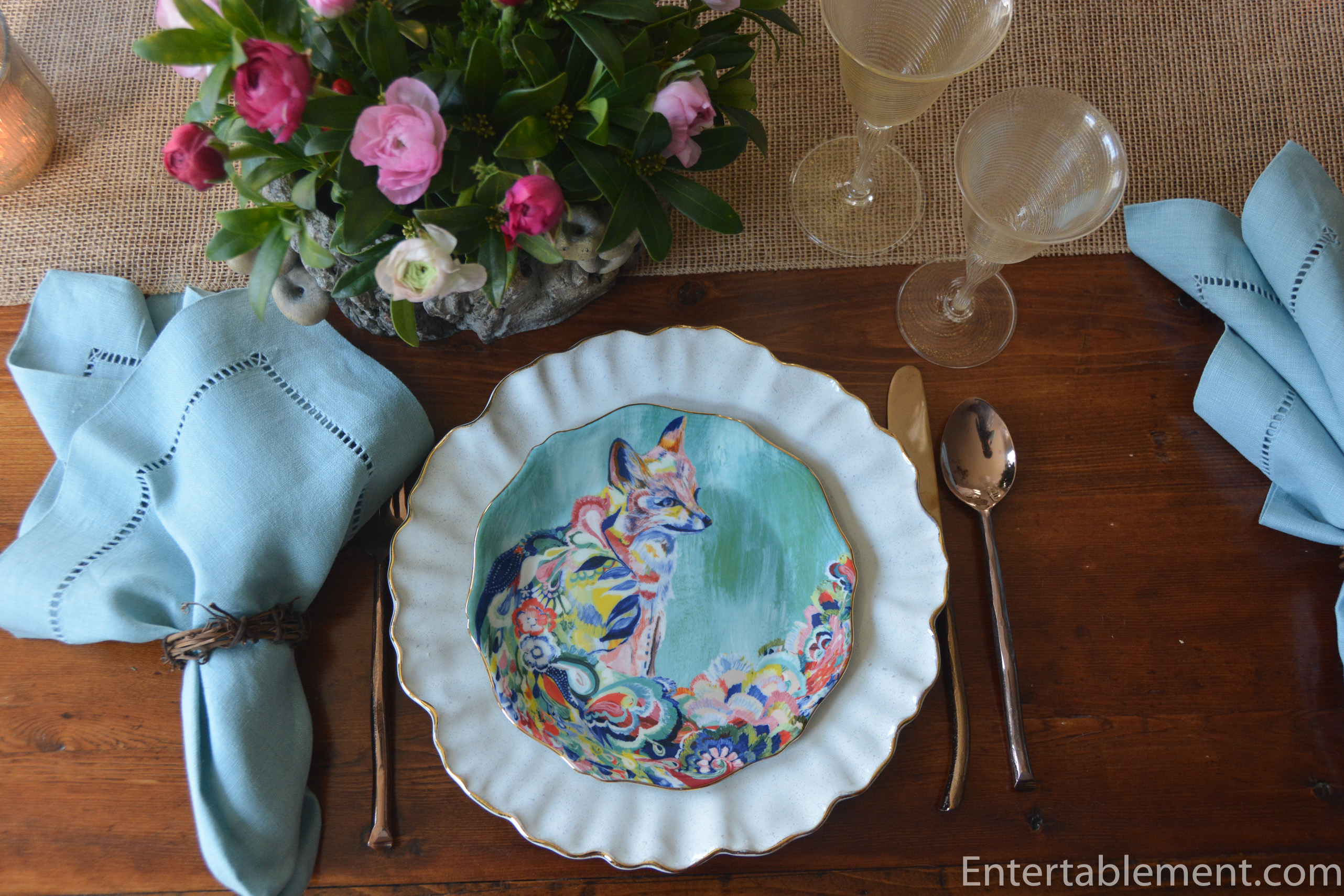
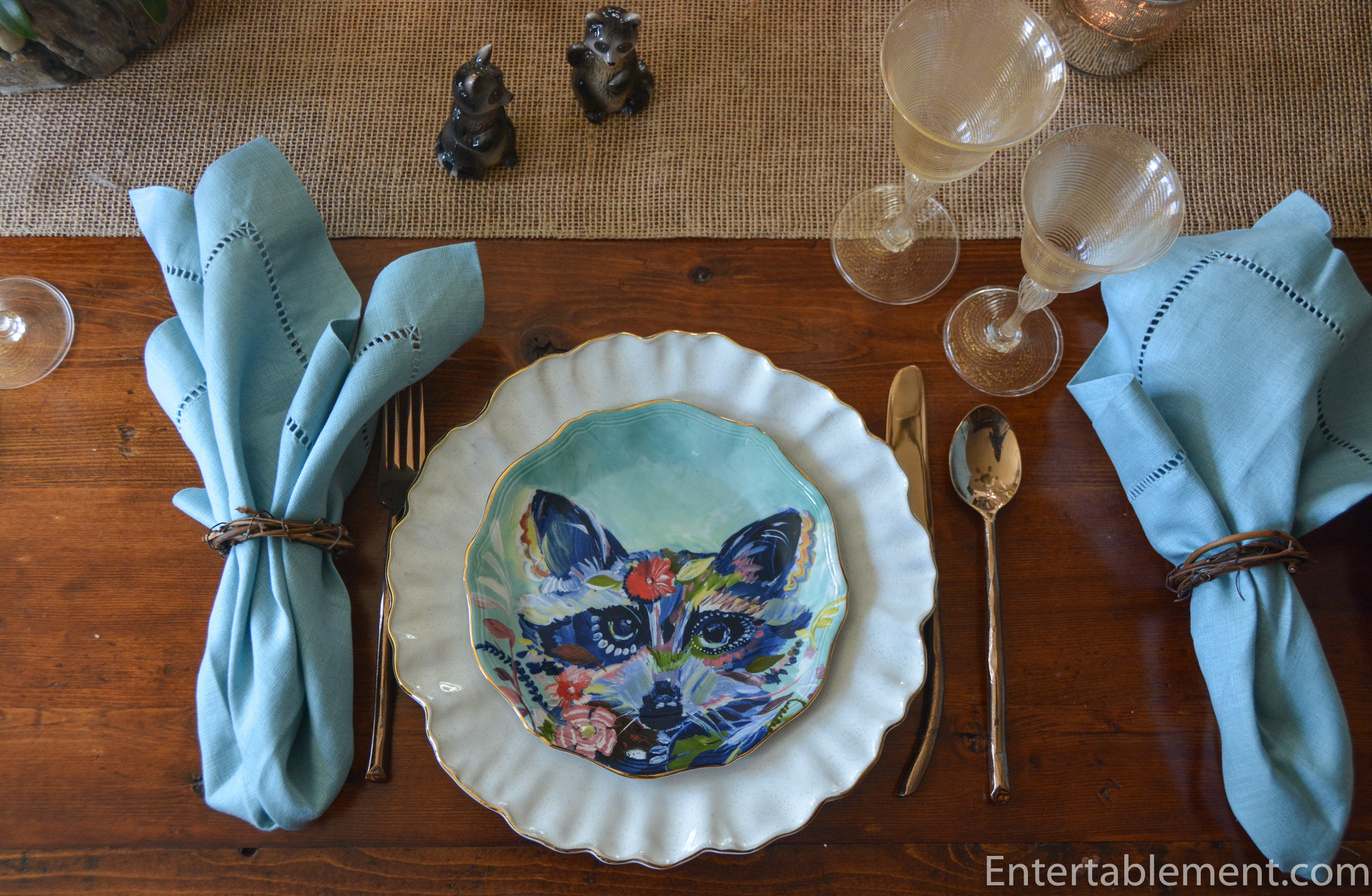
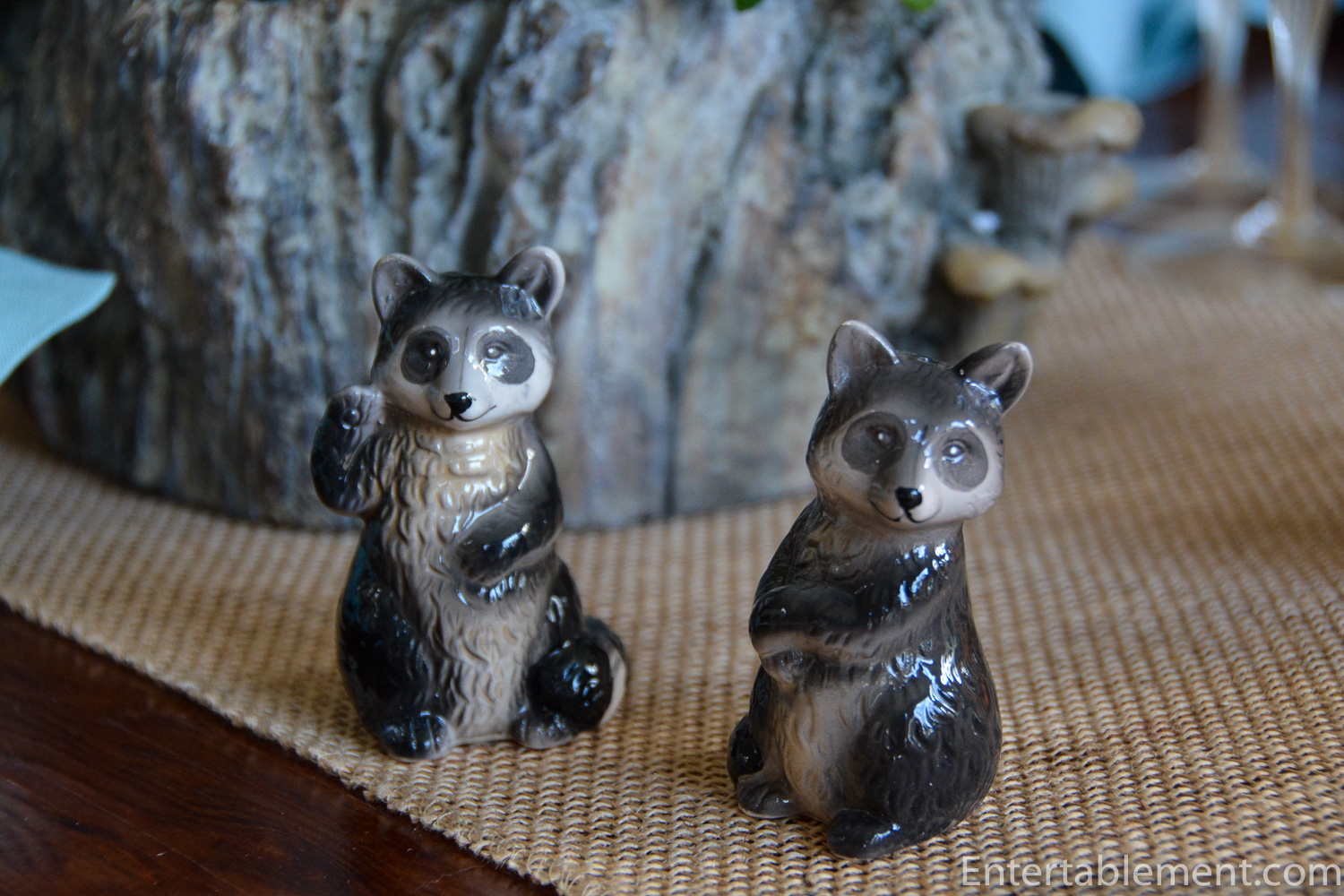
The first series of plates features aqua backgrounds and in addition to the charming fox, includes a very cheeky racoon,
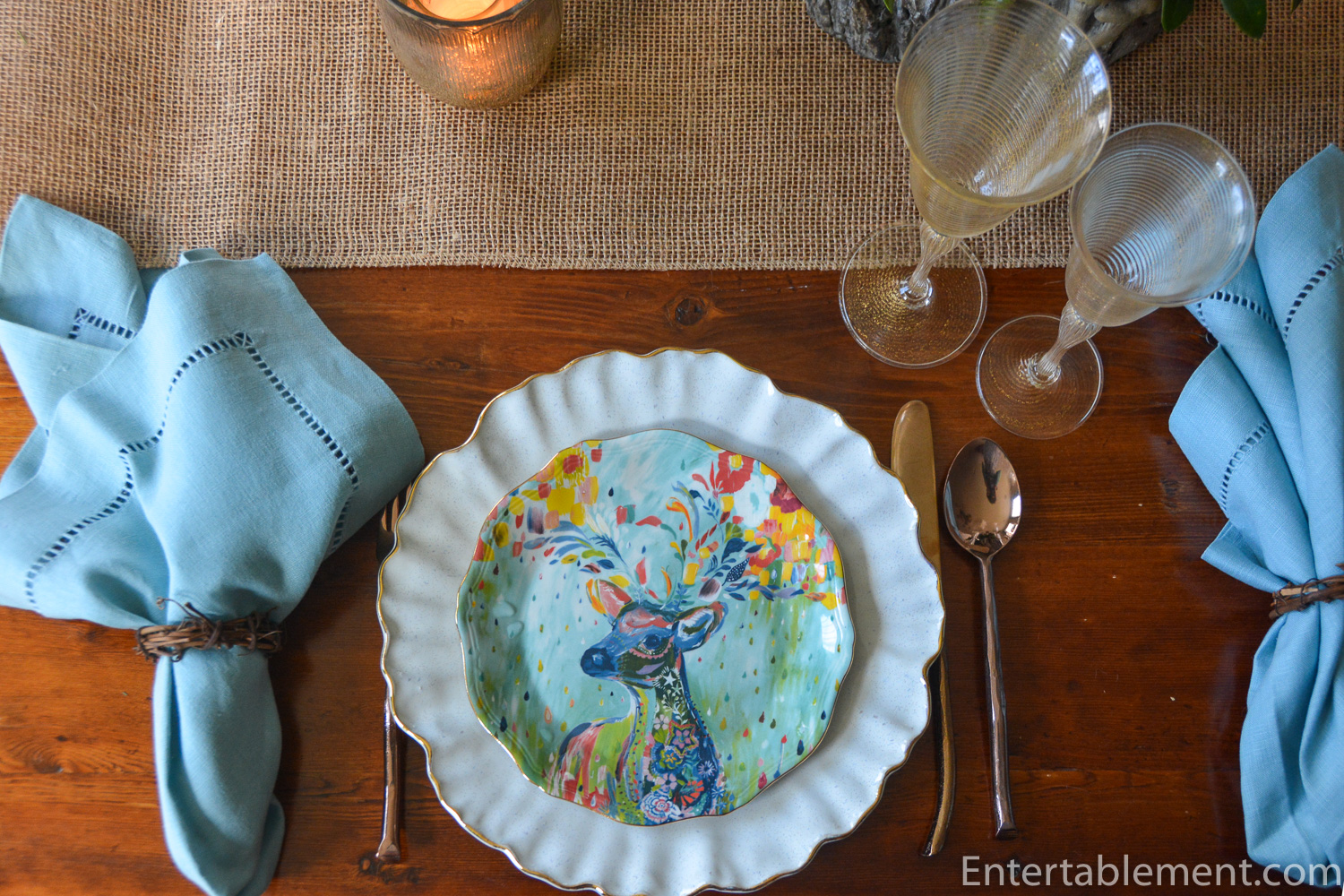
A single deer,
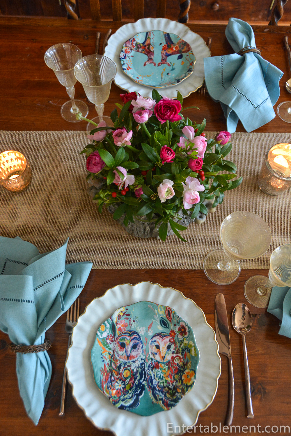
A pair of owls – don’t they look wise?

And a pair of deer.

Yes, I know, five is a weird number, but I think they issued four in one group, followed by a multicoloured series that included one aqua plate. The other three in that series have coral and red backgrounds – very striking. I bought these in dribs and drabs on eBay, so ended up with eight aqua plates and a few of the other colours.

They were more difficult to style than I’d anticipated. It was hard to find a visual rhythm.
The illustrations have lots of colour, so I started there: ranunculus from TraderJoe’s and some greenery from the garden went into the mushroom planters I picked up a couple of years ago from Pier 1.

This Fox Planter would have been perfect!

The Mooreland plates have a wavy, irregular shape and they’re trimmed with a gold edge, so I paired them with the ruffled edge dinner plates from Williams Sonoma. The texture and shape are similar. Gold-swirl antique Venetian goblets from Elise Abrams Antiques and rose-toned Twig flatware from World Market continued the subtle gold theme…

..which was reinforced with gold mercury glass votives from Pottery Barn. The smoke blue napkins were from Pottery Barn years ago and they continued the aqua background theme of the plates, to counterbalance all the colour in the floral arrangements.
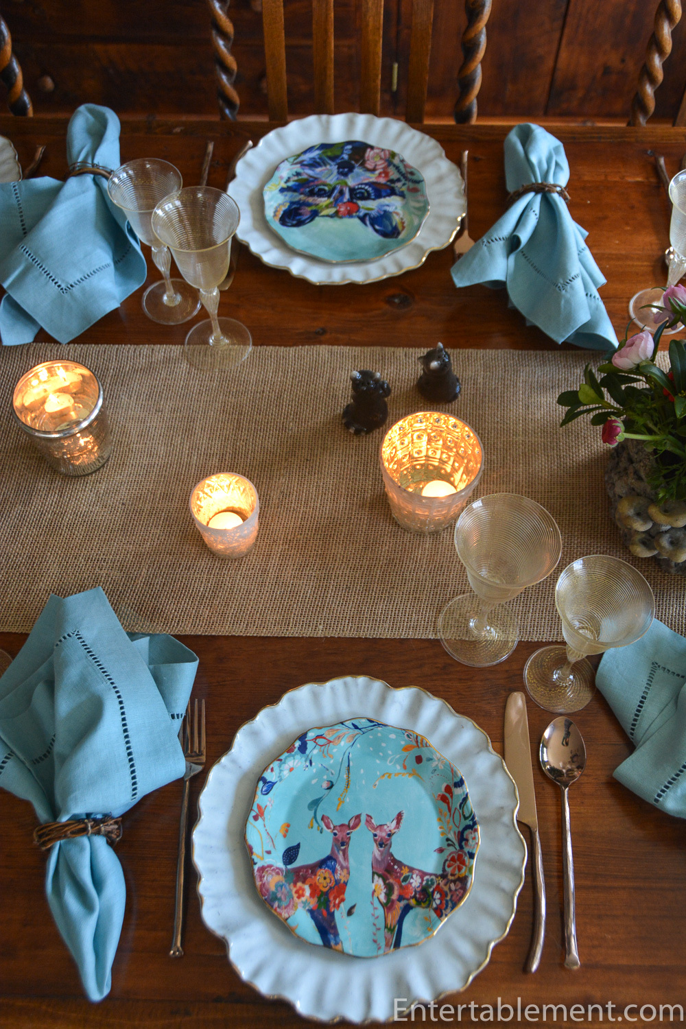
Of course, the racoons salt and peppers had to come out and say hello.

Thanks for coming out to play, Ms Fox and gang! (it does look like a she-fox, doesn’t it)? And thanks for helping us celebrate this first day of spring, 2019! Yeah – we made it, folks!.


I’m sharing this post with Between Naps on the Porch.

That table is just pure fun! I love it!
Thanks, Joy!
I bet your little girls will love these plates. I might even have used navy blue napkins – if I had them and I don’t. But, your choice is perfect. That colourful fox is intimidating to look at but the colours are striking. Another creative table setting indeed
I tried Cobalt glasses, along the same lines as your suggestion on navy napkins, but it seeemd overpowering. I’ll try other combos, particularly if we include the coral and red background plates. The navy might be just the ticket. Thanks for the ideas!
Pretty table. Such colorful dishes. I like that the white and the aqua dishes are both wavy around the edges and I like the white against the wood table. The centerpiece flowers and the woven runner are casual and they play off of the more formal glassware in a really fun way. Great table.
Thanks, Lorri. There are all kinds of colours to play with in the woodland plates. I’m going to try another one that includes the red and coral in the autumn.
I LOVE all your color! So tired of farmhouse neutrals and minimalist design. Sigh.
Yup – I’m so unlikely to ever be accused of minimalism! Not fond of neutrals, either.
Dear Helen,
One pill makes you larger, and one pill makes you small…the Summer of Love seems like yesterday! All you need is a hookah-smoking caterpillar. I would love those mushroom cachepots–you lucky, you! Was at HG today, and their spring lineup is wonderful. The smoke-blue of the serviettes is easier on the eyes than cobalt, and I’m trying to learn to pick up lesser colours (such as the pinks) in a complex setting like this. Thanks for the continued tutorial…
I just keep playing around until it looks right to me, Beatrice. I can’t always describe why I go one route rather than the other…
As eye catching these plates are, I’m hopelessly drawn to your antique goblets. Fab!!
I am not in the market for a big set or more stemware but heart strings zing at Lesley Roy set of twelve in gold I also yearn for.
It’s interesting – Venetian gold goblets present a soft, muted elegance, much more subtle than gilded Moser, say. Both are beautiful, but I always feel the Venetian glass is more “user friendly”. Lesley Roy seems to be somewhere in between, from what I can see online.
I think you made the perfect choice here in goblets & plates. Brilliantly done!