
Pink can be a divisive colour. It comes in delightful shades and horrible shades, and where each lies on the spectrum is a matter of taste. I shudder at the particularly lurid pink of which my granddaughters are so fond. You know the one: fuschia tinged with fluorescent. Ghastly. But Ballerina Pink – that’s at the delightful end.

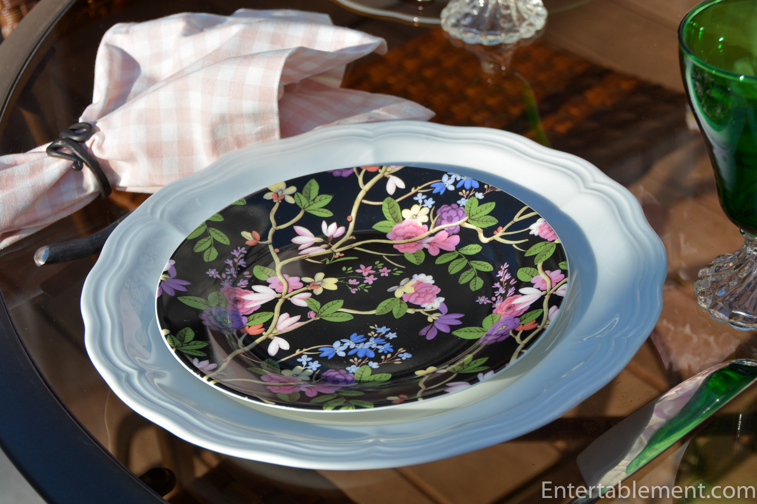
A few years ago Pfaltzgraff was selling off their “Victoria and Albert” series at the end of the season, and Kilburn Black made its way into my collection of one-off salad plates. Love, love the bold black background, and the combination of spring blossoms provides lots of colour choice for various table combinations.

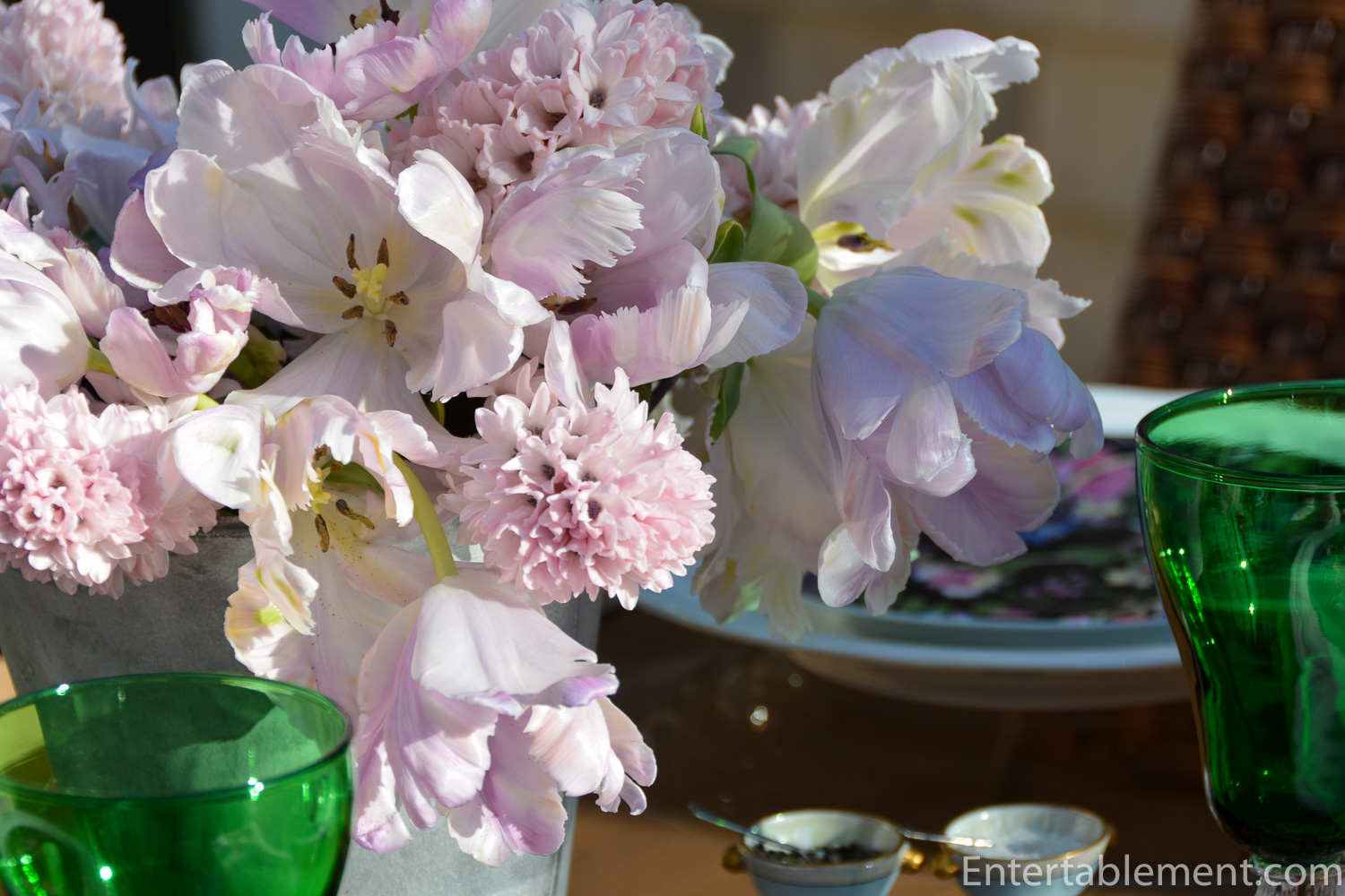
Trader Joe’s had a particularly interesting display of tightly bunched hyacinths. They’re almost feathery, as opposed to waxy, which is how I usually experience hyacinths. Add in some overblown tulips in the palest shade of pink and we have a simple but effective centrepiece.
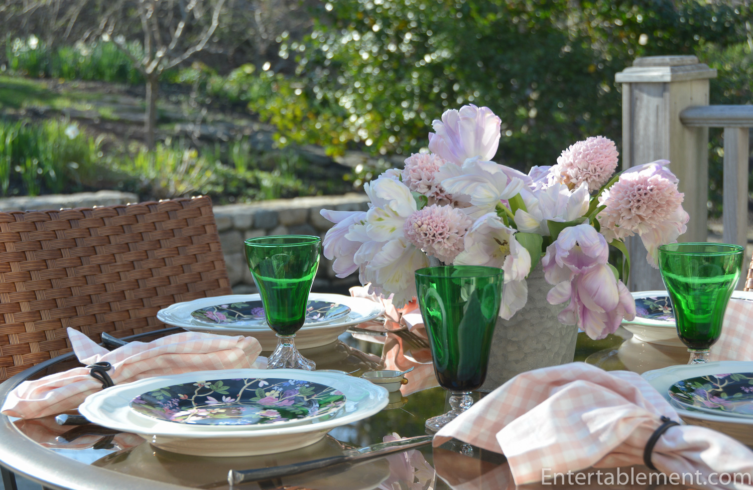
Pottery Barn provided the pale pink gingham napkins; World Market the Fiddlehead napkin rings and Twig flatware.

The Kilburn Black plates needed little visual help, so I went with Queen Anne dinner plates by Pillivuyt at the base.

Colonial Dame green iced tea glasses added a bit of oomph without being overwhelming.
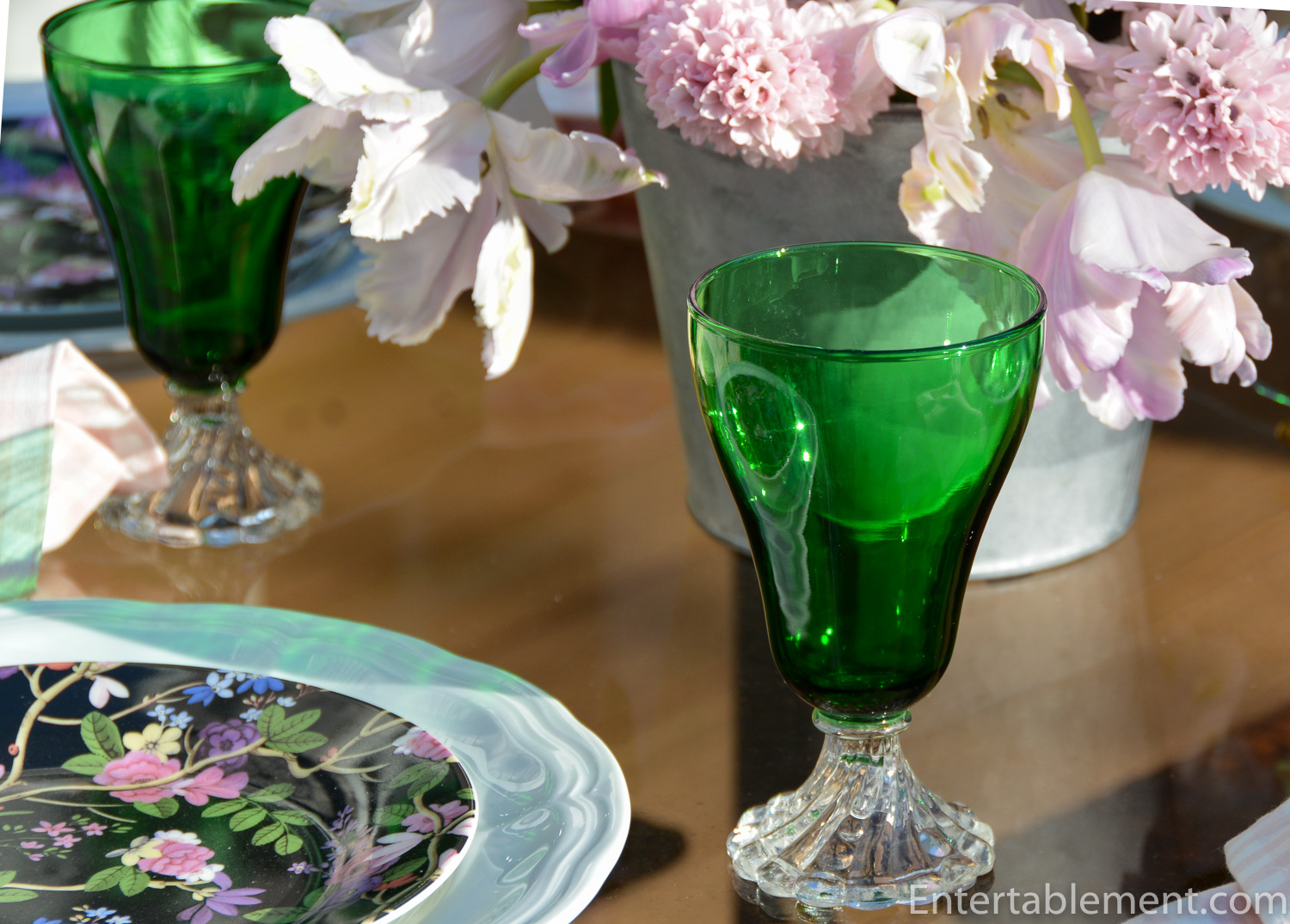

I used a plain galvanized pot as the vase for the flowers. It was unobtrusive and faded into nothing, leaving the blossoms to carry the day.

Vintage open salts with a pale blue band and some subtle gilding added a little glam.


Hurry up, spring! You keep teasing with some nice days, then fading back into chilln’. It’s time to shine. Don’t be shy.

Hooray, Hooray, it’s the first of May! (and you know what that goes with…). Hehe.

I’m sharing this post with Between Naps on the Porch.

Always exquisite table settings and I love your creative pairings.. I am partial, though, to your travelogues through the great edifices of England. Have you read any of the Howard Carter/Lord Cavernon (Highclere) biographies?
The green glasses you feature so often are actually the Anchor Hocking “Boopie Bubble” pattern and NOT the Fostoria “Colonial Dame.” Very similar, of course, and often confused on re-sale sites.
Hi Susan,
I’ve got a bunch of travel posts cooking, and will have some done in the coming weeks. We’re back from England and I took a ton of photos – lots of houses and a bunch of cathedrals. I’ve read Lady Almia and the real Downton Abbey by the Countess of Carnarvon, and intrigued by the Victoria series, I recently purchased The Young Melbourne and Lord M by David Cecil – partway through that now. On this last trip we went to the Richard III exhibit in Leicester before visiting the cathedral, so there’s another whole line of history to follow. It never ends. 🙂
I see what you mean about the Boopie Bubble vs Colonial Dame. The difference is the bulge in the stem. I need to haul out the box with those glasses, because they were all bought as Colonial Dame – eight from eBay a couple years ago and four from Replacements; I don’t know if I actually have any Colonial Dame or are they all Boopie? Replacements doesn’t show Boopie in Green – they’ve got clear. I wonder if they know the difference? Always learning in this game! Thanks for the info on this.
Striking plates and the pink flowers definitely add a soft touch that screams spring. I’ve never seen hyacinths like that. Must find those bulbs! I think Spring is on vacation this year. Here’s hoping? C U soon
I’d love some of those bulbs, too, Maura, so we must figure them out. Fingers crossed spring finds her way soon.
Very pretty as are all your tablescapes.
Thanks, Cindy. Setting tables for me is like painting to a real artist. 🙂 Less messy, though!
Pretty table. Love the soft pink and the black really sets it off. Very nice.
Thanks, Lorri. Pfaltzgraff did a nice job with the V&A series – really inexpensive, too. I’ve got a couple more boxes in the series – Clover is one, I think.
This setting is just beautiful – gave me a lift just looking at it – that delicate pink is such an exquisite color!
Thanks, Mary! I really loved the faint ribs of yellow in the tulips, too, It added another swirl of delicate colour.
I love the black floral salad plates. They really make such a bold and beautiful statement for your pink and black table. It is really a great contrast with the pastel pink gingham napkins. So lovely.
Thanks, Marsha. I’m partial to black background florals. They’re always fun to work with.
I was so excited to see that you were back at it, creating such a beautiful table setting. I love black and pale pink. It makes such a striking setting. I haven’t left a comment before but I thought it was the right time to let you know that your tablescapes, quite simply, make me happy!! Thank you!
Thanks, Tracy! I’ve taken a bit of a break. We were in England for three weeks, taking photos and enjoying our holiday. Back to the real world, now! Thanks for stopping by and posting such a lovely comment.
Gorgeous flowers and very unique plates! I really like this combo of pink and black!
Karin
Thanks, Karin! I’m partial to the combo, myself!