
I’m still not sure about this table. It kind of works and it kind of doesn’t.

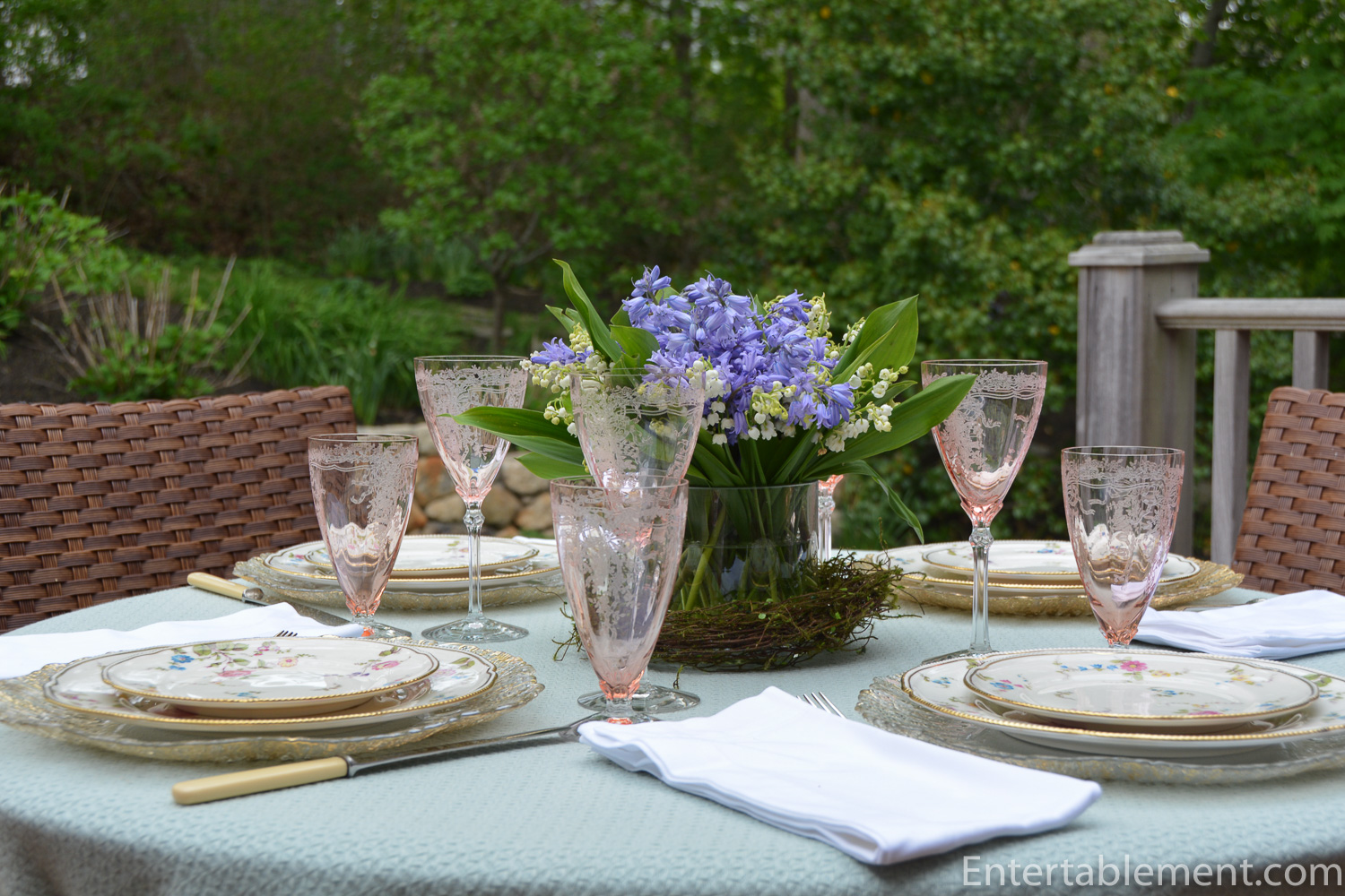
The plates, Sunnyvale by Castleton, have a lot going for them; they’re a modern twist on a floral classic featuring an all-over pattern with lots of white space. The curvy beaded edge with the gilding adds a touch of formality without being over the top, and the gilded glass chargers work well. So far, so good.

The small, blue banded open salts share the gilded edge feature.

The June Pink Depression glasses by Fostoria are a soft peachy-pink and echo the subtler pink flowers in the plates. Still working.

Lilies of the valley and bluebells are true harbingers of spring. They both have a heavenly scent. They’re neutral colours, though the bluebell is a bit more of a violet than the blue in the plates. Starting to go off the rails?

Let’s step back and take another look.

If I had to put my finger on it, I think it’s the metalasse tablecloth. The grey-blue is neutral, but I think it fails to harmonize the violet-blue of the bluebells and the brighter blue of the plates.

It’s not bad, but it’s not great. Or maybe I’m being too critical. Does anyone else dither around like this before, during and after setting a table?

Some tables just leap out and say, “I’m done!”. Others say, “I’m feeling…meh.”
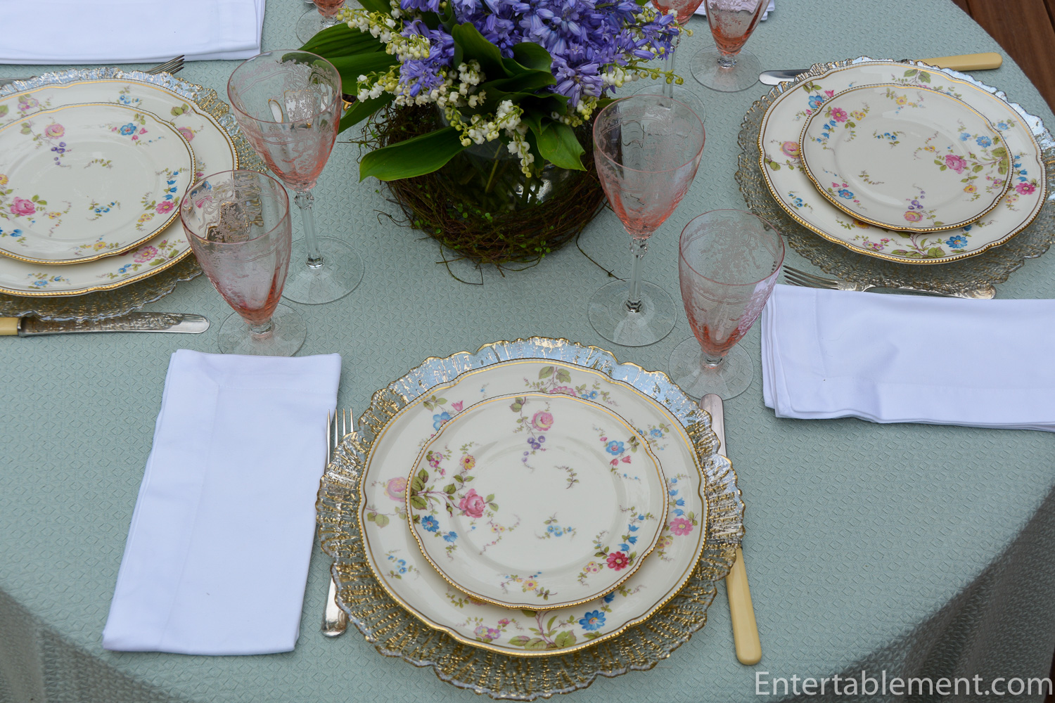
I fear this is a “meh”. Maybe it’s the napkins. Too flat and boring. Perhaps I should have used the gold floral napkin rings I used in this table, Bideford Aqua.

Hmmm. Still not sure.
Oh well, can’t win ’em all! It’s a lovely spring day, Mother’s Day is around the corner and summer is in the offing. I won’t get too fussed about a wishy-washy table.
I’m sharing this post with Between Naps on the Porch.

Well, I think this table is lovely! Your tablecloth may not be the PERFECT shade of blue, but it works. Sunnyvale is one of my top favorite china patterns because my mother’s mother had it, so it’s extra perfect for Mother’s Day weekend as far as I’m concerned. And I love the June pink glasses with it. Relax and enjoy!
Thanks, Joy! I first saw Sunnyvale in a Victoria magazine and loved it. Nice to hear about your family association with it – I didn’t realize the pattern had been around as long as it has – doesn’t it look modern? Happy Mother’s Day weekend to you!
Too many plans are sidelined in an effort to reach perfection.
Beauty is in the eyes of the beholder and these days so many eyes are infected with perfection.
Simple perfection is much more honest & beautiful
That is so true! Thanks for the reminder.
It’s lovely. Don’t be too hard on yourself. Enjoy the day.
Awww! You’re very kind Deanna. Thanks.
In 1938, when the war started up in Europe, the Germans began running blockades on the oceans, laying mines, etc. One result was that Stores could no longer get European china, crystal, and the like. That period marked the rise in the growth and success of North American china manufacturers. Castleton was one of those companies. It’s a lovely table. Yes, I experience your situation now and again. I usually find that the napkins are the culprit. I don’t worry excessively about colors. I try to think about colors in a garden. An amazing variety of seemingly unrelated colors always seem to play well together. I liked your matelasse because the pattern seems to echo the beaded gold edge on the Castleton. Thanks for inviting us for a peek. CherryKay
Such words of wisdom, Cherry Kay! And you’re right about the napkins – they make or break a table so often. I sometimes get too hung up on exact matches, but when I look at other tables, it doens’t even cross my mind. Thanks for stopping in!
Love your table setting, and the glasses are the star—perhaps light pink napkins would really set this off for a spring luncheon. White is gorgeous, but very formal.
Great suggestion, Sandi. A luscious peachy-pink would have been just the ticket.
Very pretty china pattern and the chargers draw attention to the gold on the plates. The centerpiece flowers are lovely. I like the softness of the pastel colors.
Thanks, Lorri! Nice to have another opinion.
In spite of your negativity on your table, it’s still very pretty. It happens to be the exact dishes I helped a friend to pick out years ago and I love the pattern. I’d be happy to eat at this table any day! Happy mother’s day
Thank you for your kind words, Maura. It’s funny how many people know about and love this pattern. It really is quite lovely. Happy Mother’s Day to you and yours. See you guys soon.
That’s a beautiful china pattern. Your table looks lovely. I think the white napkins may have been the source to your dissatisfaction. Your center florals must have smelled so good!
I agree, Liz. It is the napkins. Nice to have that solved! Yes, the flowers smelled divine. Lily of the valley is one of my favorites. Short lived, but worth it!
Dear Helen,
I agree that pink serviettes would have solved the problem. I do like that pattern, and the tablecloth would have worked, I think, had the white not been fighting it.
A week ago we popped into a florist in Innsbruck, and they were sorting fist-fulls of lily of the valley from a bucket into bouquets for sale. Oh my, the perfume!! My neighbour has them as ground cover, and they are blooming now (still almost freezing at night).
Hi Beatrice,
It’s very tempting to set the whole thing again with pink napkins and see how it looks.
I’m astonished at how quickly lily of the valley spreads. We have it growing in both our Cape and our Canada houses and what started as a couple of measly patches have transformed into a veritable carpet of fragrance. My only quibble is the messy, unsightly end phase where the leaves turn brown and hang around forever, but that’s well into the fall. The leaves are marvellous ground cover for the summer.
Hello Helen. I don’t have a blog or website, but your Castelton Sunnyvale post caught my attention on Pinterest because this is my Mother’s china I inherited. With her being 40 years older than me when I was born, it could just as easily been my Mother’s Mother’s china like a poster above. Mother purchased her pieces in 1940-1941 when the set first came out while she lived in New York City alone during WWII while Daddy served even though they were from Texas. I only recently, after an very long on again off again unsuccessful search for over 45 years now, found the pattern for sale and I was finally able to complete her set with the few remaining pieces she never got to purchase. I am estatic over that! She had enough the set could be used for usually our family sit down in the formal dining room Easter dinners, but I always wanted to complete the set for her. Unfortunately she passed at 97 in 2011, but I still wanted to complete the set in her memory. I wanted to mention that while I am no one special, I agree with the thought that the napkin is the only thing at that gorgeous table that feel a tiny bit off as you put it. When I use this china I love to pair it with a pink napkin that I fold into a rose shape using Napkin Folding techniques easily found on the internet. Sometime I place this pink rose napkin on the bread and butter plate. Other times I first drape a light green napkin forming two points on the sides into the tea glass, and push the rose folded pink napkin into that one at each place setting.. I wish I had pictures to post here, but those are on my phone not my computer. I hope I’ve described this possible napkin display well enough in words. I am so envious of your Fostoria glassware btw.
Hi Sammie,
I’m so glad you found Entertablement! Thanks for weighing in with your suggestion of the rose shaped pink napkin, both with and without the green one. I didn’t have great pink napkins when I set this table, but have since acquired some soft pink jacquard ones. I will give it a shot next spring or summer. I think the table could look quite lovely with pink roses, pink napkins in a rose shape and clear glassware. Stay tuned!
I really enjoyed your story about completing your mother’s collection of Castleton Sunnyvale. What a wonderful thing to do in her memory, and I’m sure you enjoy using her china.
Hope to hear from you again!
Have a great rest of the weekend.
Best,
Helen