Things are pretty crabby around here.

Something smells fishy.

In fact, some of the inhabitants are downright prickly.

But with a little cooperation, it should be smooth sailing.

Maybe a little food would help.

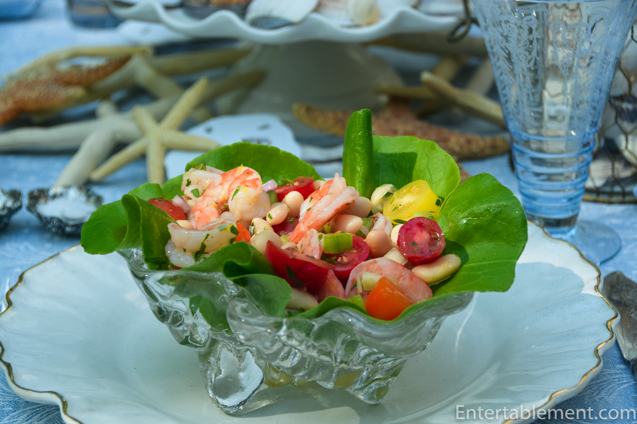
Let’s go with a White Bean and Shrimp Salad and see if the mood improves.
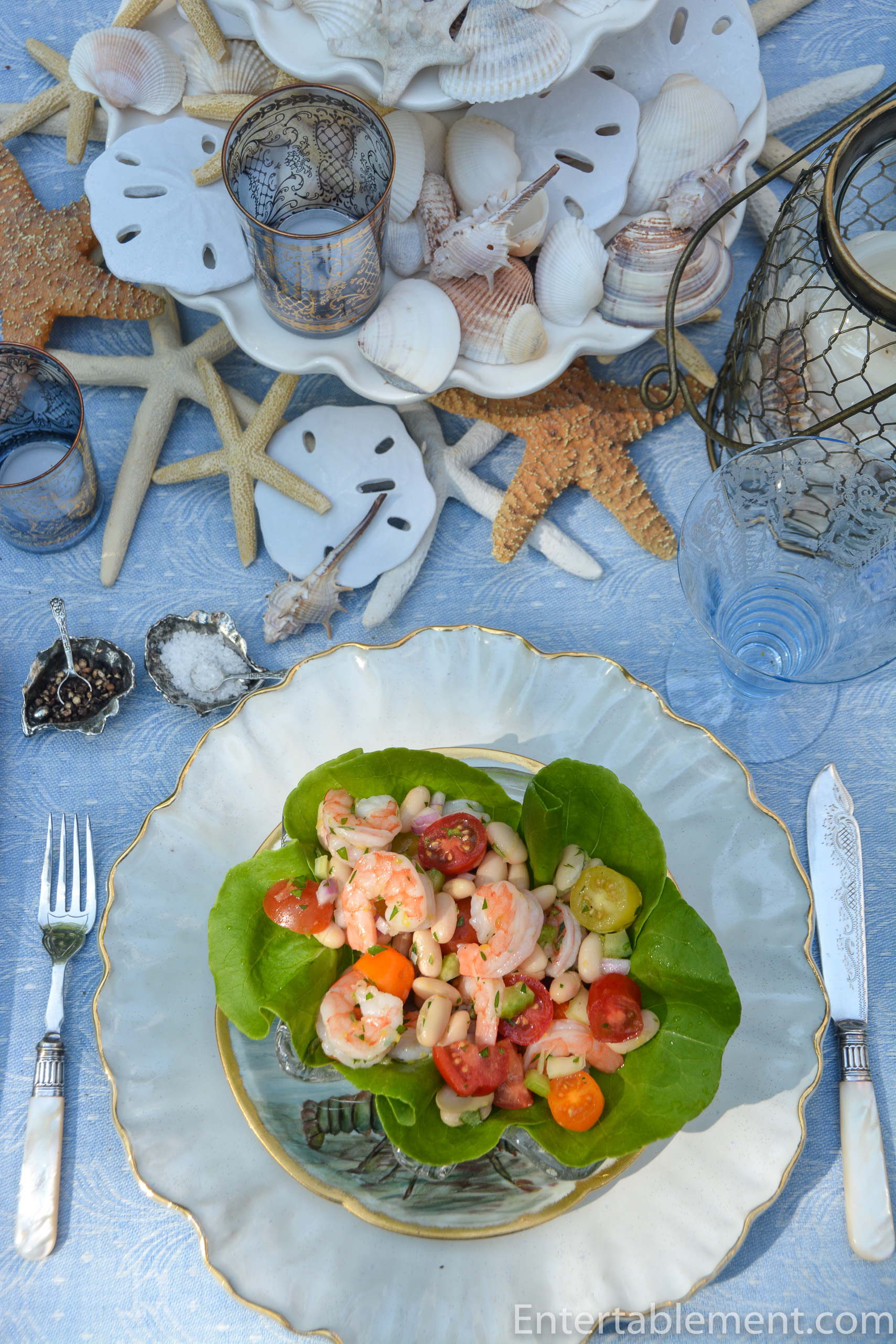
It’s really easy to make. Some chilled shrimp, celery, tomatoes, red onions and white beans in a light vinaigrette.

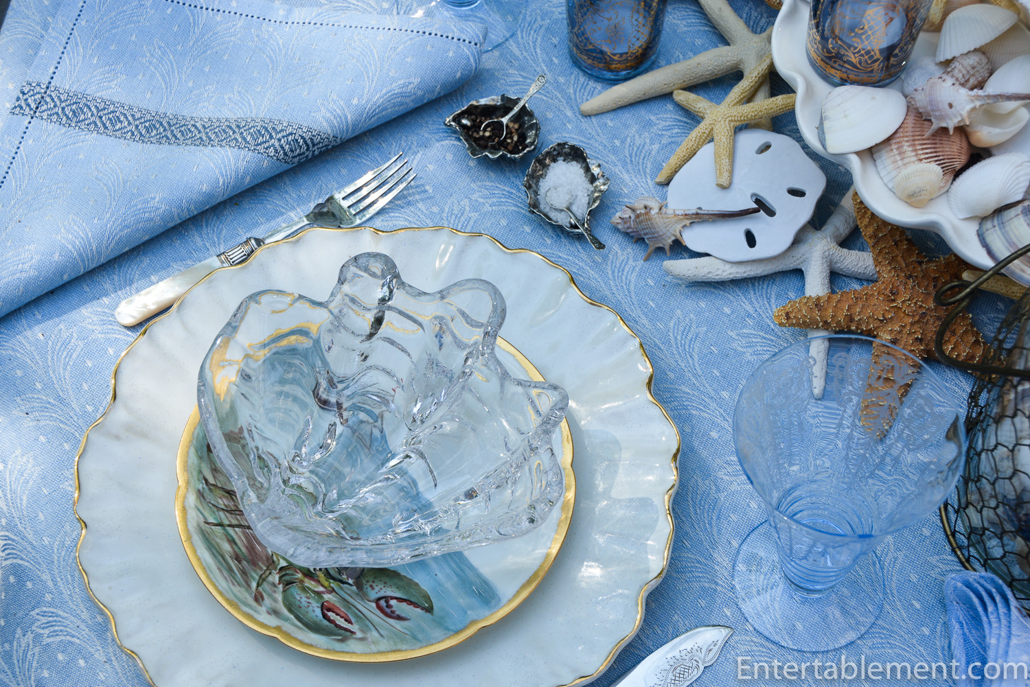
Tuck some Boston lettuce into a clear glass clamshell bowl, pop the salad on top and voila. An elegant, no-fuss lunch or starter.
Let’s check back with the table inhabitants. How are things? The mood seems to have darkened…

No – things are brightening up.
Coming along swimmingly, in fact.


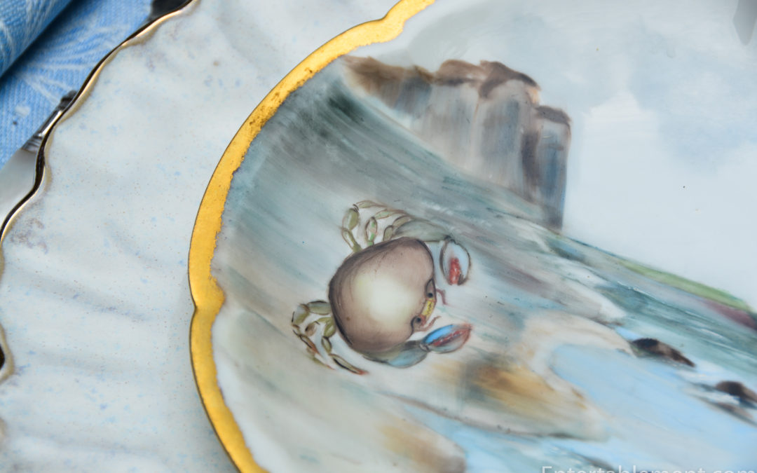
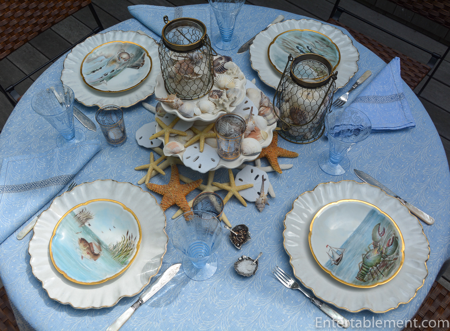
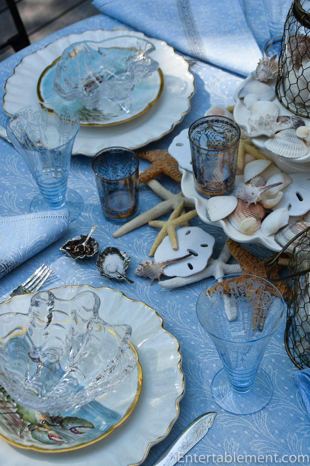
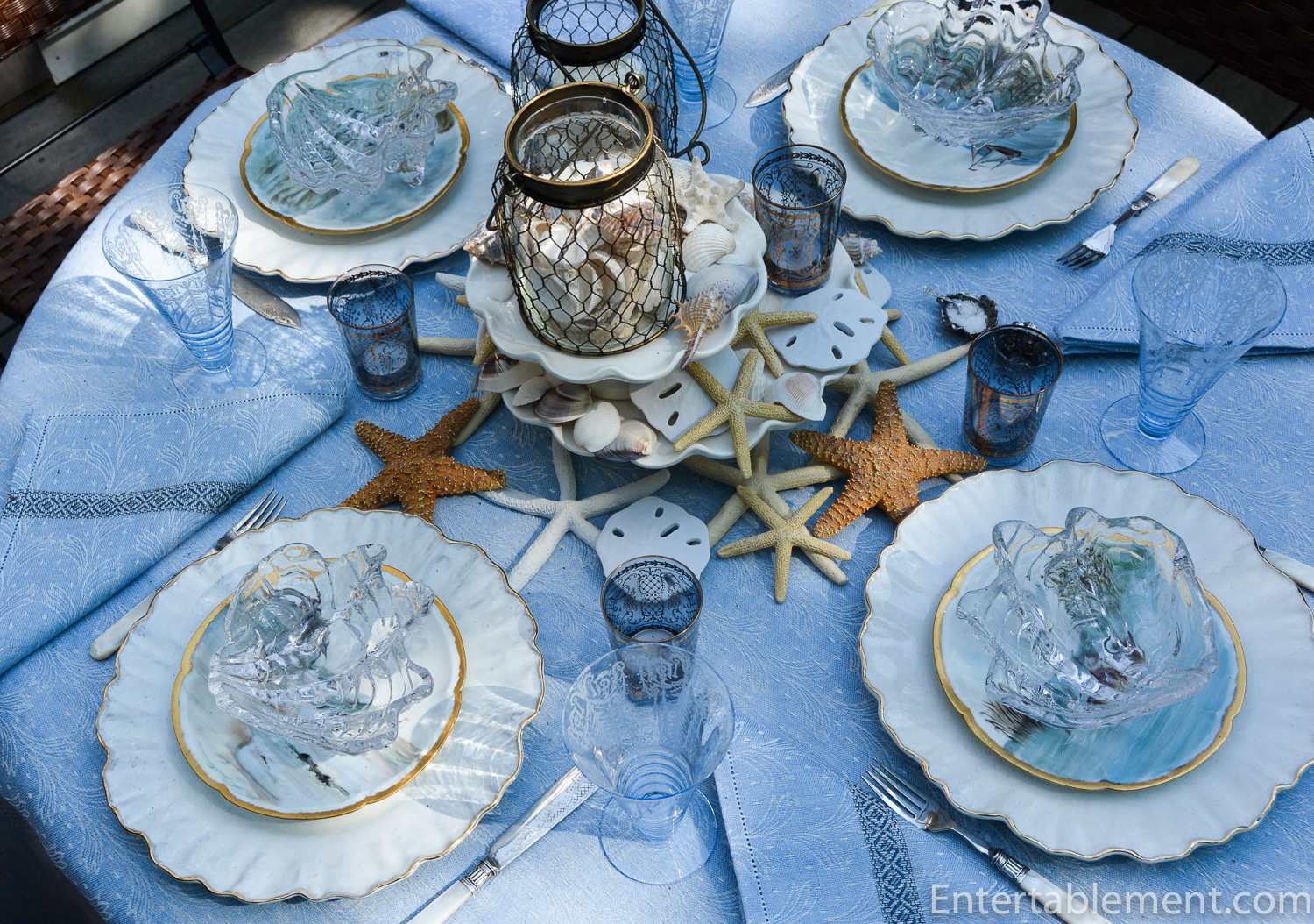
I’ve had these hand-painted Limoges Fish Plates (as I call them) for years. They were one of the first purchases we made when we bought the Cape house.
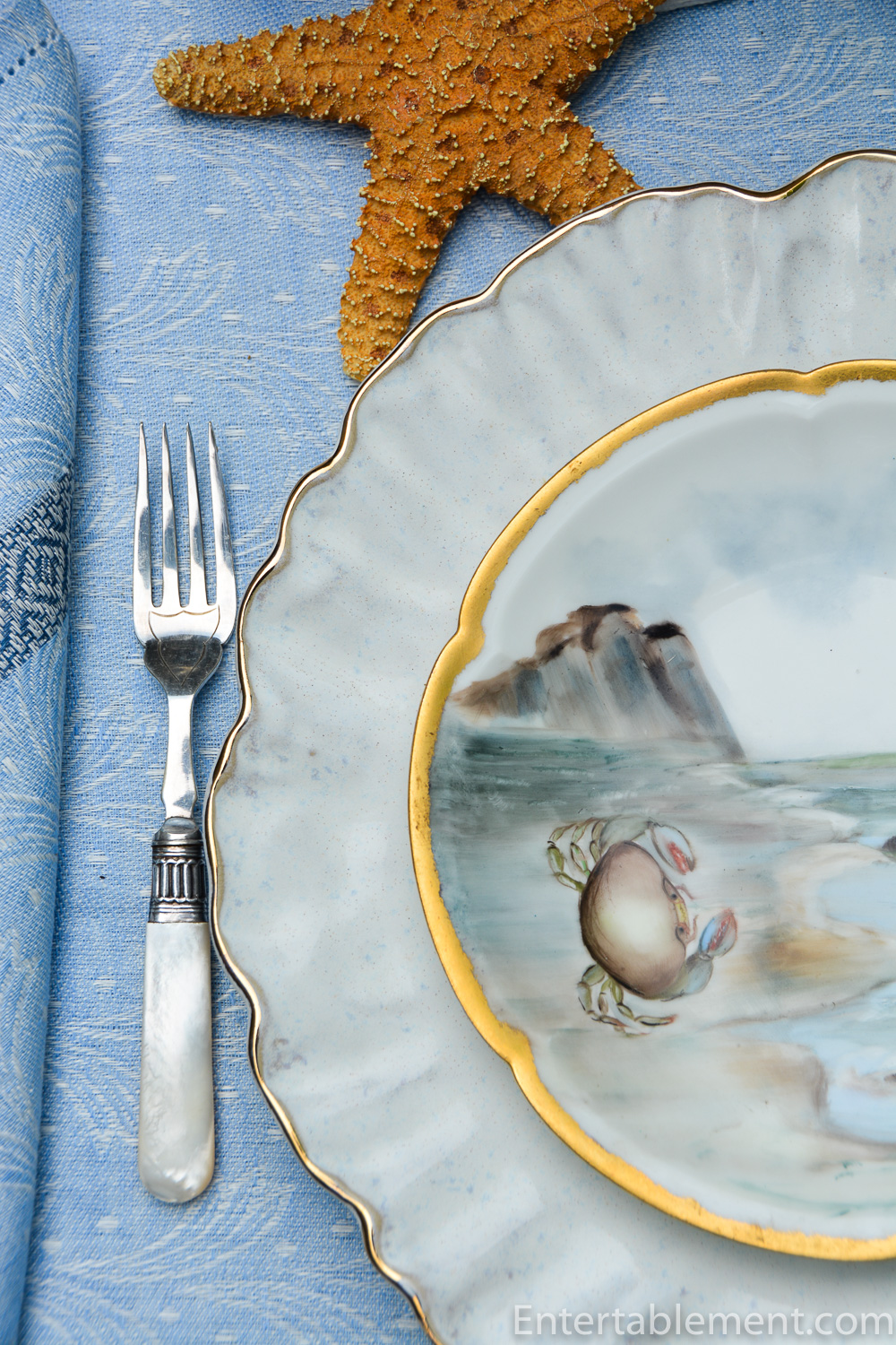
In the summer, they usually grace the open cabinet in the dining room, cozying up to majolica oyster plates.
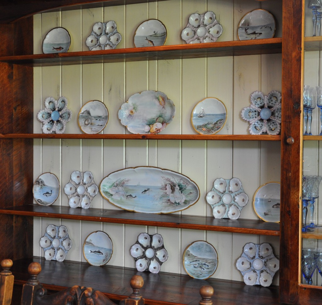
This year they’re taking a break, replaced by the Faience French Delicacies plates.

The fish plates were glad to have an outing, and work really well as a base for the glass clamshell plates I picked up from Pottery Barn many years ago.
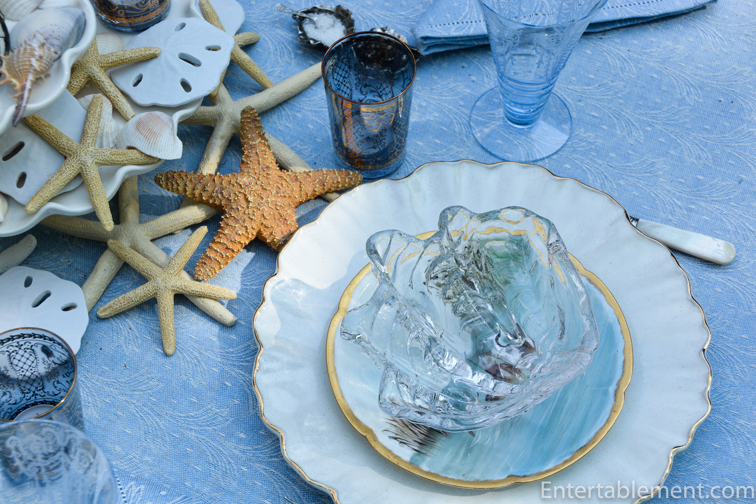
I used Williams Sonoma’s Ruffled Edge Dinner Plates as the base.

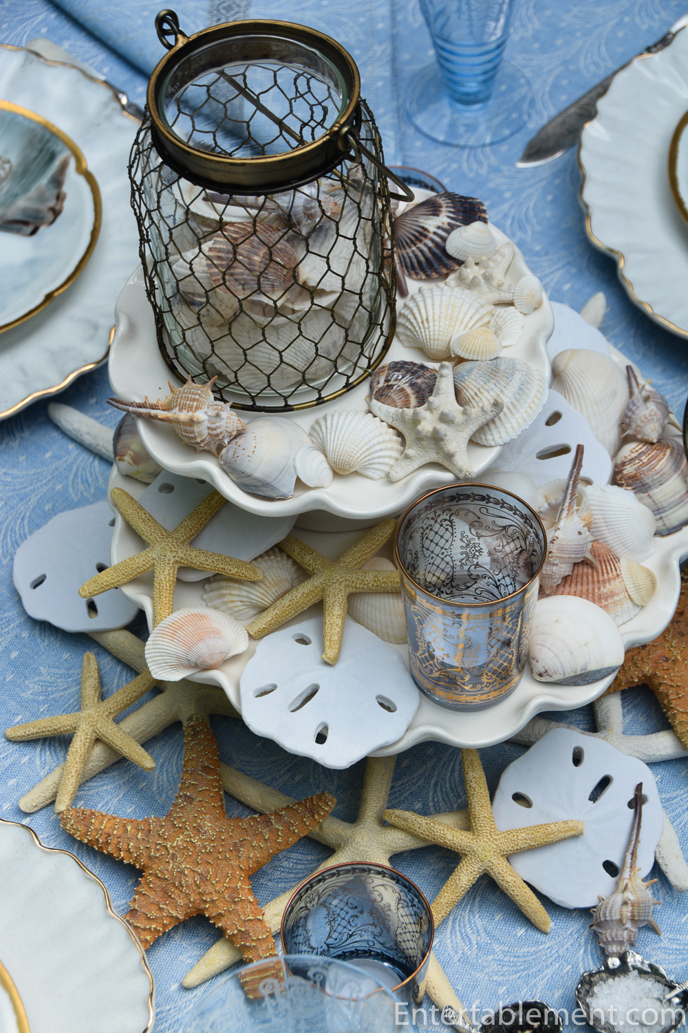
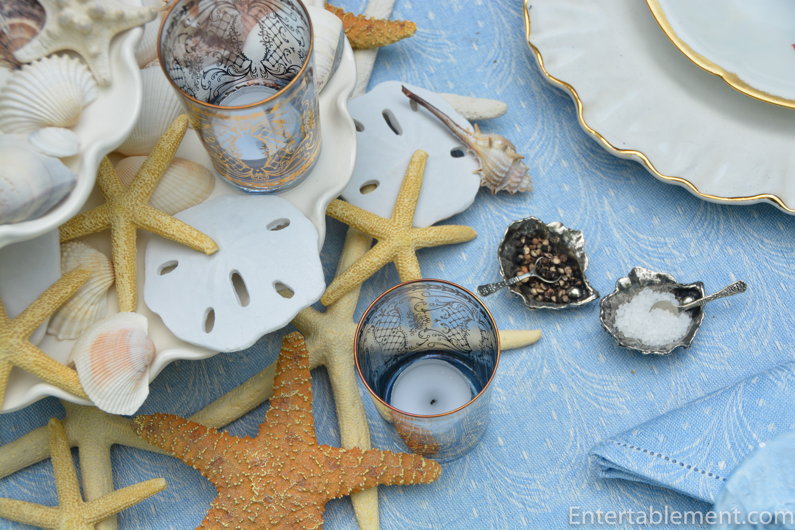
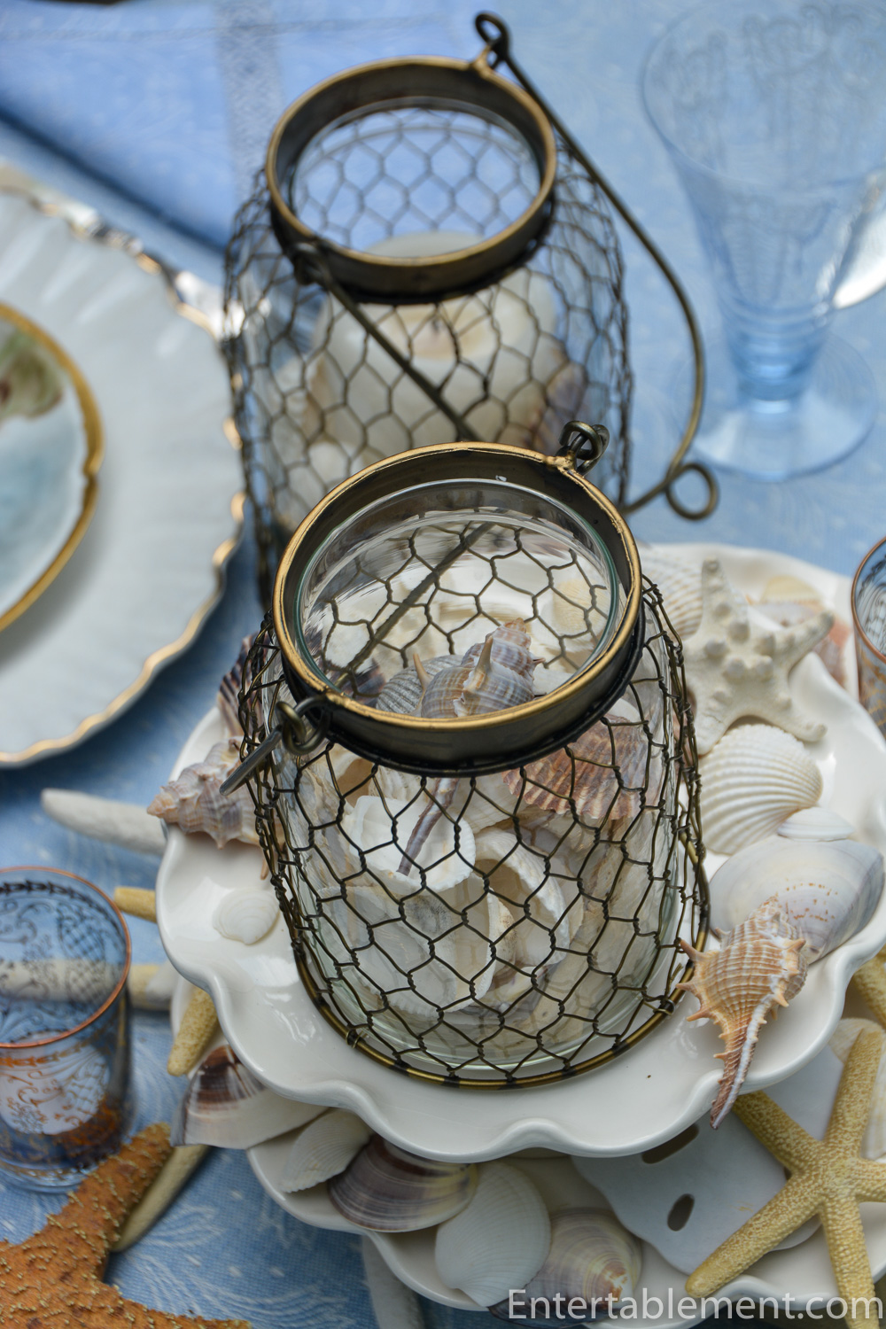
Then filled the centre of the table with two stacked cake stands filled with seashells and pale blue gilded votives. Pewter clamshell open salts snuggled right in. I’ve had mine forever, but Michael Arum has something similar, as does Amazon.co.uk.
The mother-of-pearl handled flatware is part of an antique boxed set I picked up years ago at now-defunct Country Dining Room Antiques.

As you might imagine, it gets a lot of use in the Cape. Similar sets are available on eBay from time to time.

I loved the way all the seashell shapes came together with the chicken-wire clad jars.

The glasses are new (to me) Depression glass. I’ve been cobbling together a set of Cleo Blue by Cambridge, and it’s slow work. Some of the wine glasses popped up on eBay and I’ve managed to snag three of the champagne coupes.
These are the 8 oz tumblers of which I’ve managed to procure five. Wish me luck on finding some more.

The tablecloth came from a wonderful linen shop in Pienza, Italy. Friends of ours visited it last year, so it’s still in operation. Pienza was Pope Pius II’s summer residence and literally means “Pius-ville”. Well worth a visit.


I will leave you with a few more shots of the table.
I can’t believe we’ve turned the page to August already. May all my Canadian friends have a safe and happy Civic Holiday long weekend. It’s going to be a scorcher, so stay cool, everyone!
I’m sharing this post with Between Naps on the Porch.

I love this beach-y table!
Thanks, Joy! Thsoe plates are incredibly versatile. I love all the different water creatures. 🙂
Everything is delightful, but I especially love the pearl handled flatware!
Thanks, Karen. I really using previously-loved items from another era. They add a certain elegance to the table, and it’s nice to recycle!
Dear Helen,
Thanks for another cool blue table, and the clever mixture of fine porcelain with more relaxed roommates. It’s something you do so well. I find this a difficult exercise–they just don’t seem to play nicely together on my table. I like the blue glassware, but your Versailles and the Fry optic set are knockouts. I’ll have to get you a pic of my “problem” Mirabello tablecloth with design from Ceramiche Duca di Camastra (pottery link below). It has so many colours (pomegranate, blue, terra cotta, green, gold, and sand) that I just don’t know where to start, but I’d love to set a table with it this summer. It’s just sooo summery!
https://www.desuir.it/en/
Hi Beatrice,
Thanks so much. That Fry set doesn’t always play well with others, but in the right setting, it makes quite a statement. The Cleo is a much more modest set, not needing to be the centre of attention like Diva Fry.
In terms of your Mirabello tablecloth, it sounds like it would be beautiful any number of ways. I’d suggest you start with two complementary colours – perhaps blue and terracotta or green and pomegranate. If you’re using plain white china, choose one for your napkins and the other for the glassware. Or do a centrepiece of summer fruits, including some pomegranates and carry one of those colours through to the glassware or napkins. I like to stick with fairly neutral chargers or placemats when dealing with a busy tablecloth. Mary over at Home is Where the Boat Is does a marvellous job of layering complex patterns, so, by all means, check out her site. She uses a lot of quilts as tablecloths, then layers patterned china and several different patterns of napkins.
We tend to be overly critical of our own endeavours, and you may well be too critical of your own combinations.