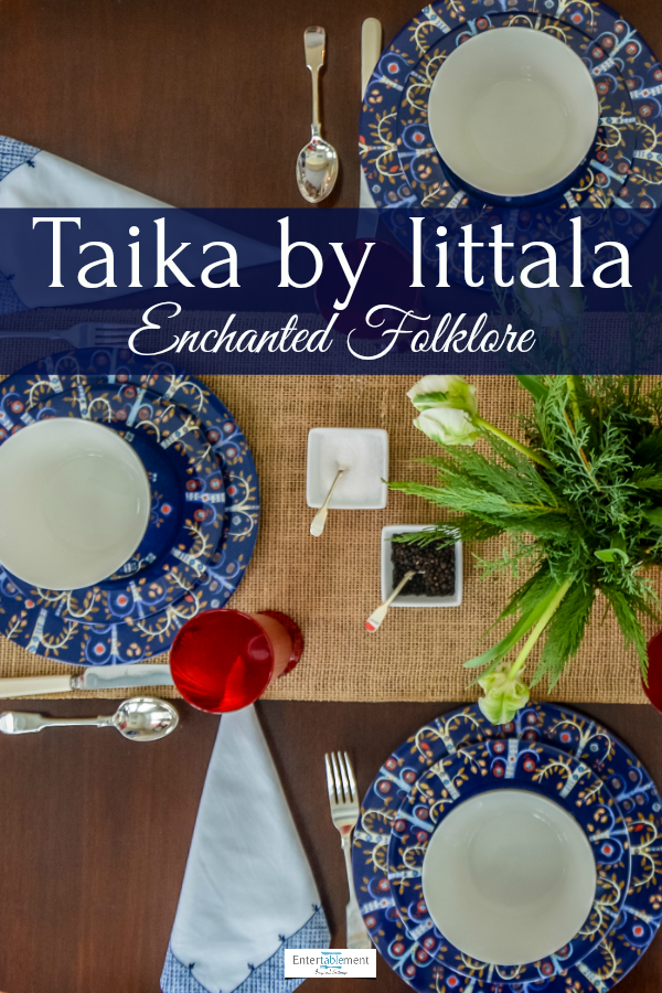
When it comes to whimsical tableware themes, you can’t go wrong with the Finnish firm, Iittala.

I came across Taika more than a decade ago, and it was love at first sight. Intrigued by the fantastical creatures, I was also taken with the rich cobalt glaze, not common in an “everyday” dinnerware pattern.

It’s described thusly on their website:
“With an authentic folkloric voice, Iittala Taika (Magic) tells the story an enchanted forest full of fanciful creatures. The vivid Iittala Taika designs are both whimsical and sophisticated in nature, showcasing Finnish designer Klaus Haapaniemi’s adept attention to detail. The intricate illustrations are a perfect match for the smooth, simple shapes of Heikki Orvola’s porcelain pieces. Though the stunning Iittala Taika collection has the look and feel of fine china, it carries the convenience of daily dinnerware; each piece is freezer, microwave, oven and dishwasher safe.”

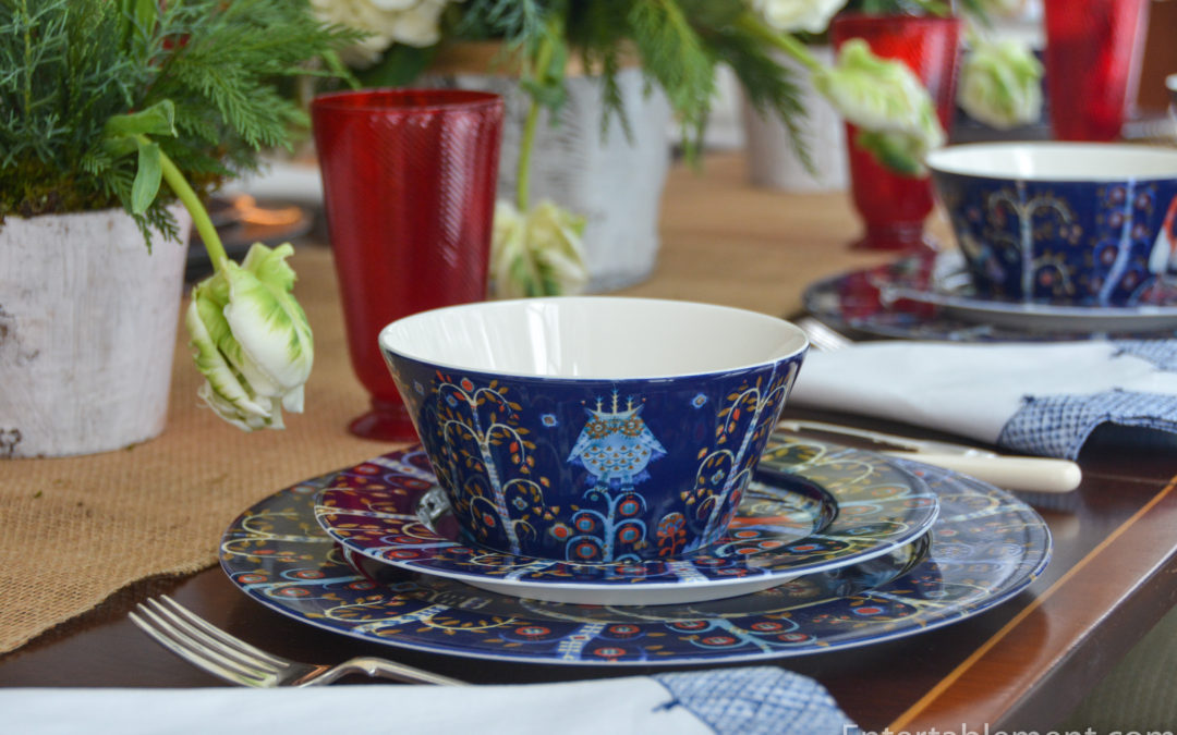
Love it. Who could resist this little owl? It’s my favourite piece of the whole service, a darling little demitasse cup, perfect for a shot of espresso.

Another bird, presumably of someone’s imagination, graces the dinner plate; this one is much bolder and more assertive than the diminutive owl,

The salad plate has an…er…um…???? I hesitate to say dragon (no wings), and the bobbly bits coming out of the head are hilarious.

He (or she) is also on one side of the cereal/soup bowl.
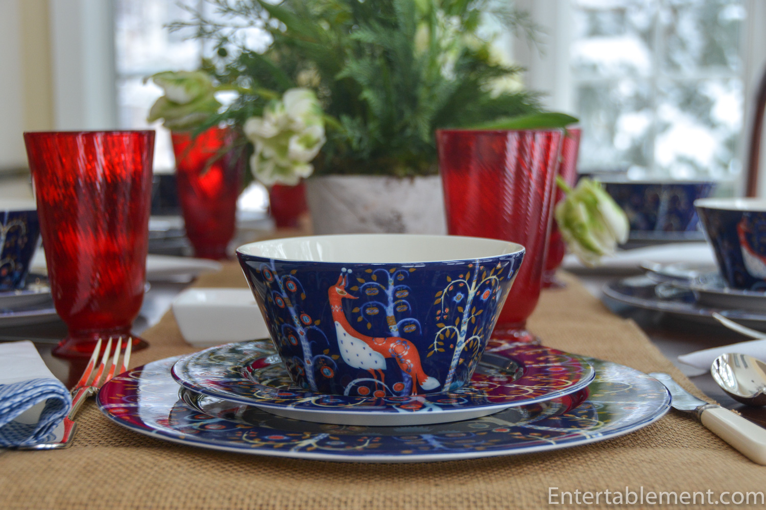
The other side has the owl.

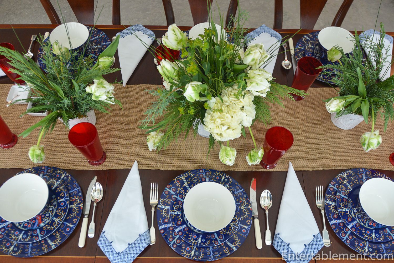
Together they make for a lively and bold table.

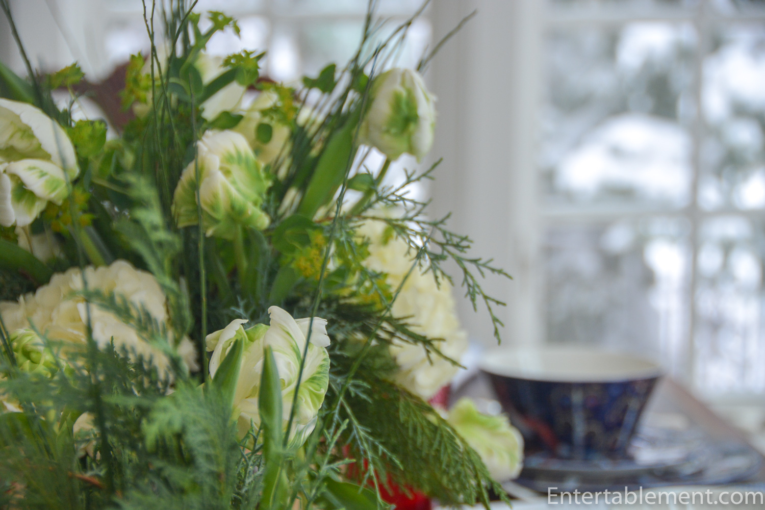
The accents on the set are mainly white with pale blue and touches of red. With so much going on in the pattern itself, I decided to stick with simple white floral arrangements.
Arabella glasses by Juliska added just a snick of bold red, enough to provide some interest without being overwhelming.

Taika has simple, clean lines, so I employed open salts in a similar vibe.

The navy edged napkins from Williams Sonoma a few years ago seemed to fit.

It’s a bit stark, but that somehow fits the mood of the early new year, don’t you think?
Deep, rich colours are often my go-to after the Christmas season. For the kitchen china, I usually pull out Taika, Provence Noir by Royal Doulton and/or Adelaide Green by 222 Fifth. I always have a white set going alongside, either Country Heritage by Villeroy & Boch or the Baronesse White set by Tirschenreuth (always have to look up the spelling on that one) I got at a thrift store a few years ago.

I’m happy to move to pastels a bit later in the season, as Easter preparations get underway. But for the frosty months of January and February, deeper colours are the order of the day.

Taika also comes in backgrounds of white and red, and the latest release is in plain black and white.
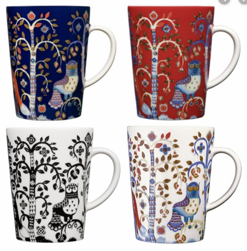
The red is reaaaaallly bold!

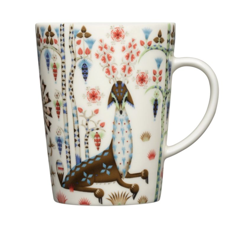
They’ve added a slightly new palate with additional creatures to the white background offering, Taika Siimes. With accents of coral and green, it’s meant to evoke images of Spring. That little face on the deer? is adorable.
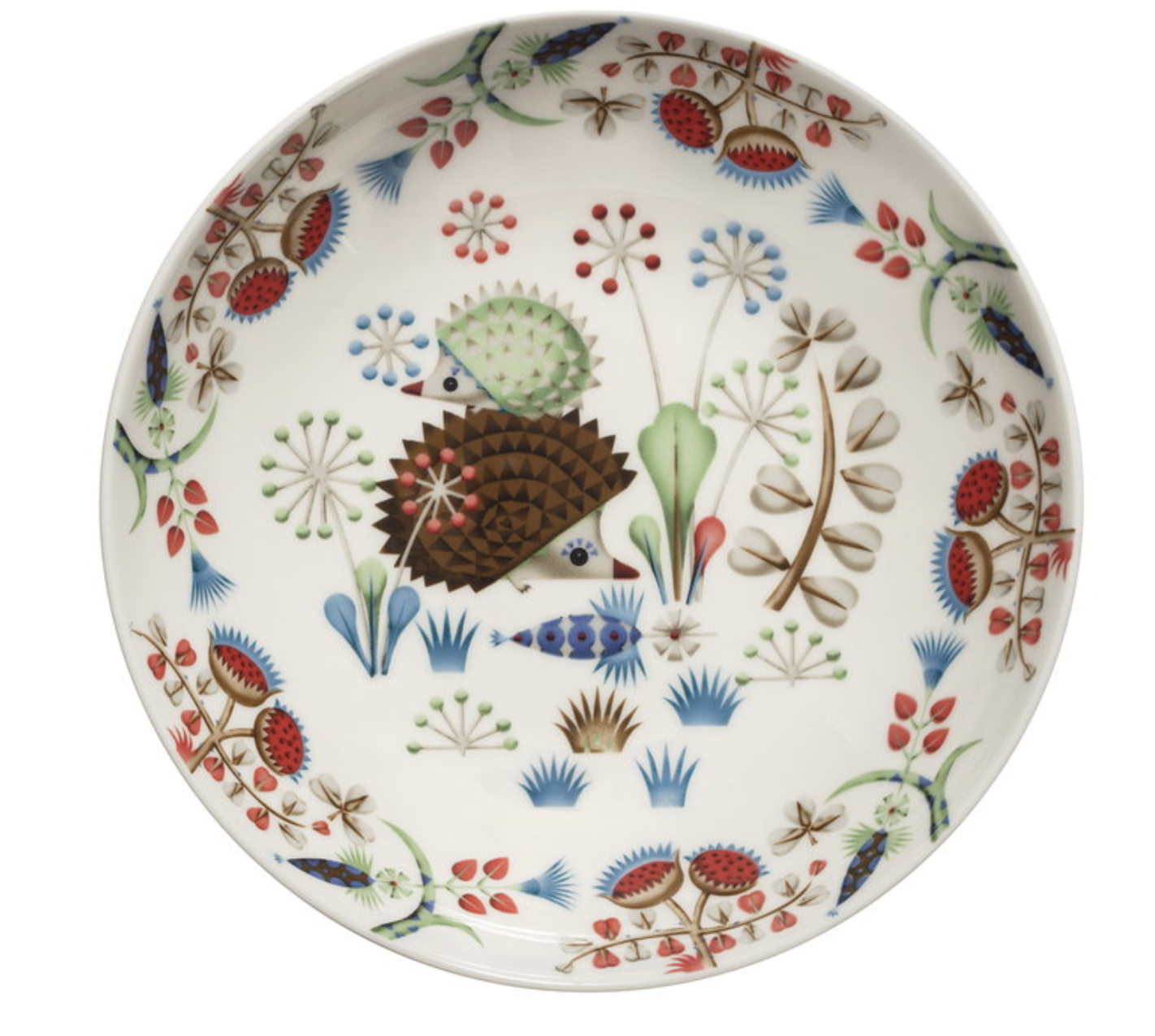
But the hedgehog has quite won my heart.

He (and his little green wife) feature more prominently on the pasta bowl – they call it a “deep plate“.
Siimes wasn’t on offer a couple of years ago when I went looking for pasta bowls to augment my set. I ended up going with this one, instead. It’s a bit bigger at about 10″. The Loch-Ness-Monster style fox is very cute, though not as adorable as the hedgehog.

You can see the Nessie-fox bowl below on this arrangement (photo from Century House’s website). The slightly smaller bowl with the owl is the same size as the hedgehog Siimes one, at about 9″.

Lots and lots of choices with Iittala. You might remember our magical forest table with Tanssi? That’s another fun pattern.

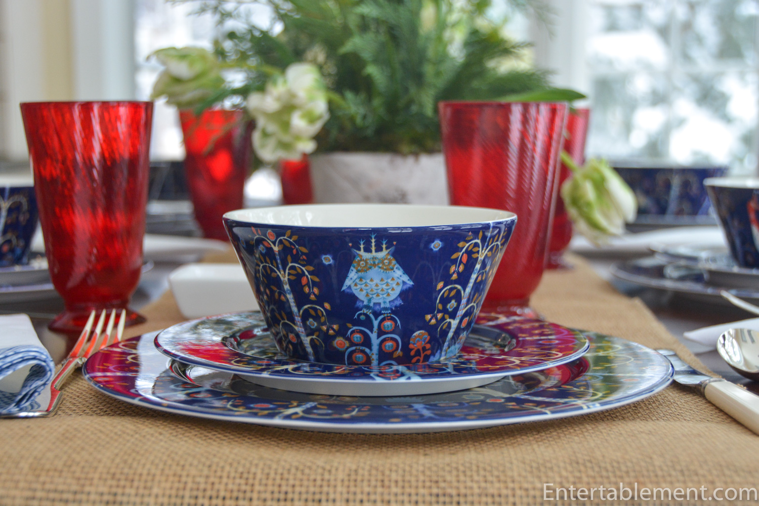
But back to the cobalt blue Taika. Hi there Mr. Owl. We are so glad you could join us.
That’s all for today. I hope you’ve enjoyed our visit to the magic land of Taika.

I’m sharing this post with Between Naps on the Porch.

Dear Helen,
I love the richness of this table and its cheerful Taika Sininen (blue) vibrant colours in what I’m sure is a dreary time of year up there. The serviettes have just the right amount of blue to bring out the secondary blue in the china pattern. But Iittala is headquartered in Helsinki, not Sweden. I remember ogling their heavy ice-like glasses in the 70s when I worked in a gift shop one Christmas season. The red animal is a fox, although he seems to sport an ermine front-piece…for some reason, all their foxes have bobbles on their ears. The Siimes (shade) hedgehog (my favorite animal) is really cute. Imagine my delight: I lifted up a wood pallet that had sat all winter in the garden and found a sleeping hedger underneath. I set the pallet down gently and said a tiny “sorry,” for disturbing him, but I was far from sorry to see him!
Hi Beatrice,
Aren’t hedgehogs just the best? None in Canada, which is very sad. Our youngest had a pet African Pigmy hedgehog named Ralph. We adored the little prickly guy. I love that you took such gentle care of your wood pallet dweller. It must be marvelous to see them all waddling about in the spring. They’re coy and shy creatures, and I always delight in seeing them when we are in Britain.
Thanks for the correction on Iittala’s headquarters. I knew it was Finnish. Brain freeze while typing, I can only imagine.
Have a good day.
HK
Love this striking rich cobalt blue pattern and all the whimsical animals. Nice pick with the red glasses. I think you need some more dishes!!! Pretty soon you’ll need a storage pod. The simple white flowers soften the tablescape and beautifully put together. What next?
My thoughts, exactly. I’m clearly running low on tableware options!
I’m doing a lot of digging among patterns I’ve had for years. Just unearthed the Sarah’s garden I’ve had for 20 years and I love it all over again. It’s nice to appreciate afresh patterns not seen for a while.
Enjoy the day!
HK
I am looking to buy but everything is online so confused between the 27cm vs 30cm plate. What sizes are the ones you have here?
Hi – sorry for the delay. I had to go and physically check the plates. The dinner plates are the 30 cm size.