Every November, the poppy reminds us to pause and reflect — a small but powerful emblem of remembrance.
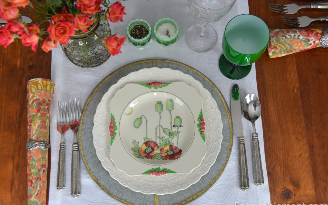
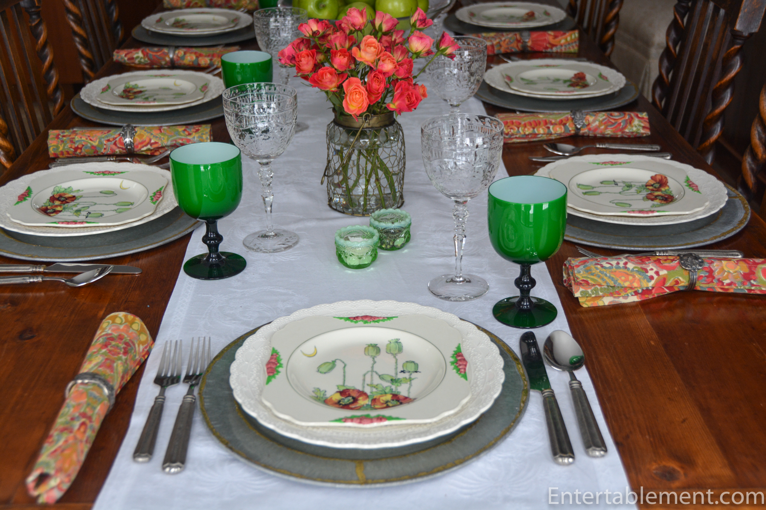
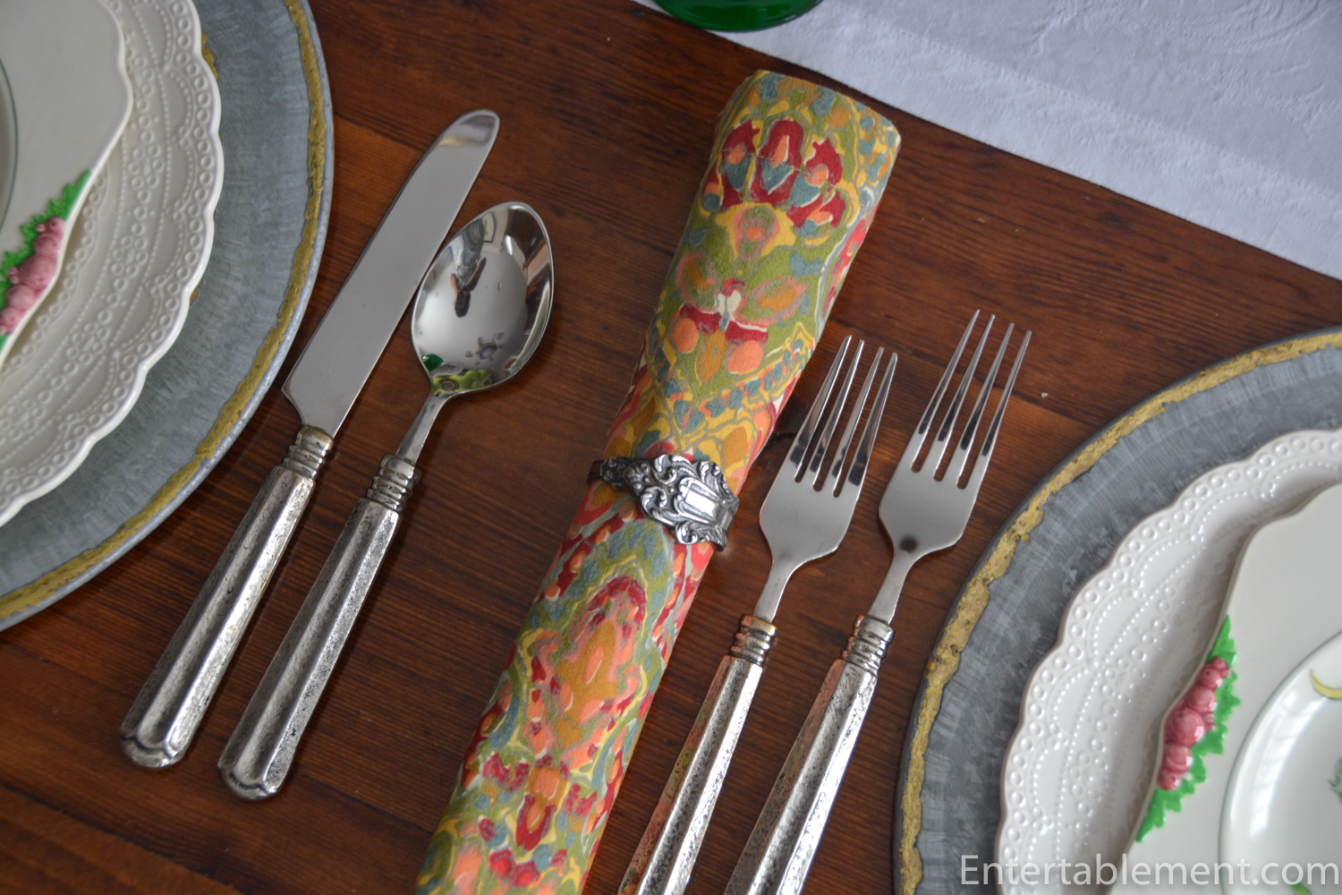
This year, I’m marking Remembrance Day through art and tableware. The square poppy plate shown below is one of a set of twelve Royal Doulton Arts & Crafts dessert plates, circa 1929, that capture the beauty and symbolism of the poppy in a way that feels timeless and deeply fitting.
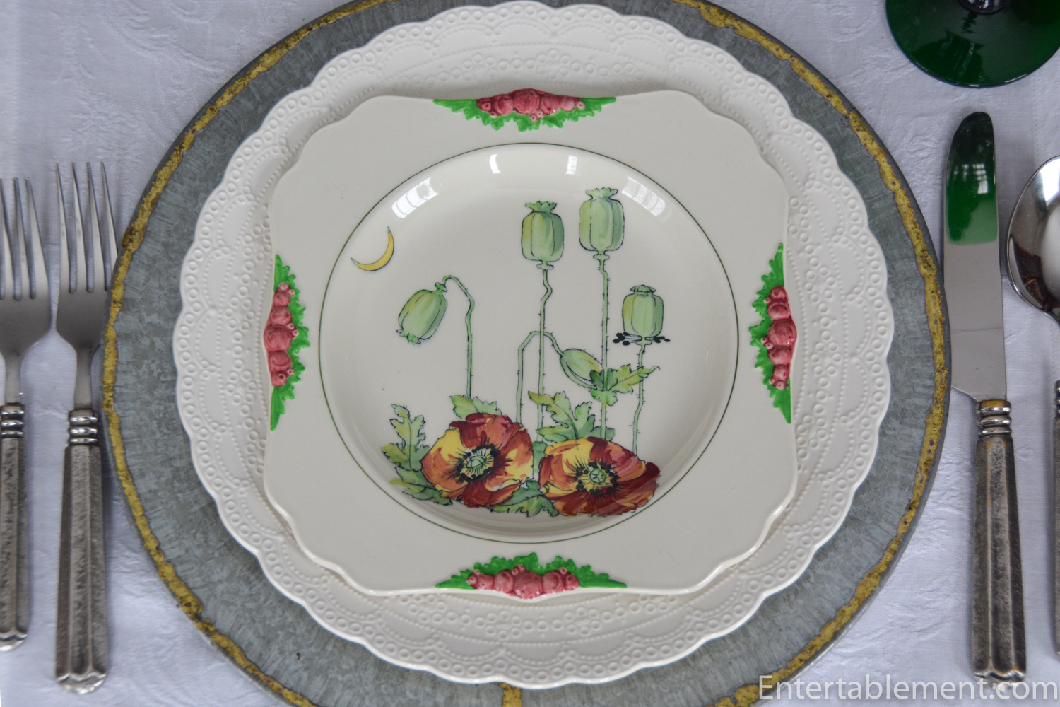
The set of square creamware dessert plates (on loan to set the table) is available through Elise Abrams Antiques. It features Royal Doulton’s iconic Poppy pattern, with delicately moulded floral borders highlighted in red/pink, and green enamels. The central motif — vivid hand-painted poppies with seed pods and a whimsical crescent moon — embodies the movement’s devotion to natural forms and handcrafted detail.

Dating from around 1929, these plates sit beautifully within the Arts & Crafts tradition. Their clean lines and organic flourishes reflect a design philosophy that prized craftsmanship and authenticity over industrial perfection. Nearly a century later, they remain as fresh and evocative as ever.
Many of the antique pieces in my collection have come from Elise Abrams Antiques over the years. Elise has an extraordinary eye for quality and history — her collections are impeccably curated, and her knowledge of fine ceramics is second-to-none.
As readers can attest, my own approach to collecting is more eclectic. I mix antique with modern, upmarket plates with eBay bargains. I love pieces that tell a story — whether that’s a glimpse into a particular design period, a playful motif, or simply something that sparks joy. For me, not everything needs to be museum quality to be meaningful. The magic lies in the mix: blending the fine with the fun, the storied with the surprising, to create tables that feel both beautiful and alive.
Back to our table: to highlight the poppy plates’ natural charm, I employed Spode Jewel creamware dinner plates as the base. They’re from the same era, although Jewel had a much longer production run (1926-1975). The green glassware — goblets and bowls— is also from Elise’s collection.
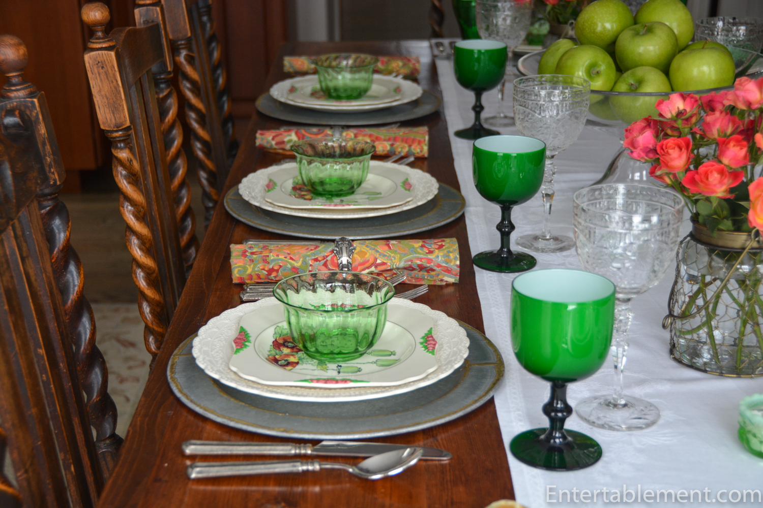
The cheerful napkins are modern, adding another burst of colour to complement the tone of the poppy plates. The effect is quietly celebratory — a table that honours the day’s solemnity while celebrating life’s enduring beauty.
Art, in all its forms, can help us remember. Whether through a field of poppies, a painting, or a beautifully crafted plate, it offers a way to hold memory close and beauty closer still.
And on that note, you might like to see this year’s display at the Tower of London to mark the 80th anniversary of the end of the Second World War.
From the Historic Royal Palaces Website:
The display of nearly 30,000 of the original poppies, made for the 2014 installation, ‘Blood Swept Lands and Seas of Red’, returns to the Tower, marking the sacrifices made by so many during the Second World War.
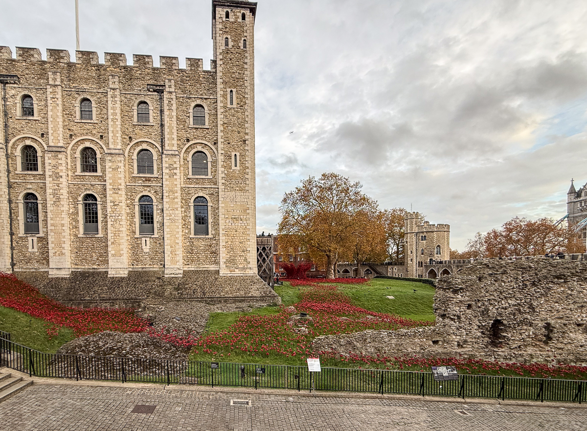
The specially commissioned installation resembles a ‘wound’ at the heart of the Tower, which was itself bombed during the Blitz. Poppies pour across the lawn overlooked by the ancient White Tower, where the blood-red flowers form a crater, with ripples flowing outwards.
On display within the Tower’s walls, the installation creates striking images, reminding us of loss through war, and of the long-lasting impact of conflict. It creates a shared space for visitors to remember and reflect on the collective sacrifice of so many in this important anniversary year.
The poppies are on loan from Imperial War Museums and were designed and made by the artist, Paul Cummins. The new display has been created by the designer, Tom Piper.

The 2014 installation ‘Blood Swept Lands and Seas of Red’ was originally at HM Tower of London from August to November 2014, where 888,246 poppies were displayed, one for every British or Colonial life lost at the Front during the First World War.

The poppies and original concept were by artist Paul Cummins, and Tom Piper designed the installation in conjunction with Historic Royal Palaces. Each one comprises a set of red ceramic petals placed carefully on a steel “stem”, and then a central black ceramic piece is screwed on top to keep the petals in place.
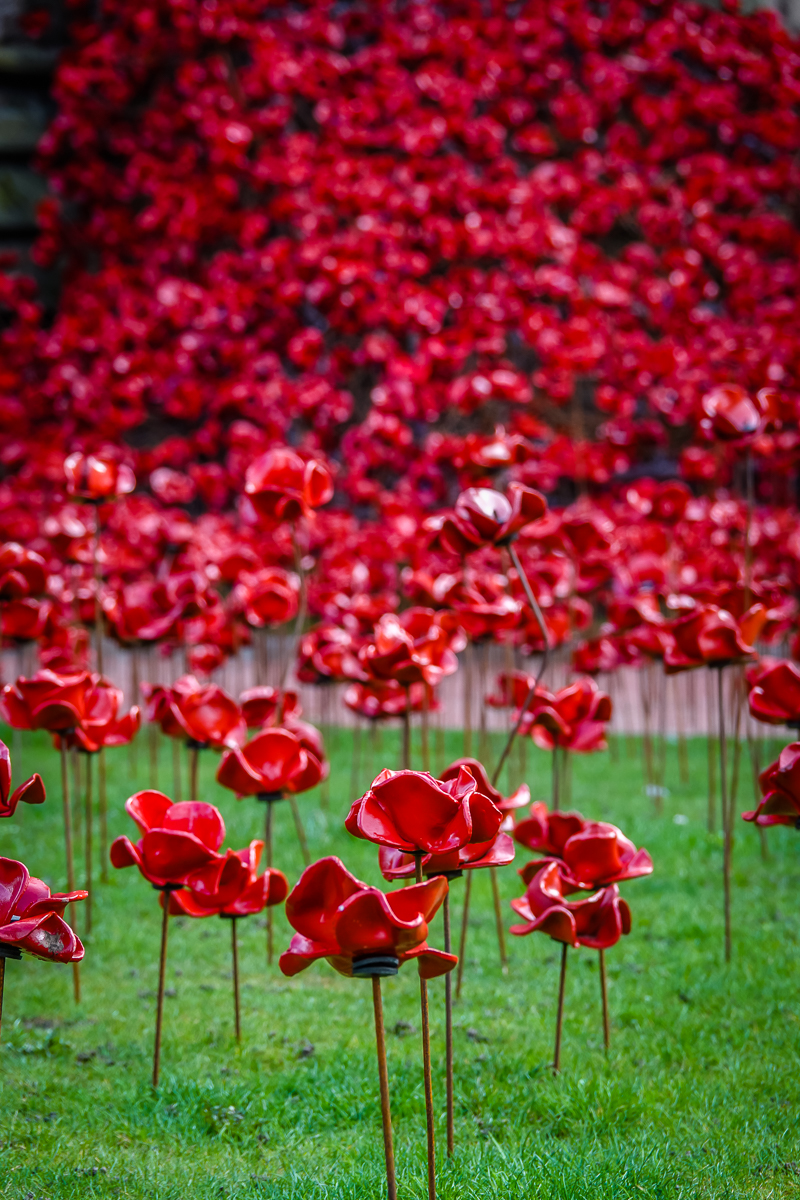
The poppies were installed by volunteers, each at a rate of about 500 per day.
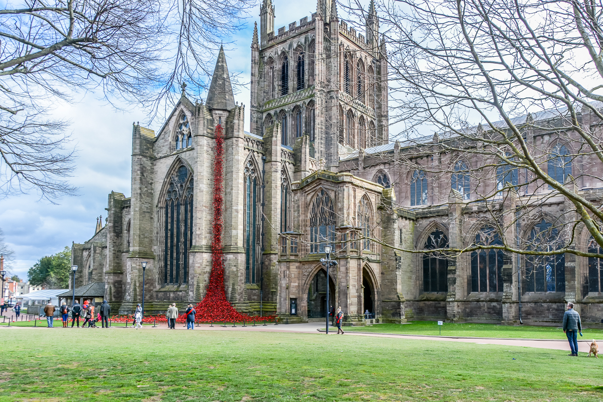
When Bloodswept Lands and Seas of Red was dismantled in London in the fall of 2014, scaled-down versions of the display toured the UK, remaining at each site for between six weeks and three months. We saw the Weeping Window display at Hereford Cathedral in the spring of 2023 (a full write-up is available on Entertablement Abroad).
Lest we forget.


Thank you for this most meaningful post and for making us aware of the stunning Tower of London display. I have followed your site for years and draw tremendous inspiration from your tablescapes. I ‘m aware you have followers from around the globe but admit I am always particularly pleased when you feature a table representing a Canadian leaning theme. This year the poppy truly deserves to be highlighted as it is sadly being diminished in modern society. Thank you for your creativity and hard work!
Thank you so much, Kathryn! What a lovely thing to say.
Now you have me thinking about Canadian-themed tablescapes. We are so lucky, living in Canada, aren’t we? From the incredibly varied landscape, having all four seasons, and some of the world’s best food – produce second to none, seafood galore, abundant grains and terrific beef. Hmmmm….
Have a wonderful weekend!