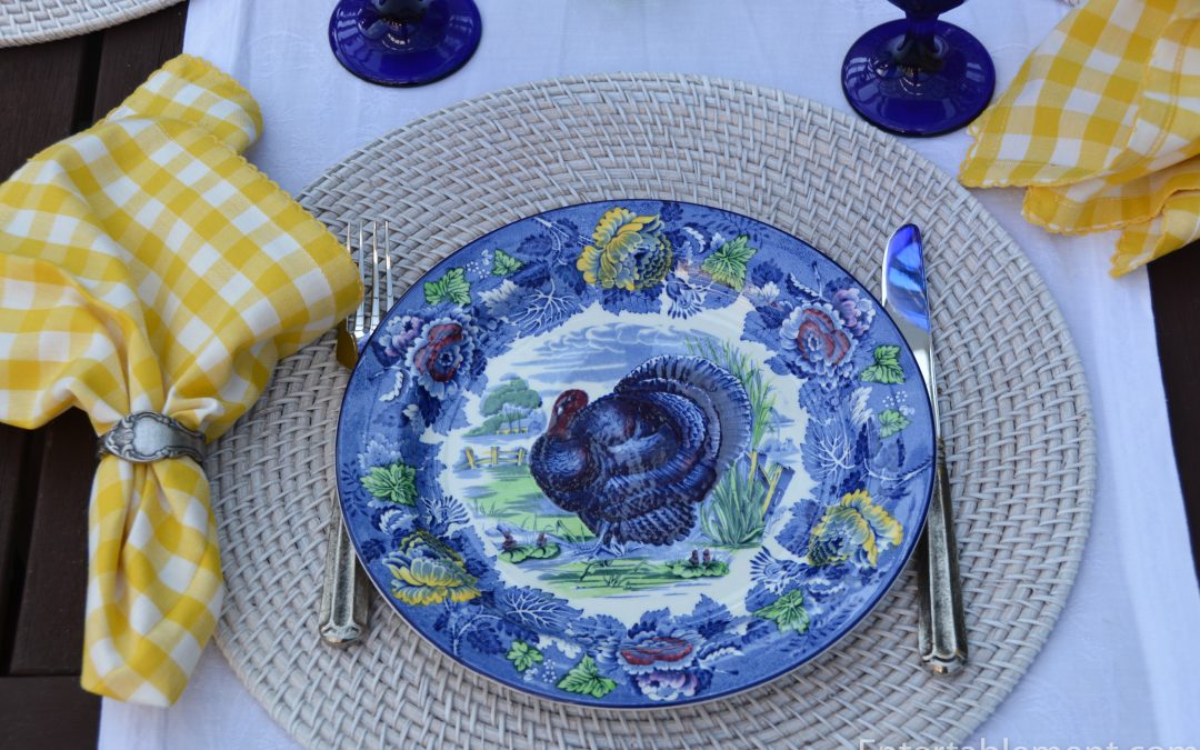
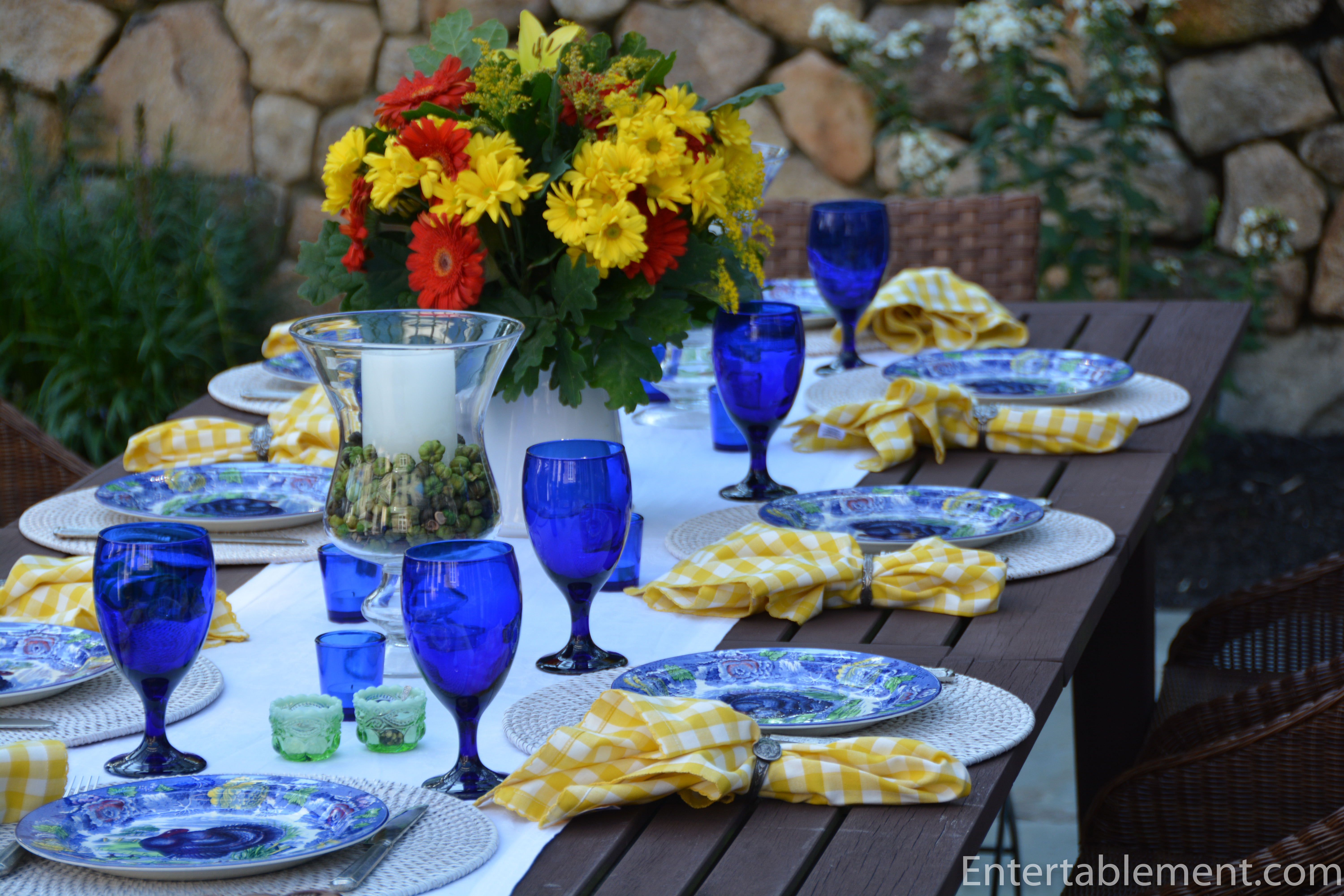
Cobalt blue, vivid yellow, lime green and deep red is not a combination that immediately comes to mind when I think about turkey plates. But somehow these just seemed to work.
Made sometime in the early 20th century by Enoch Woods of Burslem, England, these lively depictions of the noble bird are a fun twist on traditional Thanksgiving tableware.

Styling them took some thought, however. All the regular fall accoutrements were clearly not going to work.
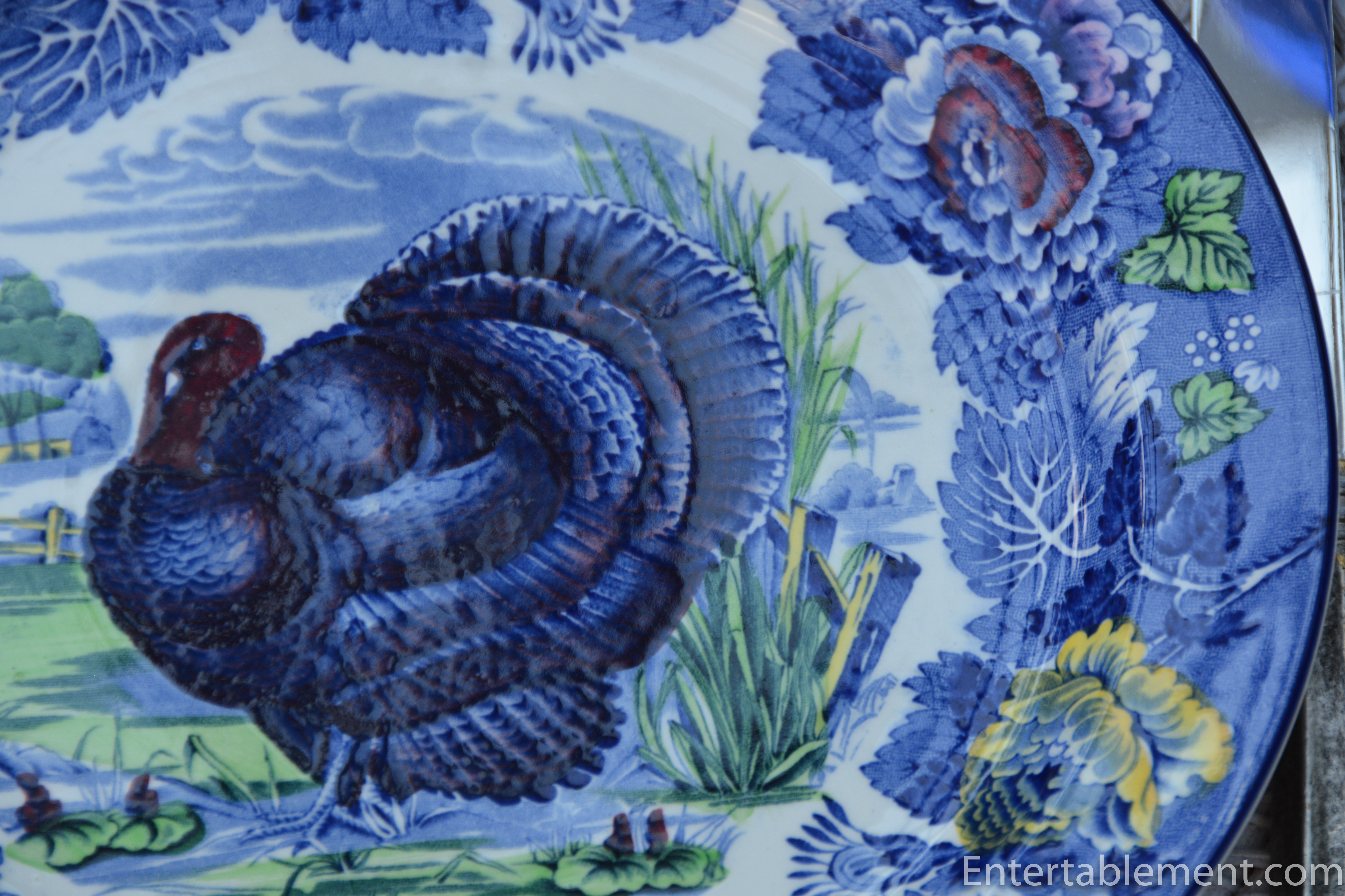

The yellow is quite deep and vibrant. And as Tom Hayes, of Country Dining Room Antiques told me many years ago, “You can’t mix yellows. Reds, pinks, blues, any other colour, it’s fine to go with various shades on a table. Yellow, no!”.
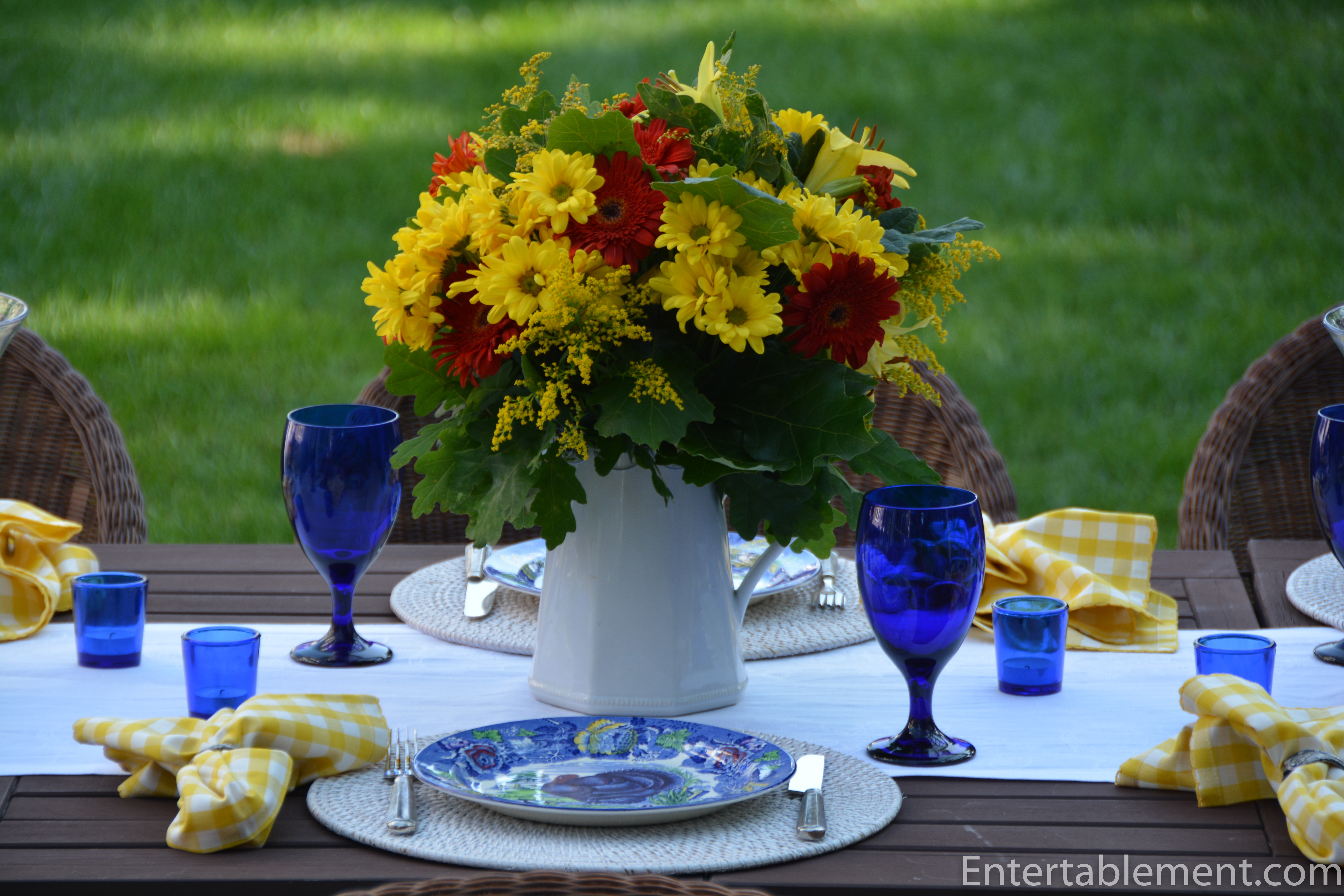
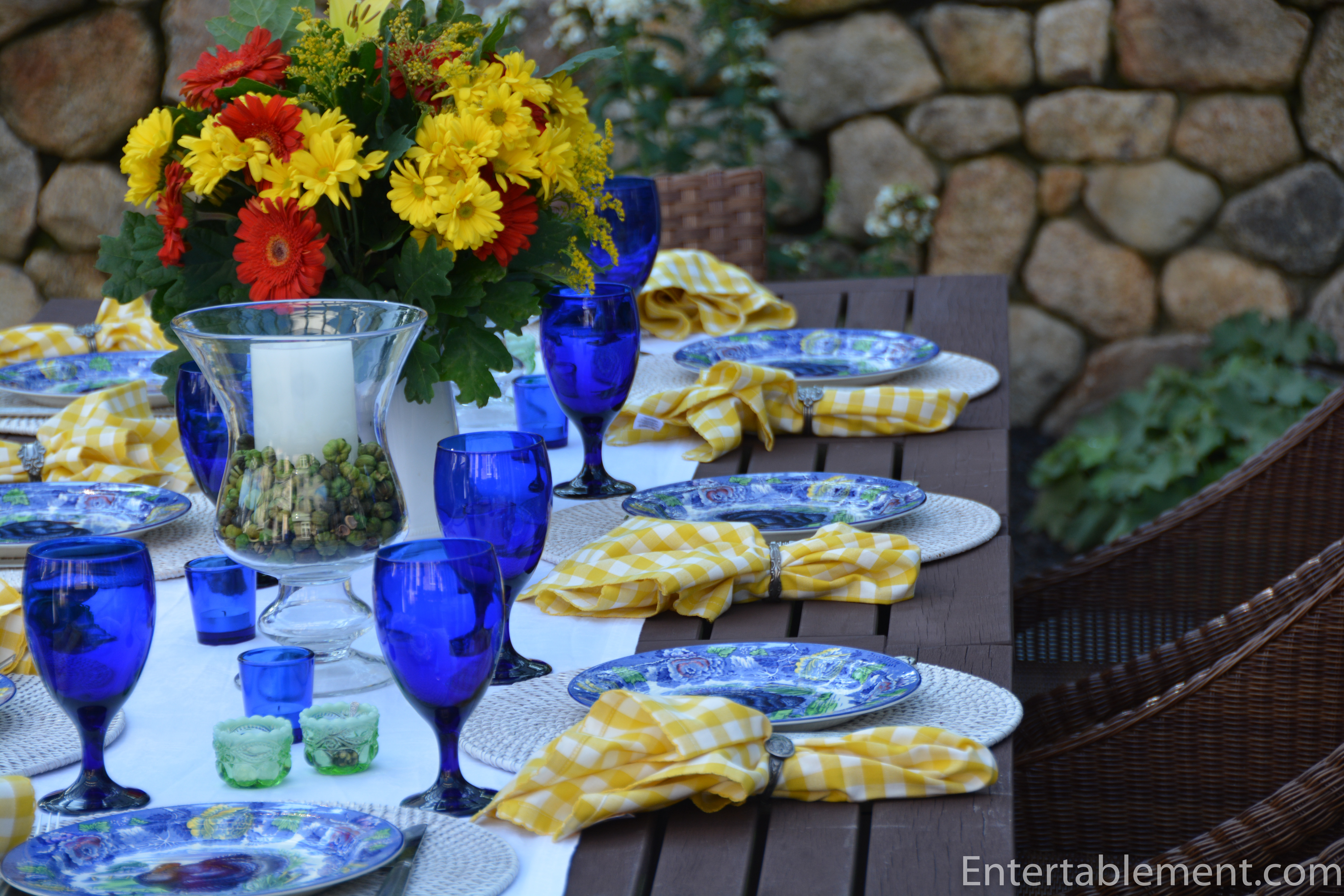
Heeding his advice, I started with the flowers: yellow mums and deep redish/orange gerber daisies.
-
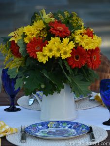
- Deep yellow mums and dark orangey red gerber daisies
-
- Acorns peeking out of the oak leaves
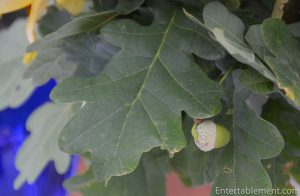
I supplemented the daisies and mums with oak leaves from some nearby trees, and was enchanted to see the acorns peeking out. Awwww… There is something magical about acorns, don’t you think?

The yellow napkins are from Pier 1, this spring. I was both startled and disappointed when they arrived, as the picture on their website showed a beguilingly soft yellow check, not the ballpark-hotdog-mustard shade that the UPS man dropped off. But through sheer laziness or distraction I didn’t return them promptly and they joined the napkin family. Well, they’ve found their role.
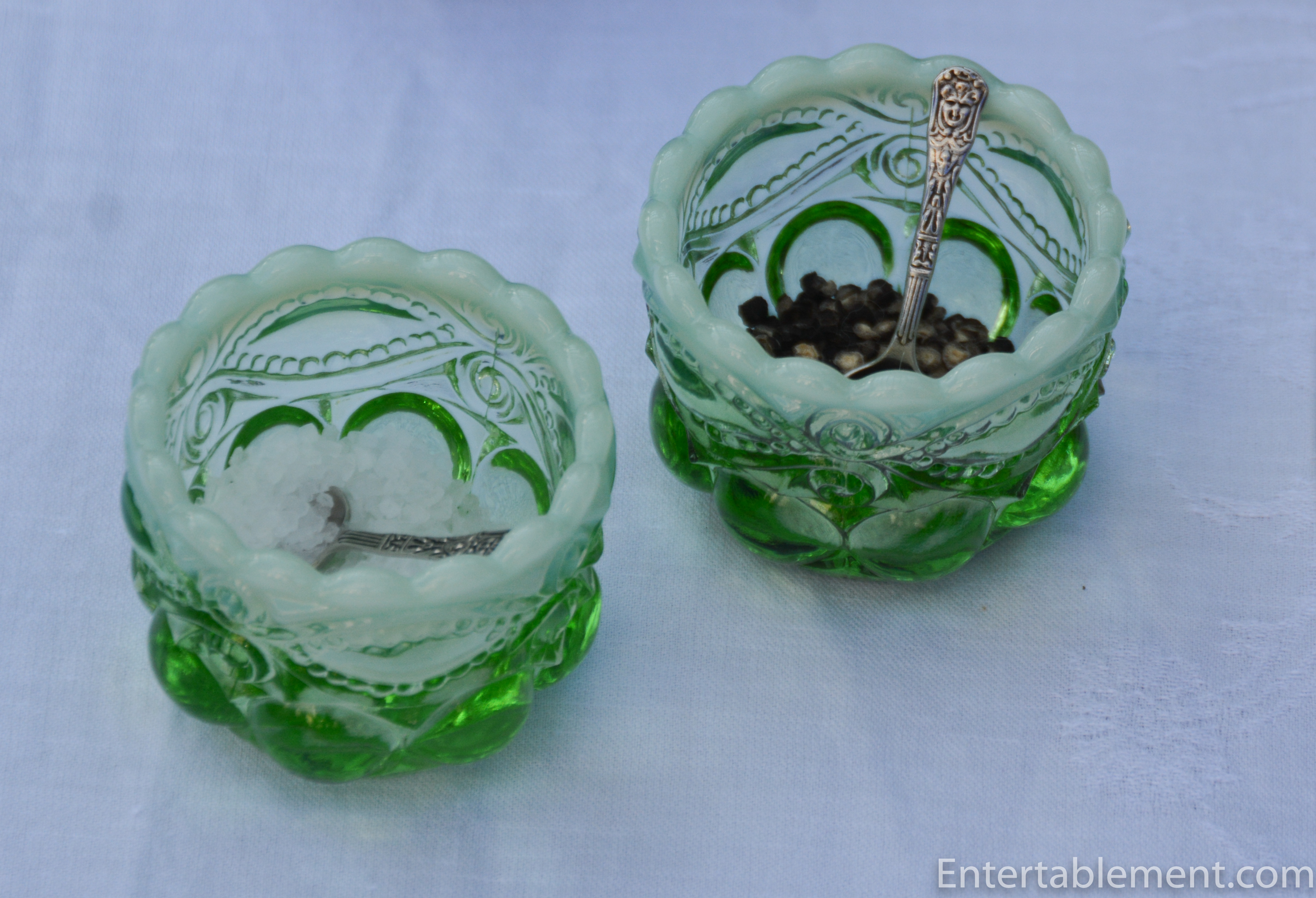
The opaline open salts from The Source Collection reflect the vivid green in the plates.
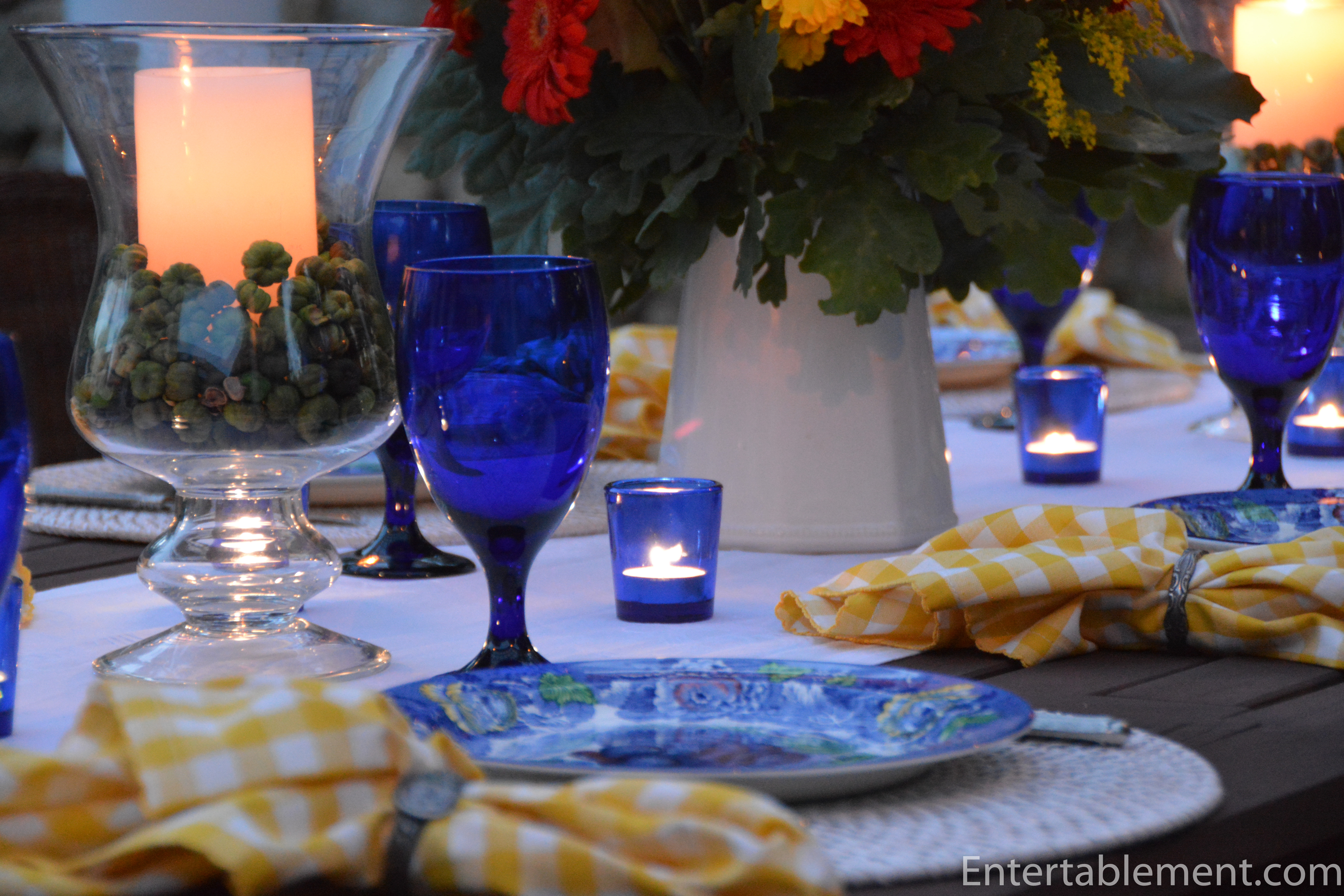
The blue part was easy. Cobalt Libbey water goblets (readily available, even on Amazon), and cobalt tea lights that we had purchased for my daughter Kirsten’s wedding several years ago. In fact, it was of Kirsten that I was thinking when I purchased these plates. She’s the “blue girl” in the family and I can see these gracing her dining table in future.
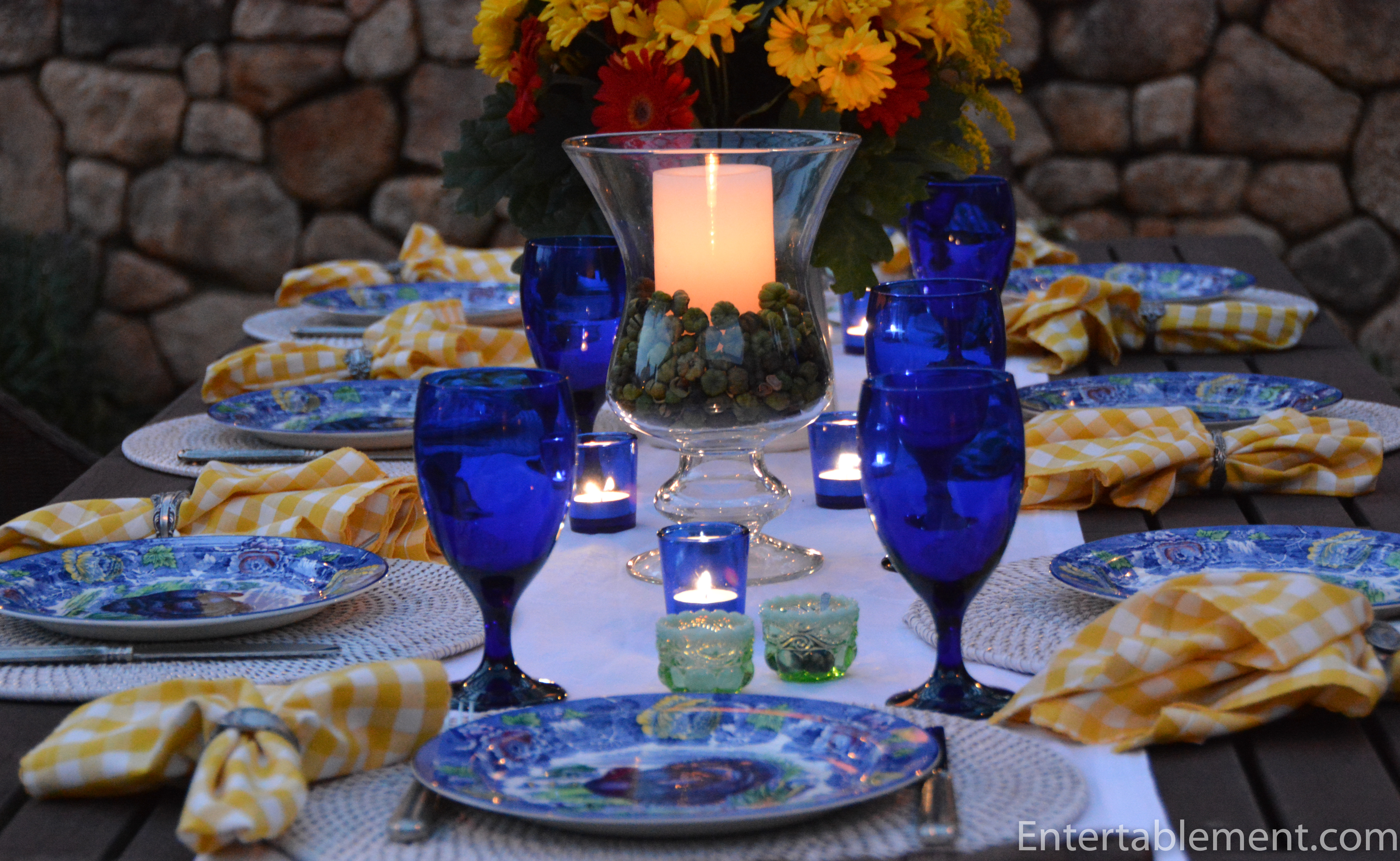
I added some lime green putka pods from Save on Crafts as vase fillers around the pillar candles. I’d never seen these little pumpkin-like guys before, but they looked so cute.

The pewter Danieli flatware is from World Market. The napkin rings are from eons ago, and I believe came from Pottery Barn. The whitewashed rattan napkins are from Pier 1 several seasons ago.

The table looked even nicer at night. I like the way the colours softened a bit and the blue glowed. The yellow still stands out, though! My goodness.
It seems that Thanksgiving comes in many colours!
I’ve been intrigued with the bluish-gray theme that is so prevalent this year, especially in pumpkins. Pier 1 has a lot of it going on, with plates, napkins and napkin rings in the blue/gray.

Later today I am helping one of the kids style a table with some inherited Noritake china in that colour way. So much fun!
I’m sharing this post with Between Naps on the Porch.


Hi! I think you and I were of the same creative mind this week! It’s nice to mix it up every so often. Why go strictly traditional when we can dig deeper and explore a decorating challenge?!! First, I LOVE the blue turkey plates! NEVER have I seen anything that even comes close! They remind me of Spode but with more of a flourish. The years of joy they will bring you and your “blue daughter” are going to be many, I’m sure. I enjoyed your description of the napkins you expected vs. the napkins you actually got. They work well with this setting, and I have a feeling you’ll find many future tablescapes for them to brighten up! The addition of the elm tree branches to your centerpiece arrangement…perfect!!! I just saw several elm trees on the grounds of Nell Hill’s yesterday. I marveled at their beauty. We just lost a couple of trees, and that’s what I want to replace them. They’re beautiful AND useful for decorating! Lovely, lovely tablescape! Have a happy weekend!
Thank you so much Alycia. The plates are very reminiscent of a Spode pattern, aren’t they? Such vibrant colours! I had a lot of fun setting the table, although I was stumped for a while on exactly how to go about it. Enjoy your weekend, too! My husband and I are taking a photography course, and are looking forward to spending the two days outside in the brilliant fall weather.
these colors are so vibrant – i love it!! The napkins might have been brighter than you hope for but they certainly look lovely on your table!
Hi Patti. Yes, the napkins got their turn at the table, once I got over glaring at them. Poor things – not their fault they weren’t what I was expecting. LOL. It’s all about finding the right setting. Have a good weekend.
So beautiful! My oldest daughter is the blue girl in the family too. She adores everything cobalt. I believe that for some reasons the combination of all those colors works perfectly. It’s a true inspirational tablescape.
Thanks Edmee! Cobalt is such a classic – no wonder our girls love it. My youngest daughter is into all things skull, so she’s in heaven at this time of year! Not quite such a classic, but to each their own. 🙂
Absolutely wonderful (out of the box thinking) tablescape. The yellow napkins really make the yellow in the plates “pop”. And I love those beautiful plates.
Thanks so much, Sandy! Nice to change things up, isn’t it? I love fall colours and its great to have options.
Pretty table and the cobalt and yellow is such a striking combination. Very nice. I like seeing fall done in atypical colors.
Thanks, Lorri. I really liked the rich blue, though the bright yellow is a bit difficult to work with. Next time I’ll focus more on the rusty tones.
Gorgeous! I really love this table. The colors are spectacular especially in candlelight. Love the plates and you did an amazing job blending them into this table . Dianne
I bought these turkey plates with my “blue” daughter in mind. She’s got a growing family and is having her own big celebrations at Thanksgiving.