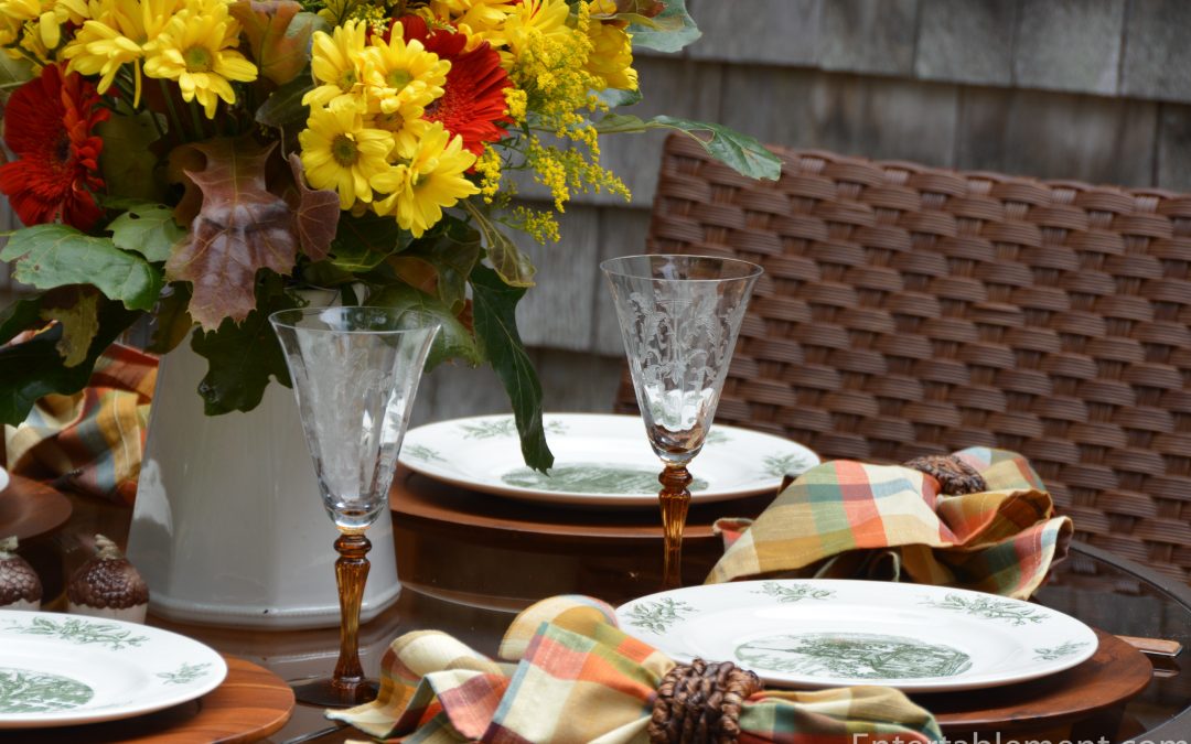
Inspiration for table settings comes from all over the place. I never quite know when or where it’s going to strike. Sometimes it’s a flower I’ve fallen in love with, or one that shows up everywhere I look, luxuriously in season. Other times it’s an unusual accessory or linen pattern. Lots of times it’s the glassware. Most often, though, it’s the plate itself. My antennae are always up for interesting plates, especially series plates designed around a common theme.
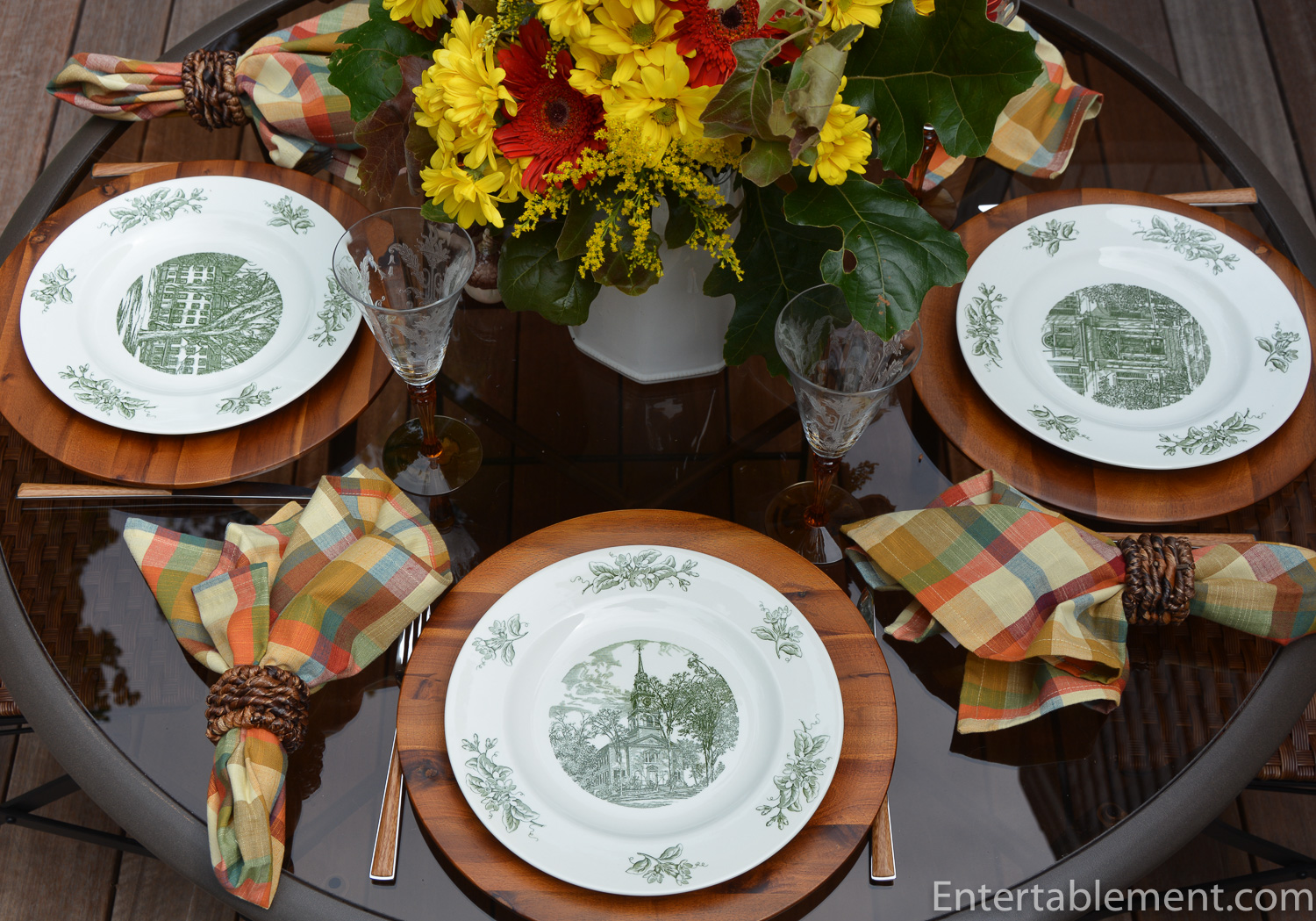
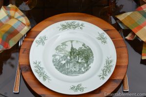
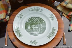
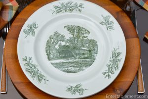
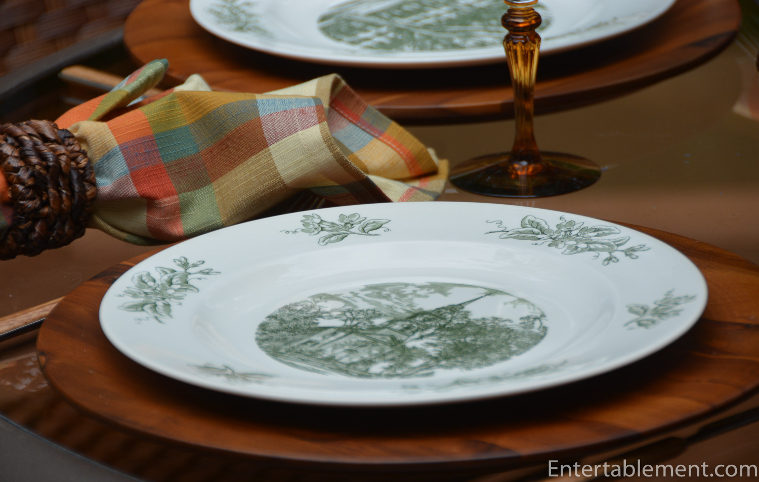
These green transfer ware plates caught my eye on several fronts. First of all, the attractive pattern on the border renders them a very useful backdrop for any number of dessert plates.

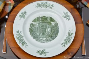
Secondly, the central part of the plates depict scenes from in and around the Boston area. This one is the Windows on Beacon Hill.
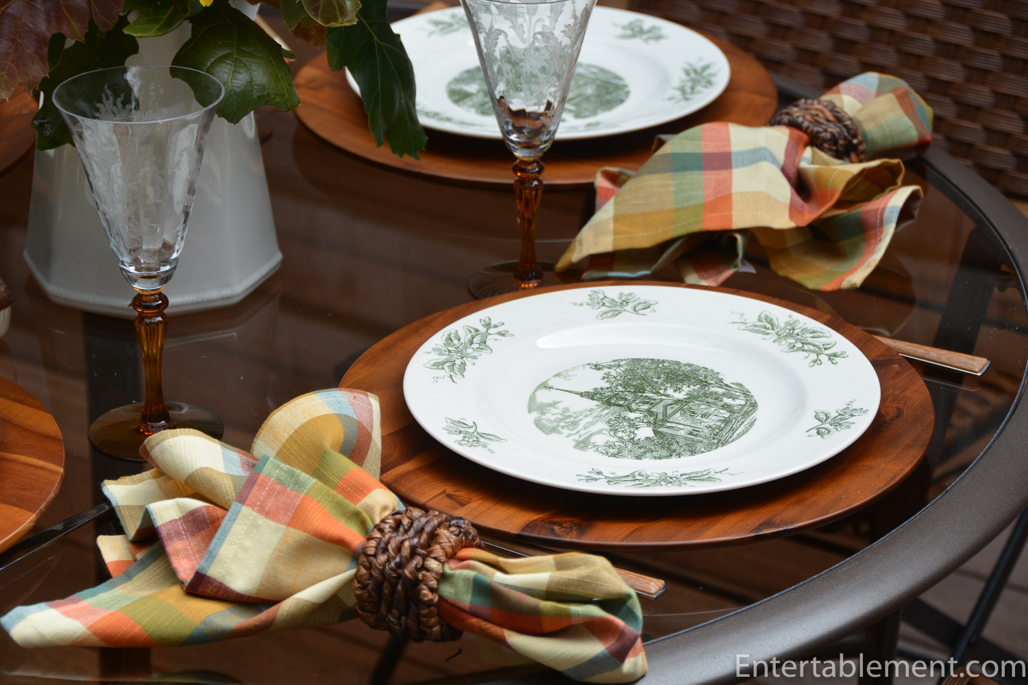
Lastly, they’re green. As a neutral, it’s unbeatable. It complements a whole bunch of colours, pale and vibrant (think leaves and grass), which is important, particularly given my affinity for floral patterns.
This pattern was was commissioned by the Thomas Long Company. Now known as Long’s Jewellers, according to their website:
“Long’s Jewelers is a family-owned and operated full-service jeweler with five stores throughout Massachusetts. New England’s love affair with Long’s began in 1878 when Thomas Long, a Massachusetts native, opened his Boston-based jewelry business. Since then, Long’s has become the foundation of Boston’s luxury jewelry and timepiece market.”
That explains why the series of plates focuses in and around Boston. Gotcha.
-
- Old New England Meeting House
-

- Backstamp
-

- Portland Head Light
-
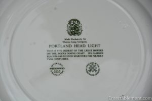
- Backstamp
-
- Windows on Beacon Hill
-
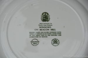
- Backstamp
-
- Maine Ship Owner’s Doorway
-
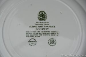
- Backstamp
-
- Old Covered Bridge
-

- Backstamp
Of course, I had to have them!
I don’t know if the eight plates were created all at once, or one at a time as an annual thing, like the Christmas Carol plates produced by Shenango. Intel is scarce on the subject. Ruby Lane Antiques sold an ashtray some time ago and indicated the pattern was produced between the late 1950s and the 1960s but few other details are available.

This table features the plates on their own, not as a backdrop to anything else. I’m happy to report that they serve that role very well, too, and I’ll be using them a lot in future, especially as I was able to track down two more in the series of eight. Yes!
I got the first five from Replacements. where they were beguilingly described as WW121. Hmmm. Less than helpful. It’s a miracle I found them at all. Google searches for Wedgwood WW121 turned up nothing. Once I set this table, however, I paid more attention to the back stamps and googled Thomas Long Wedgwood. Bingo. Several more turned up, so now I have seven different ones, and a few repeats, as the ones I didn’t have were part of a lot being sold on e-Bay. Fine with me. They were very inexpensive :). Happy tap dance. “Zippity do da, zippity day, my oh my, what a wonderful day….” I added Island Windmill and Charles Morgan, Last of the Great Whalers to the new ones and three duplicates came along for the ride. I’m just missing the Rhode Island Homestead now.
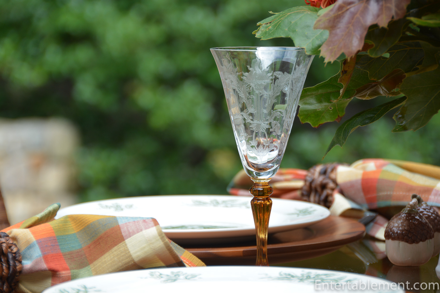
Amber stemmed Depression glass in the Julia pattern by Tiffin Franciscan picked up the rusty tones in the Farmhouse Plaid napkins by Pier 1.
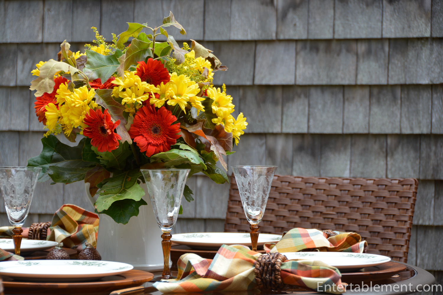
I pulled together a cheerful bouquet of chrysanthemums and gerber daisies from the ever-reliable Trader Joe’s, supplemented with oak leaves from the back yard and plonked them into a plain white jug.

The little acorn salt & pepper shakers by Kaldun & Bogle were an eBay find. They came on a little leaf tray, but I used them on their own for this setting.
What do you think? Good score?
I hope you’ve enjoyed the tour of the Boston Area, brought to you by the Thomas Long Company!
I’m sharing this post with Between Naps on the Porch.


Nice. The dishes are very pretty. They have a lot of busyness to them, a lot of detail, and one color plus white. I think that having the rest of the table in various shades of a second, more subdued color, amber, allows the dishes to shine. I like how the amber color is repeated in the glass of the table, the charger, the flatware and the stems of the glassware and even a bit on the acorn salt and pepper.
Thanks, Lorri. You’ve really summed up all the elements and how they tied together. Amber is a great “unifier”, isn’t it? A warm colour that complements the green nicely. Those farmhouse plaid napkins from Pier 1 this year were a winner. The subtle blue in them morphs from green to blue, depending on the table, so they’ve been very useful. Enjoy the weekend!
Great Blog – thanks for directing me to your fabulous collection. Nice rendering. Glad I can add to it! Londonsue (eBay). PS – the weathered shingle-siding looks like Cape Cod…..
Thanks, Susan. I’m excited to add the final plate to the collection! Thanks so much for coming to visit.
You certainly scored with those lovely transferware plates. On their own or as a backdrop for salad plates, they look great. So does your lovely fall table setting.
Thanks, Joy. I use them quite a lot, actually. And having the extras as been really useful. They make a great fall display in my china cabinet, too.
Hi I have the same plates and I have two Rhode Island I am missing the light house not sure if you have two of that & would love to trade so we both have a complete set !! love how you set the table for fall ! I know its a long shot not sure if you are still writing the blog
Hi Karen,
Sorry for the delay, but I have good news! I do have two of the lighthouse plates and you’re welcome to one of them. Please email me at info@entertablement,com with your address and I’ll get the plate to you pronto.
Best,
Helen