
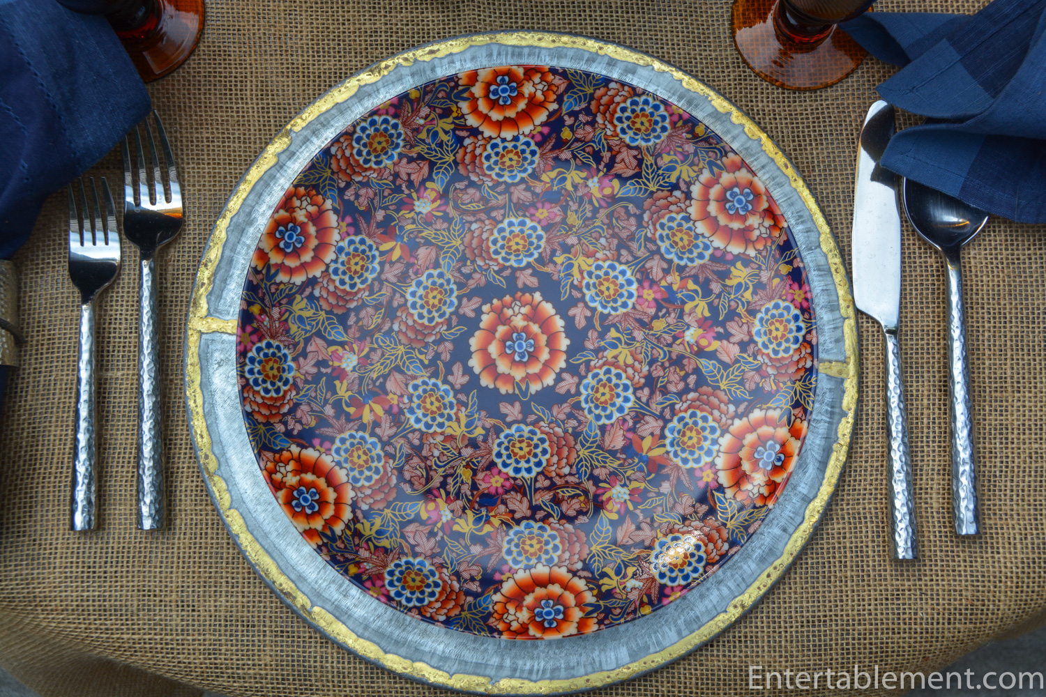
The richness of cobalt and burnt orange is a time-honoured combination found in Imari patterns, beloved by collectors for centuries.


Collectors Weekly provides us with a concise history:
“Imari is a style of porcelain named after the Japanese port from which it was shipped to the West, beginning in the late 17th century. Originally made in the town now known as Arita, which became a center for porcelain thanks to its proximity to kaolin-rich Izumiyama, Imari ware (also called Japan or Japan ware), took its design cues from colorful Japanese textiles of the day. Exotic landscapes, gnarled trees, long-winged birds such as cranes, and depictions of courtesans in exquisitely detailed kimonos are just a few examples of the most common Imari imagery.”

“The most frequent Imari palette revolved around three main colors—the blue underglaze, plus a rusty reddish-orange and a brilliant gold. The popularity of this trio led to countless imitations in the West, produced by potteries as respected as Meissen in Germany and Spode in England, both of whom copied Imari freely. By the early 18th century, China was flooding the export market with inexpensive Chinese Imari of its own, making Japanese Imari prohibitively costly in the West. The withdrawal of Japanese Imari from the Western market lured even more potteries into the Imari trade, particularly those in England, including Coalport. Foremost among them, and a strong player to this day, was Derby (now called Royal Crown Derby), which crammed its serving dishes, ginger jars, and teacups with as much pattern and decoration as their surfaces would permit.”

Williams Sonoma has added their piece to the collection with Fleur. It has all the beauty of more costly patterns, with the modern advantages of durability and practicality. I couldn’t resist.

The dinner plate is particularly richly decorated, with an intricate all-over pattern.

What to pair with it so the pattern was enhanced and the table was not overwhelmed? A Pumpkin Cake embellished with pineapple flowers, of course! I loved the way the flowers imitated the form of the chrysanthemums on the Fleur plates.


Further online exploration lead me to these hammered metal napkin rings decorated with gold orchids.

They’re from a designer on Etsy and are “in the school of” Michael Arum pieces with similar design elements.


The chargers are from Target. I thought the gold edging added a layer of interest and a touch of glam for this upscale/downscale table – a modern version of a traditionally very ornate pattern.


My trusty amber twist glasses from Williams Sonoma many years ago seemed a good choice. A bit earthy, perhaps but I thought they toned well with the bronzey colours on the plate.

The hammered flatware is from World Market.


We are getting back to normal here, and gradually adjusting to life without Burton. Taylor is adjusting better than we feared and joins me in thanking everyone for their very kind comments and expressions of sympathy. It’s so much appreciated.

I’m sharing this post with Between Naps on the Porch.


Very rich in color and especially loved your napkin rings. That cake looked too pretty to cut into. We had no idea that you lost Burton and so Very sorry to hear that. Burton was a beautiful gentle soul. Our condolences to you. Enjoy the fall with it’s beautiful array of color. Better than that white stuff
Thanks, Maura. He was a good lad, Burton. We miss him terribly.
That cake lasted about 4.6 seconds. I’ve never seen the kids hoover something back so fast. Big hit. 🙂
Dear Helen,
Hope it’s getting easier with the dogs. You must be one of those people who find solace in creativity. Why else have your two last tables shone so? I see only blue, orange, and gold, and you pull out the amber of the pheasant’s back feathers. Sigh. I would have used the Arte Italica Medici to echo the rim and napkin ring, and I would have been wrong…
As a child of the Pacific Rim, I’ve always had and loved Imari…Sis just gave me some of hers:
https://www.replacements.com/p/sadek-classic-imari-dinner-plate/sadcli/57360461
I’ll break my decades-long boycott of pineapple just to try these flowers. We always used to buy several tote-boxes of pineapples in the Honolulu airport on the way home. No fruit since has ever tasted that good; not even close!
Thanks for more inspiration.
Beatrice
P.S.: the Arum-style rings are now only available in black, unfortunately. I love love love the gold!
Oooh – do I love the vibrant green in those Sadek Imari dinner plates. Oh my goodness – the plates are wonderful! Can’t wait to see them in action, Beatrice. Please send pics when you next use them. I think they’d look spectacular with clear green orchids.
Thanks for your kind remarks about the dogs. It is getting easier day by day. My main worry was Taylor and she seems to have adapted well.
The pineapple flowers are surprisingly easy – they’re very forgiving. I found it took several hours to dry them out sufficiently, but it’s just a question of keeping an eye on them. They freeze nicely once they’re dried, too, so you can get them ready well in advance of when you want to use them.
You might write to the Etsy producer of those napkin rings. You may be able to special order some gold ones.