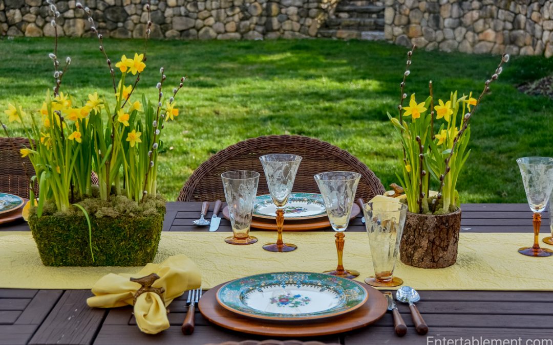
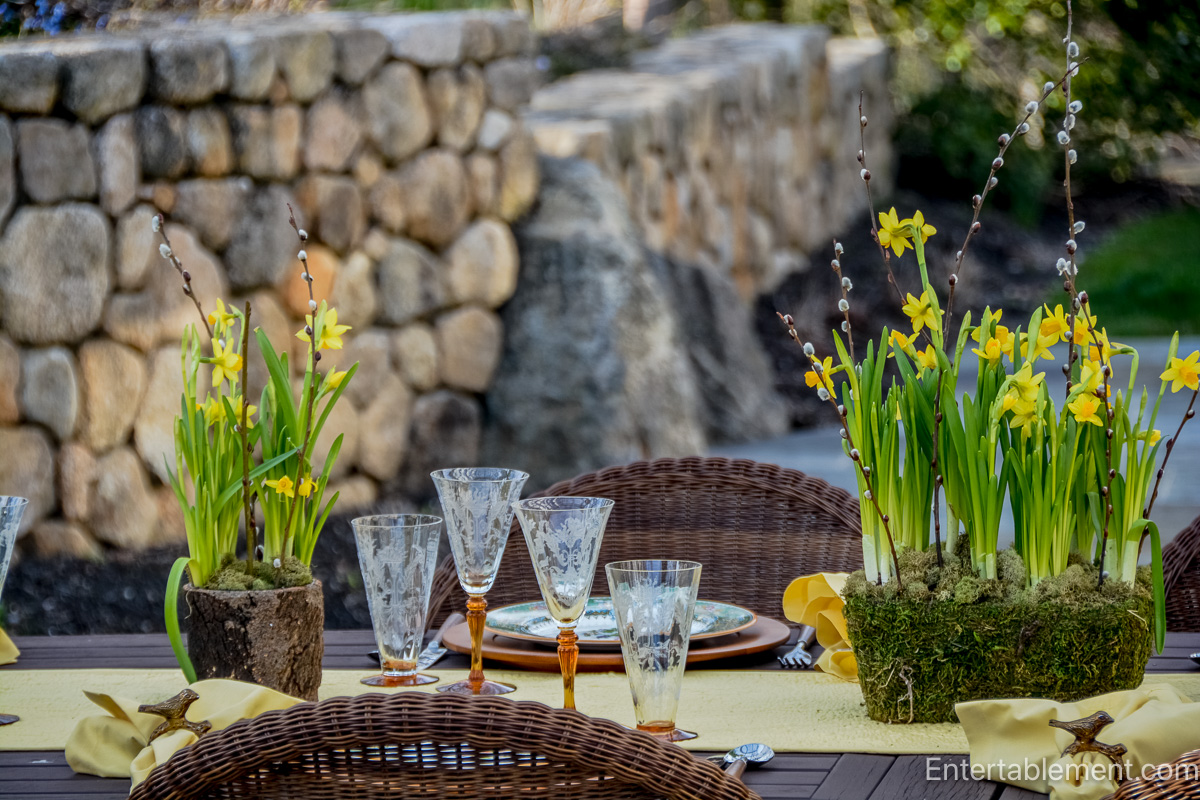
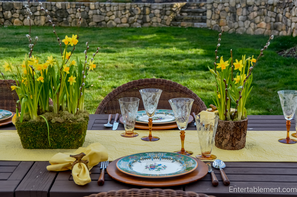
There’s something magical about spring dining outdoors—the first warm breeze, the sunlight dappled through fresh foliage, and the sheer joy of setting a table surrounded by nature. For this alfresco tablescape,
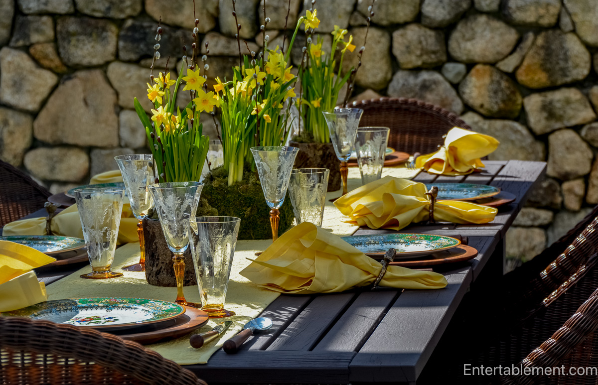
I leaned into that spirit with a palette of sunshine yellow and vibrant green, anchored by the richly ornate Garfield (Pareek) pattern by Johnson Brothers and the amber glow of Julia Stemware.

The Garfield pattern, also known as Garfield (Pareek), is part of the Pareek line introduced by Johnson Brothers in the early 20th century. “Pareek” was a marketing name created to evoke the exoticism and intricacy of Indian design, appealing to Western tastes at the height of British colonial influence. The line was known for its hand-painted details and vivid colours, often edged in gold or framed in intricate scrollwork.

Garfield in particular features an elaborate border of green, orange, and gold with neoclassical urns and floral swags—a design that feels both formal and festive.

At the centre of each plate is a cheerful nosegay of bright red, cobalt blue, yellow, and lavender flowers, which beautifully complements the golden Baby Moon daffodils from Trader Joe’s.

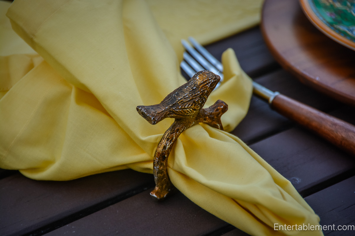
The table features natural textures—rattan chairs, a quilted yellow runner, and bark and moss-wrapped planters overflowing with mini daffodils and pussy willow branches.

Each place setting rests on a wood charger that grounds the bright tones and highlights the bold green of the china’s border. The tableware’s classic British refinement feels fresh and lively when paired with the more rustic, organic surroundings.

The Julia Amber Depression glass by Tiffin-Franciscan adds a perfect golden touch. With its delicate etching and warm amber hue, it catches the light just so, adding a romantic shimmer to the setting.
Its vintage charm plays off the historic feel of the Garfield china, creating a layered, collected look that invites guests to linger.
What I love most about the Garfield (Pareek) pattern is its unapologetic colour and detail—it’s not shy or minimal. It revels in decoration, craftsmanship, and the joy of the table. And isn’t that what entertaining is all about?
Bringing beauty to the everyday, celebrating the season, and honouring the artistry in even the smallest details.
The term “Pareek” wasn’t a pattern name but a sub-brand Johnson Brothers introduced in the 1920s and 1930s. Seeking to appeal to Western audiences captivated by the mystique of the East, Johnson Brothers coined “Pareek” as a word that sounded exotic—though it has no direct meaning in any known language. It was part of a broader trend at the time: British potteries marketing wares inspired by Indian, Persian, and Moorish design elements under evocative names.
Pareek patterns often featured:
- Brightly colored borders with jewel tones like jade green, ruby red, and sapphire blue.
- Elaborate gilding and scrollwork reminiscent of Indian textiles or palace decor.
- Floral motifs in both the centre and borders—some stylized, others quite naturalistic.
- Hand-painted or transfer-printed designs, often finished with enamel highlights.
I have one other Pareek pattern, Ningpo, which I wrote about here. Elegant and ethereal, Ningpo is one of the most delicate entries in Johnson Brothers’ Pareek line.

Rather than the conventional central floral bouquet, Ningpo opts for a clean, ivory centre, allowing the eye to focus on the graceful garland of wildflowers that drifts around the rim.

The design features finely detailed blossoms in soft red, yellow, periwinkle blue, and coral, intertwined with airy greenery—all bordered by a gently scalloped edge trimmed in gold and framed by a stylized, almost Art Deco border in jade green and warm caramel.

There’s a sense of lightness and balance to Ningpo that makes it feel more contemporary than many of its companions in the Pareek family. It blends beautifully into modern tablescapes while still offering a vintage pedigree and artisanal charm. Ningpo is perfect for spring and summer entertaining, afternoon tea, or any occasion that calls for quiet elegance with a whisper of nostalgia.

But back to the topic at hand. The Garfield pattern showcases the ornate flair typical of Pareek ware, but with a particularly European bent—neoclassical urns, baroque scrolls, and tiny floral bouquets all bound together by that vibrant green border and orange rim.
While many Pareek patterns were discontinued after WWII, they remain beloved by collectors for their boldness and charm. They capture a unique moment in time—when the British ceramics industry was steeped in its traditions and looking outward for inspiration.
To learn more about Johnson Brothers, visit Johnson Brothers: Everyday Elegance for the 20th Century Table, the first in our Makers Behind the Magic Series.


Hello Helen and Mary, I ran across your site while doing some “research” on a turkey plate I found for sale in eBay. What a great idea putting this site together. I look forward to seeing more of your beautiful table scapes. I have a collection of plates with turkeys on them. I’ve never counted them but I expect I have over 100. Some years ago I was even on Martha Stewart’s TV show. I have a copy of my few minutes with her, if you would like to see it.
Catherine Huart.
Hi Catherine,
Welcome to the site! Such fun to hear about your collection of turkey plates. Are they all different, or are some sets? Would love to see your time with Martha! Perhaps put a link into an email at info@entertablement.com. Both Mary and i receive it. Have a good evening.
Dear Helen, this pattern is so rich and lush that the simpler setting suits it well. The tete-a-tete daffodils you show here have long since bloomed in our early spring weather, and so have the parrot tulips, lilac, and wisteria. You always pull the most unpredictable colour from a pattern–this table would look totally different had you pulled the green or blue. That’s what sets your tables apart from us mere mortals! Onward to peony and iris season…
As you say, Beatrice, Garfield has so many colours from which to choose, but having the little daffodils made the choice easy. I don’t have a lot of pieces that go with bright yellow, so it seemed a natural. Our lilac buds are getting fatter, peonies buds are about 1/2″ (they seem to take forever to get to full size – we are about a month away, at least). But in the meantime, the lilies of the valley are starting. Happy sigh. I spent yesterday clearing a bed of some ugly perennials the last owners planted (it has taken several years – the dratted things have a diabolical root system). The plan is for a 4′ x 8′ dahlia cutting garden, using a netting I spotted at Newby Hall last year. The black netting, with 4″ squares, is stretched between stakes approximately 24″ above the ground. The dahlias grow up through it, and it disappears from view! Magic. Have a lovely day.